

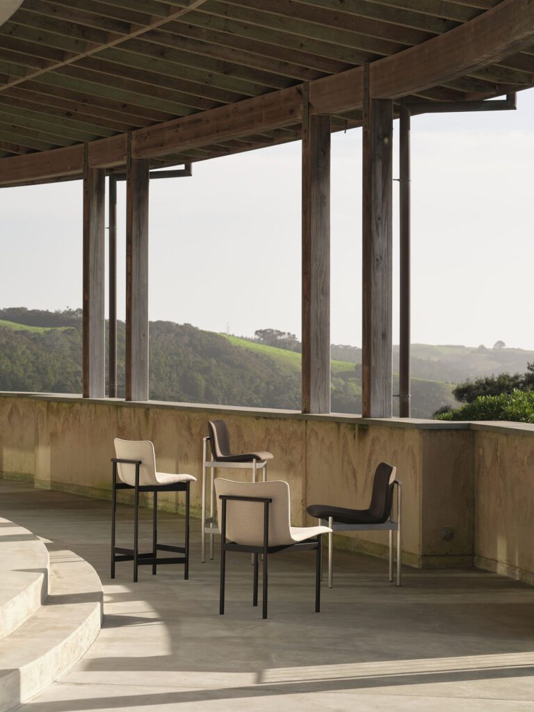
A soft, contoured seat against a geometric aluminium frame. A study of balance and clarity.
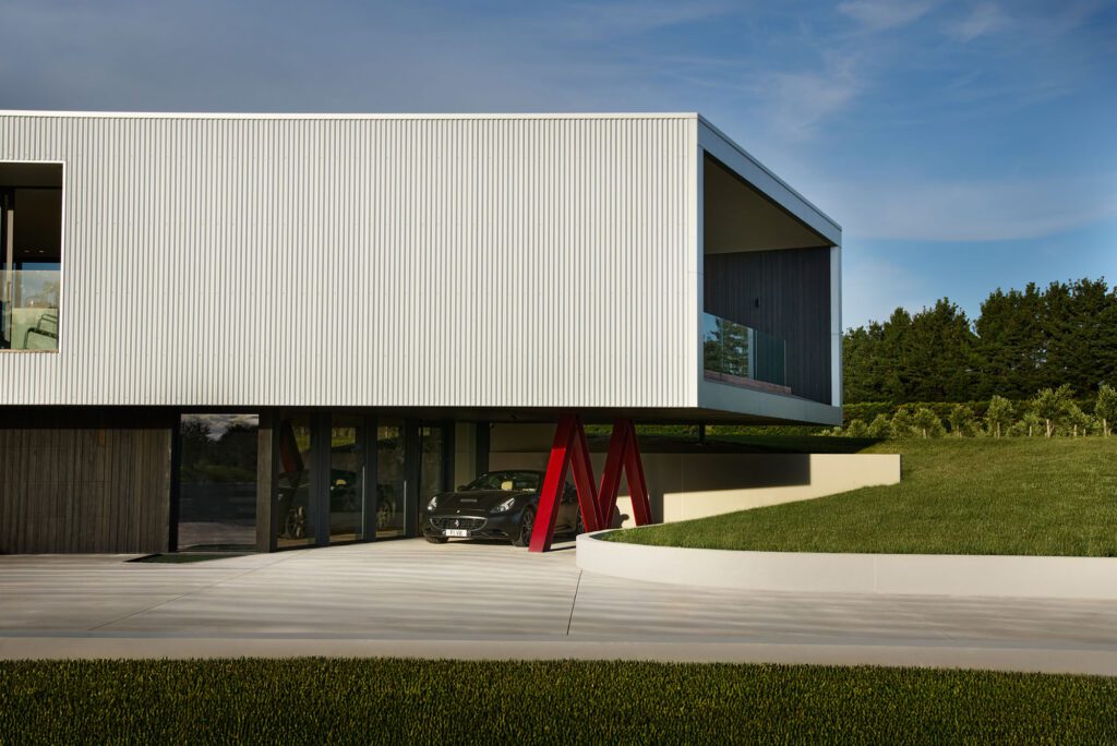
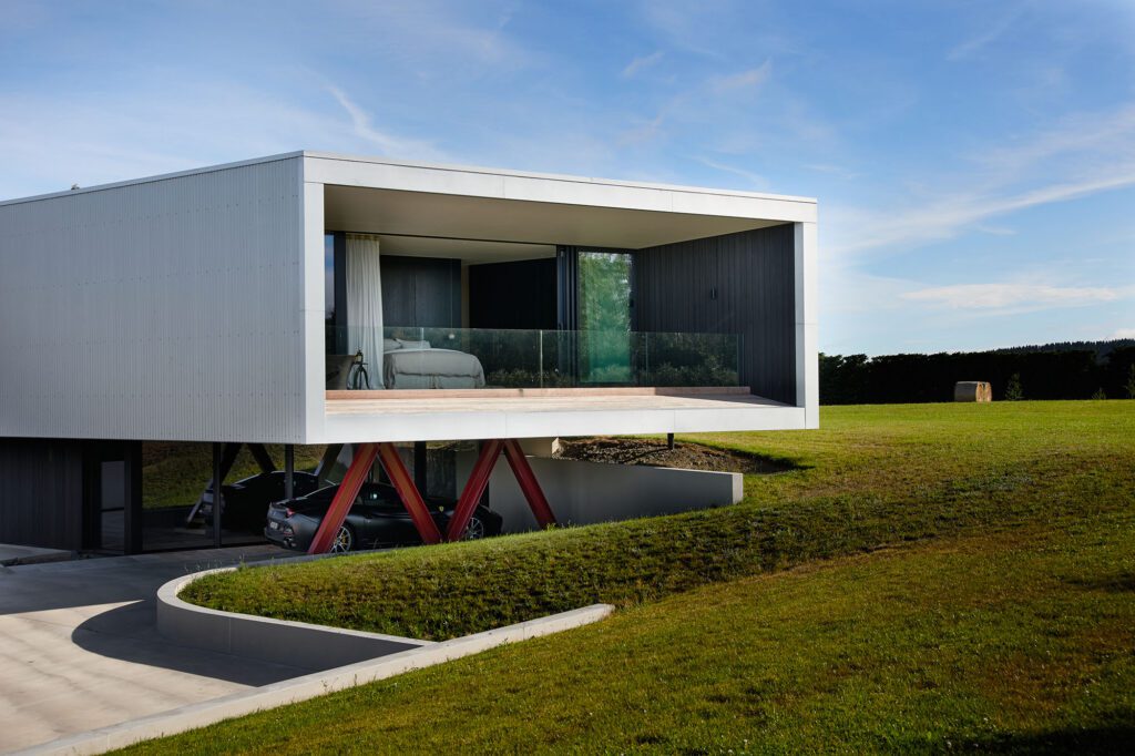
At M House by Ponting Fitzgerald Architects, the arrival sequence is deliberate — a slow arc around the building that allows the architecture to be
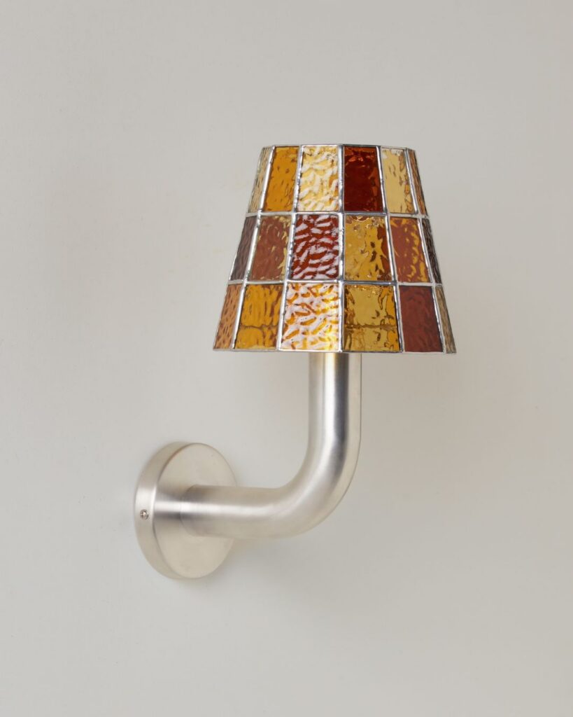
Balancing equal parts whimsy and grace, the Fun Guy wall lights are crafted to delight.
For more than 35 years, Plumbline has worked alongside New Zealand architects, interior designers and specifiers, helping bring thoughtful residential and commercial spaces to life.