


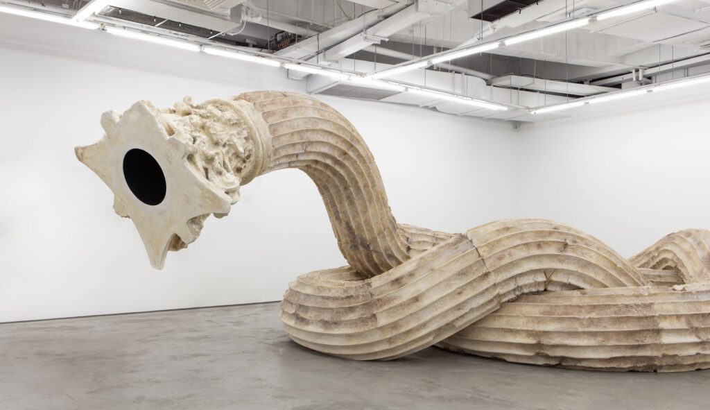
An exhibition of Chinese contemporary art arrives in Auckland, tracing decades of cultural transformation through works that span performance, installation and digital media.
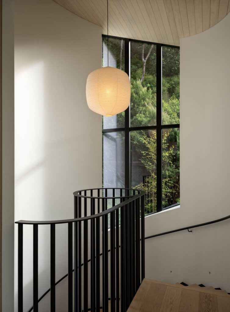
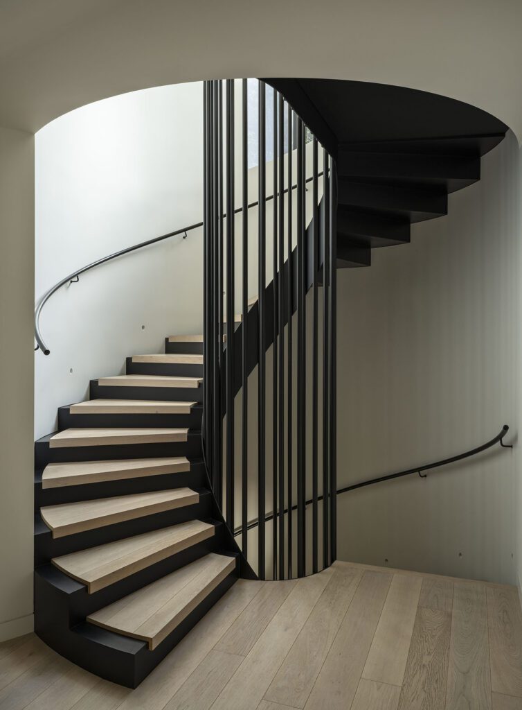
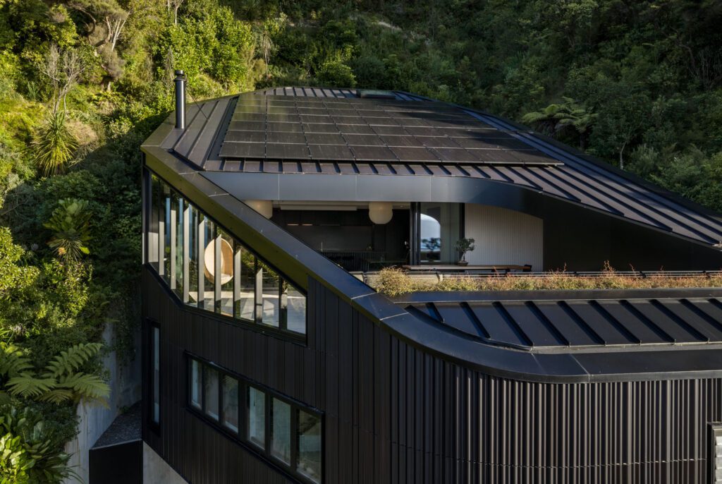
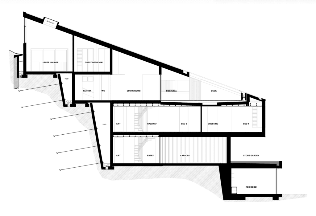
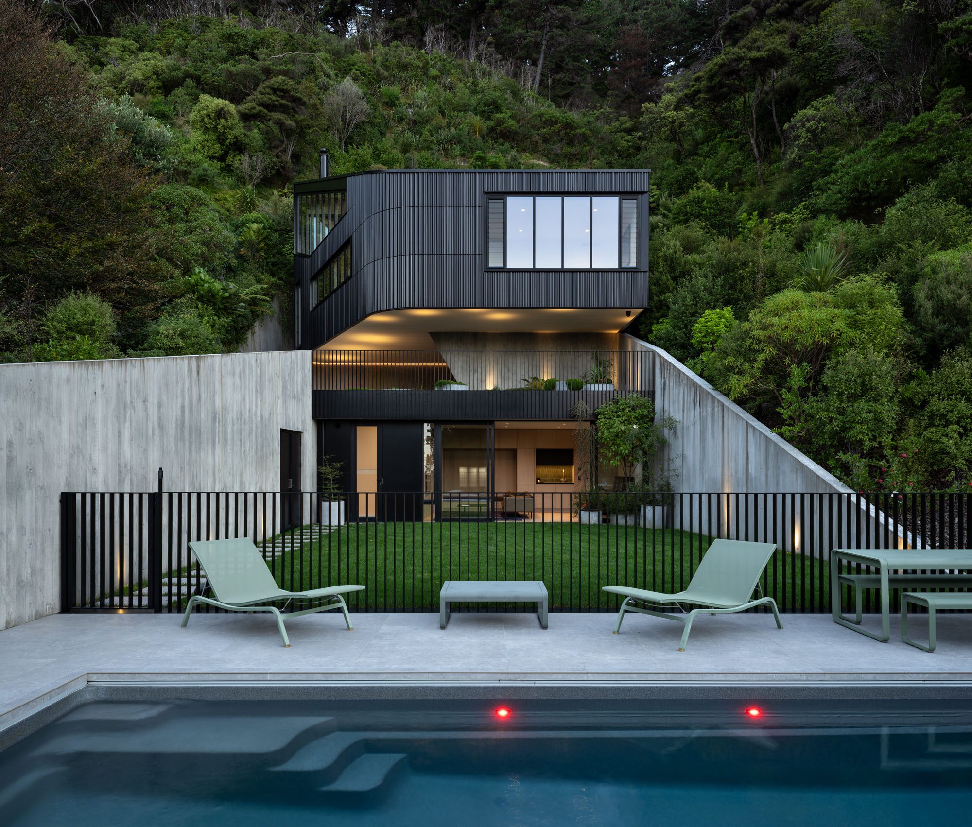
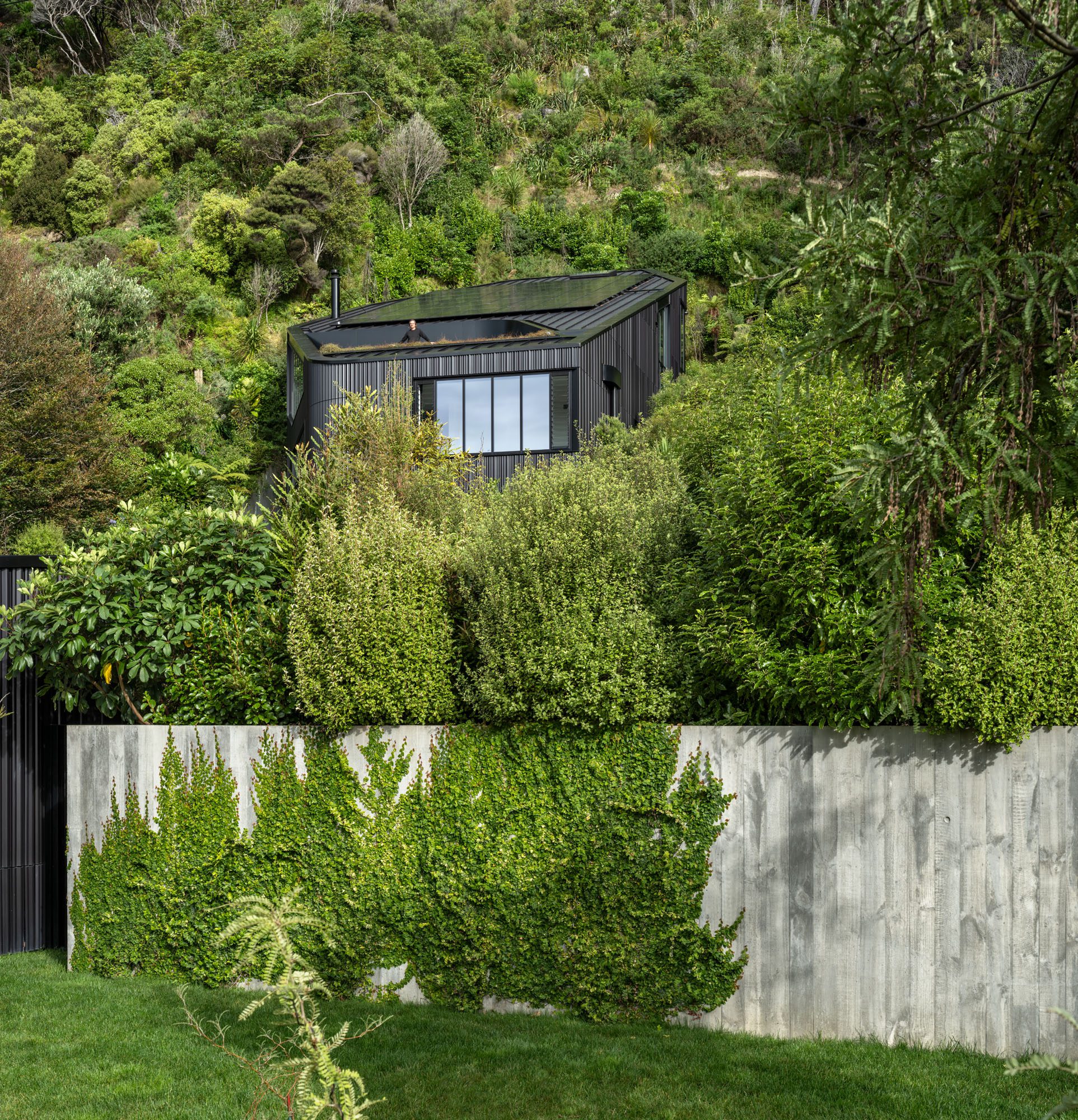
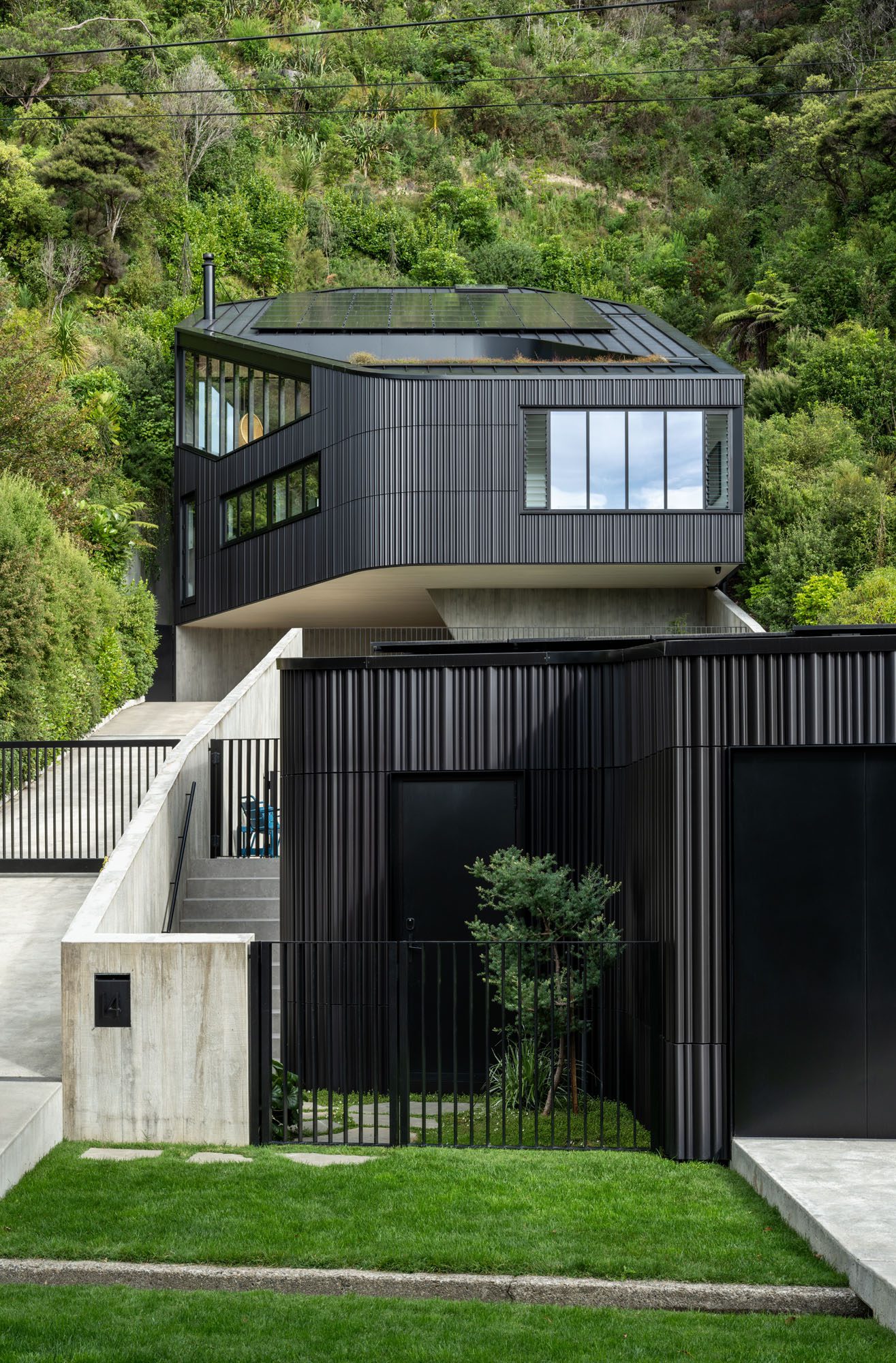
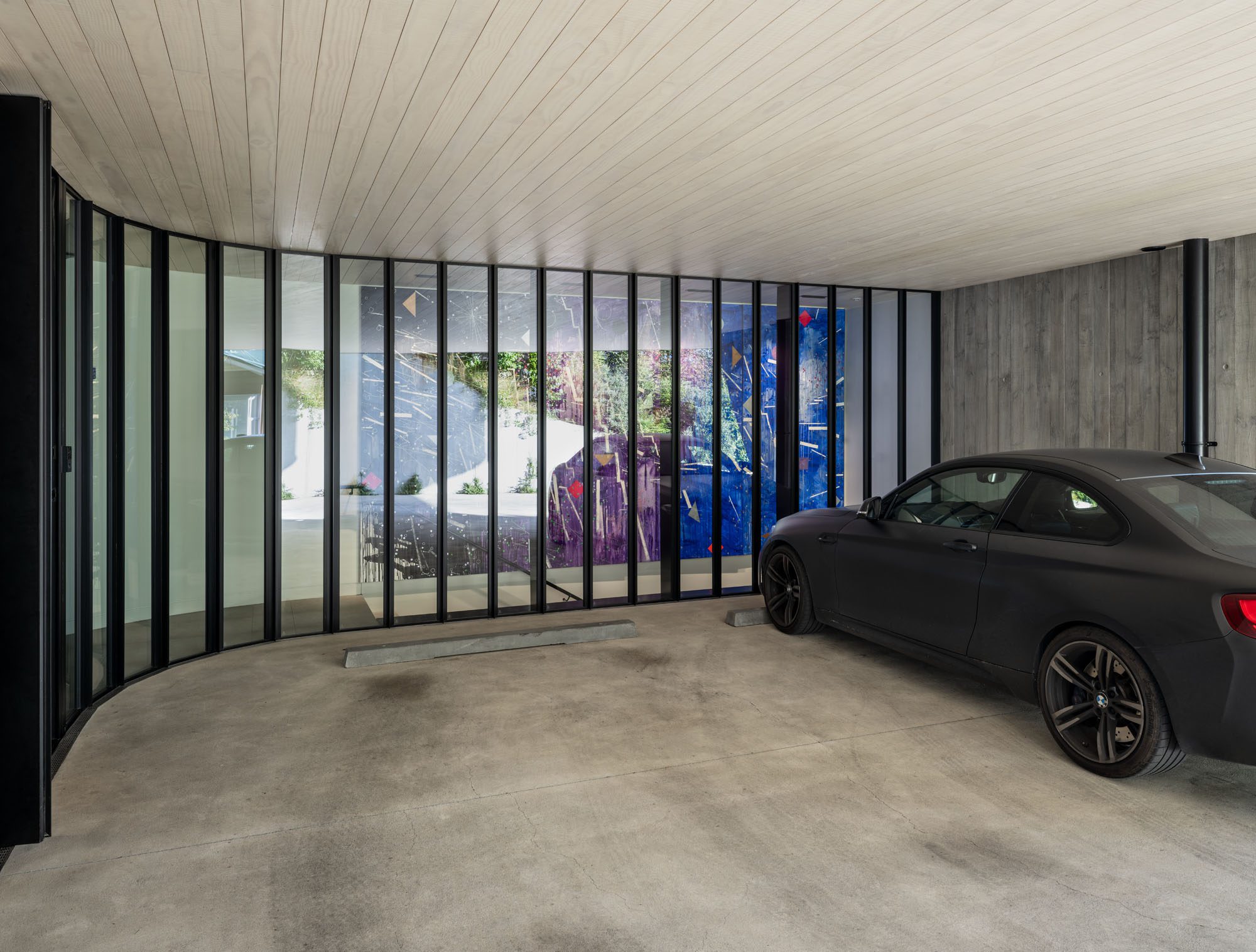
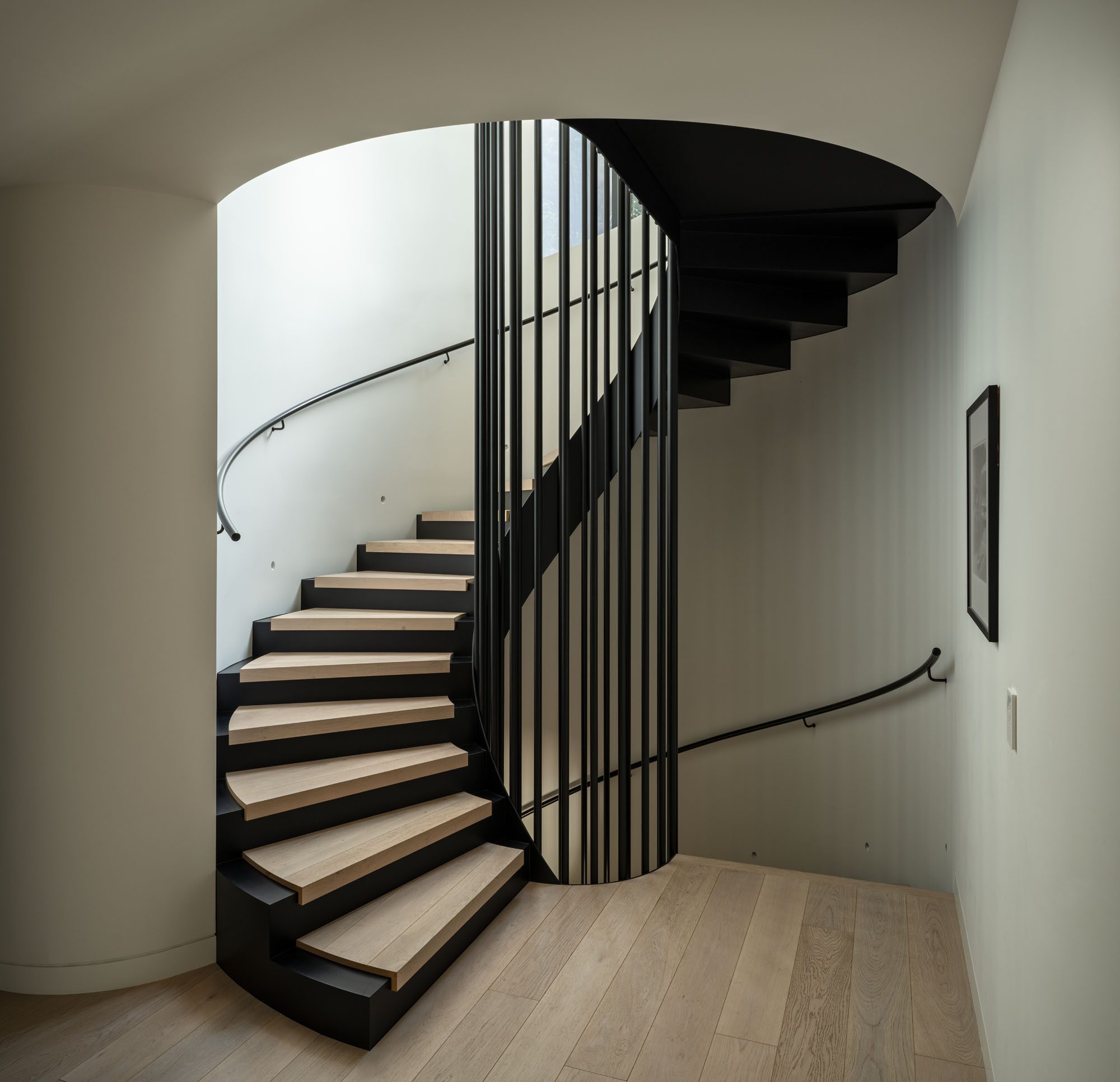
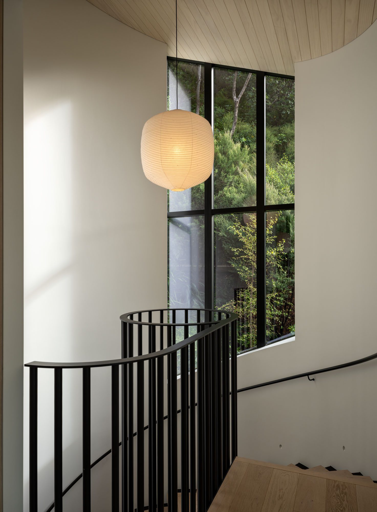
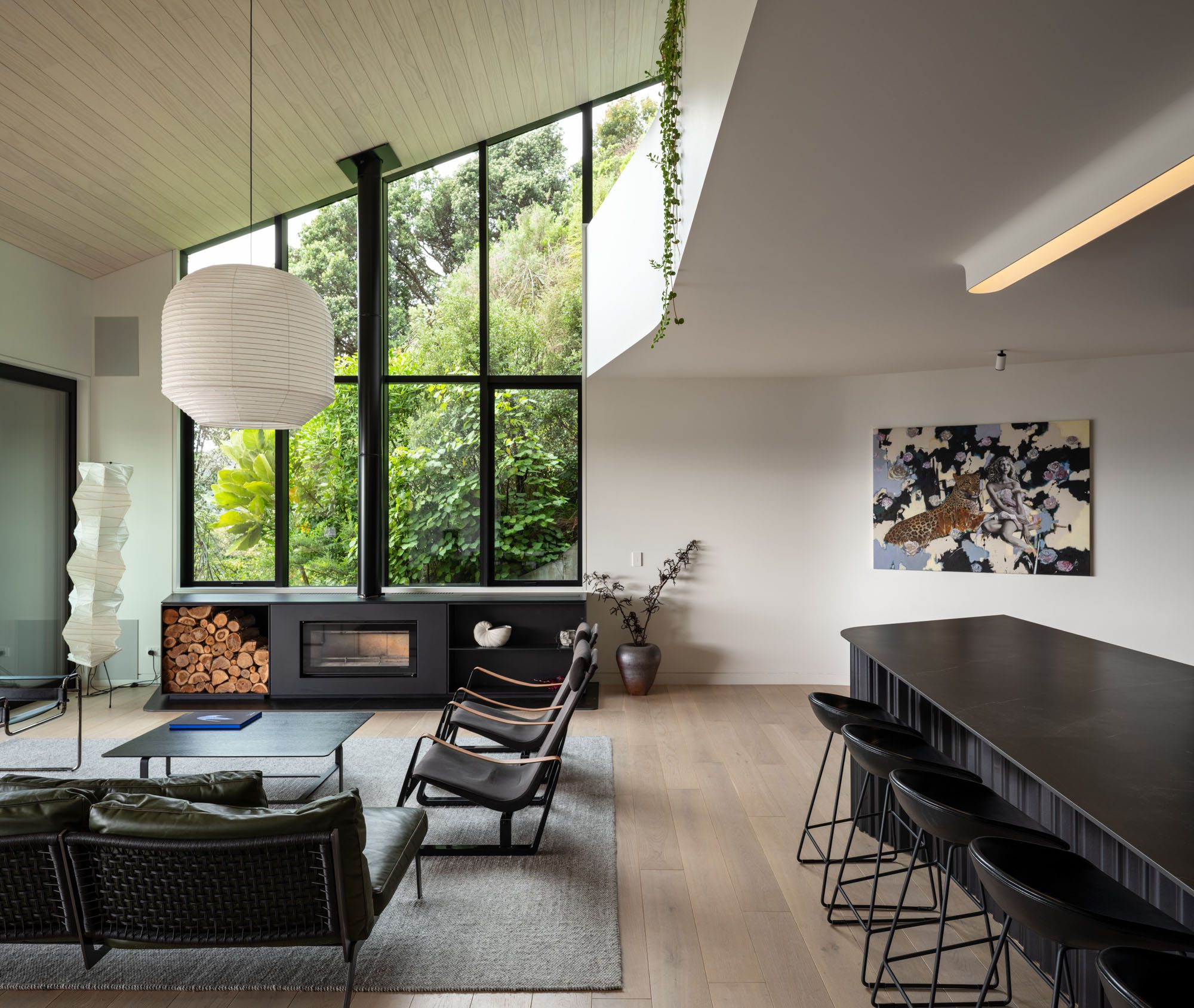
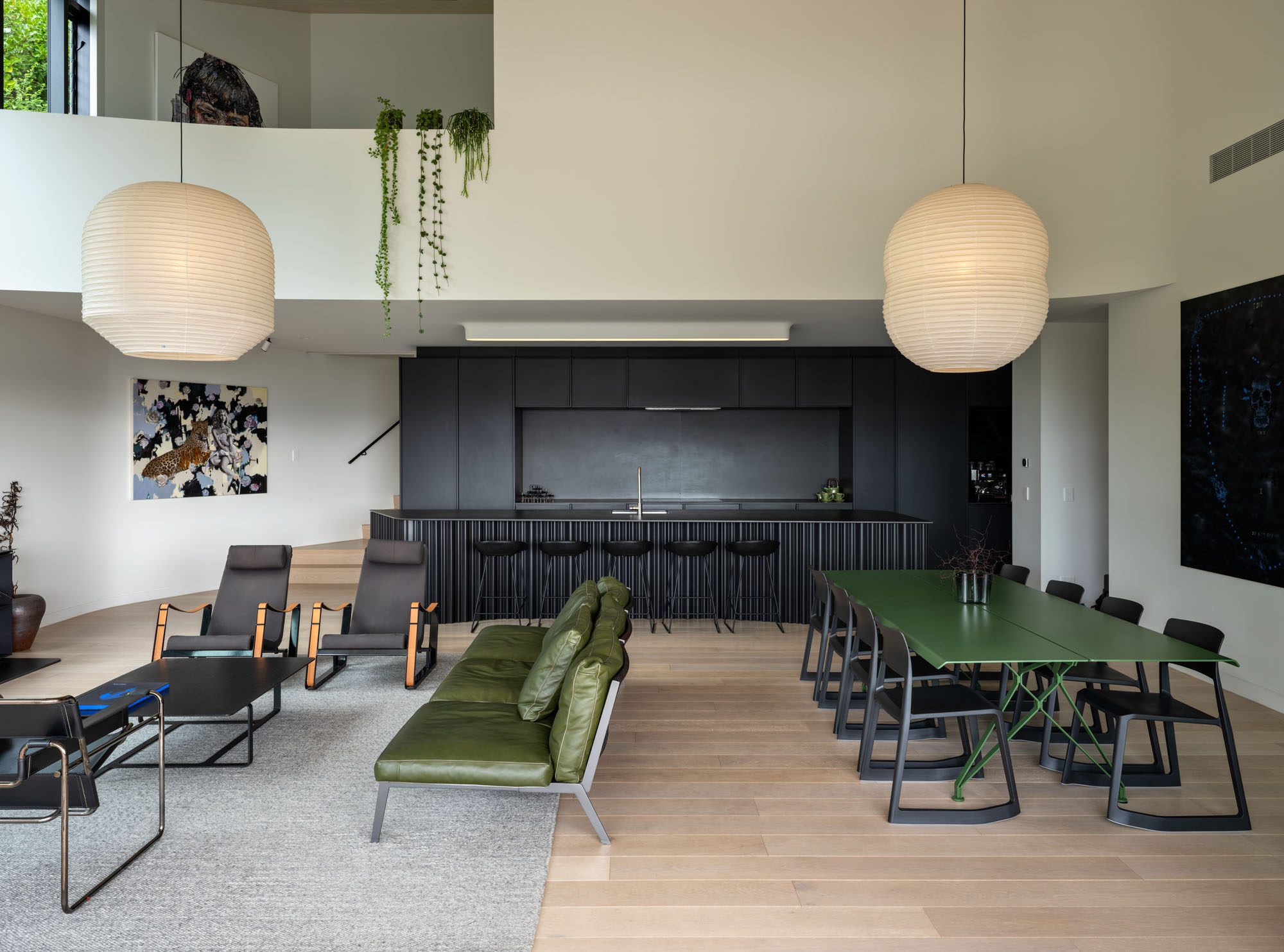
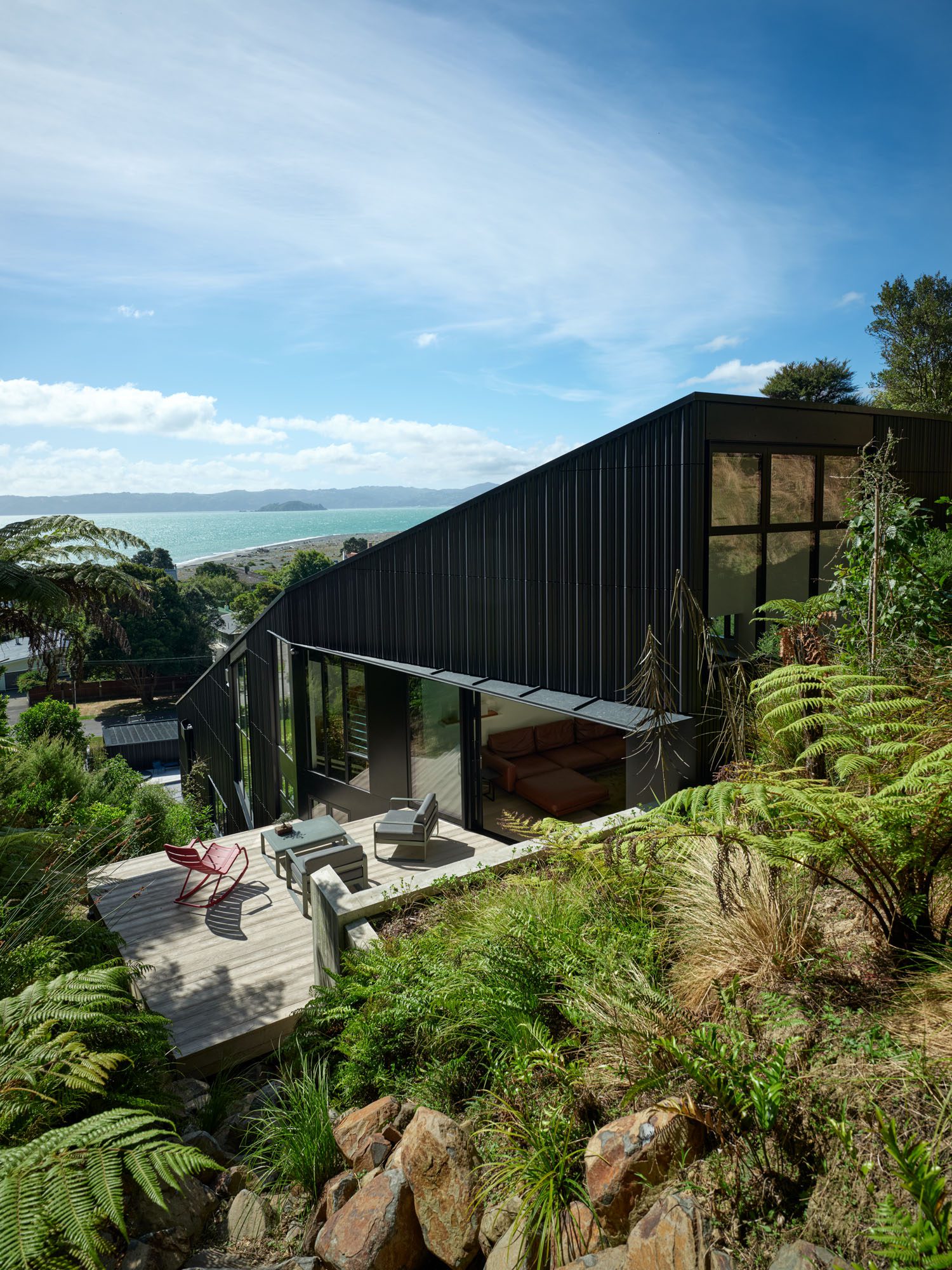
Set into a suburban site in Kohimarama, Clay Block House by Daniel Marshall Architects is a study in materiality and environmental performance.
A new architecture magazine, Architecture Aotearoa: New Zealand’s Buildings, Cities, and Culture will launch in late May 2026 as a collaboration between Te Kāhui Whaihanga
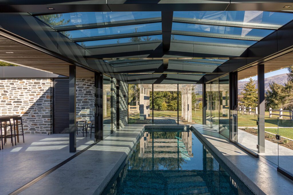
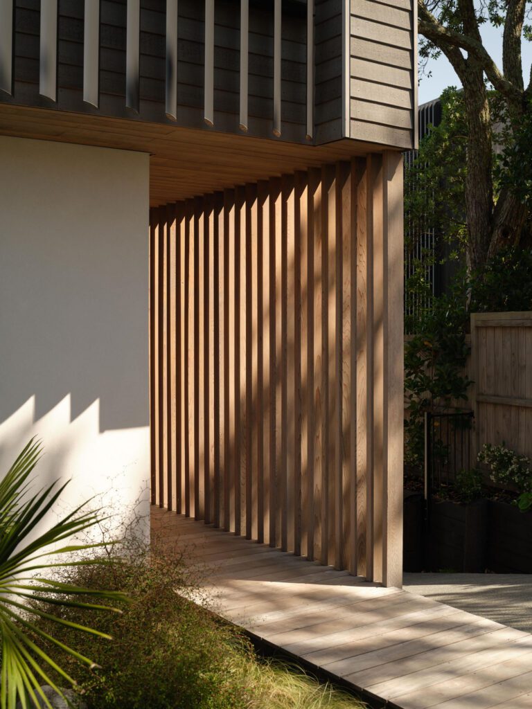
At the heart of this Wānaka home by Johnston Architects is the enduring presence of Jura Grey limestone from Quantum.