

Centre Stage at Interior of the Year

Colour is one of architecture’s most expressive materials. Here, we explore the Resene palettes used in two Interior of the Year finalists where bold gestures and sumptuous detailing combine to deepen the spatial conversation.

Not for Resale by House Party Interiors

Designing for longevity means looking beyond convention. In this Wellington renovation, colour becomes the thread that connects architecture, landscape, and family life, to create a home that blends old and new in a vibrant and enduring palette.

Image: Adrian Varcoe

Built in the 1940s, the weatherboard house had gathered a patchwork of additions over time. Within a modest footprint and a carefully managed budget, the new design reclaimed overlooked spaces, opened the house to garden and sea, and embraced colour with assurance.

Instead of the pale neutrals typical of coastal homes, the palette looks to Mediterranean summers. Deep blues are layered with peach, terracotta, and red, bringing warmth and optimism to even the greyest Wellington day. Throughout the home, Resene colours create a sense of continuity, allowing timber, stone, and crafted details to stand out.

Image: Adrian Varcoe

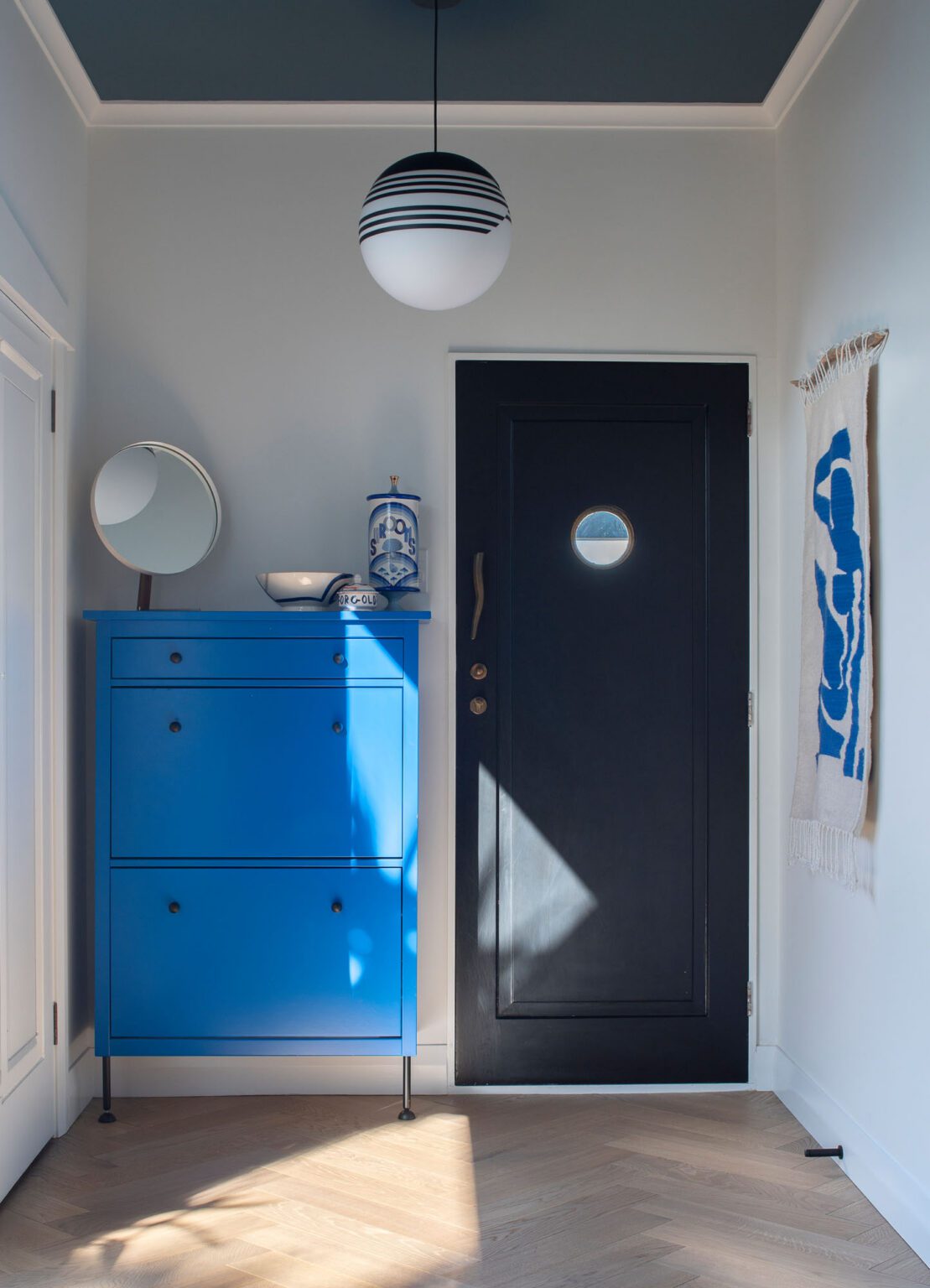
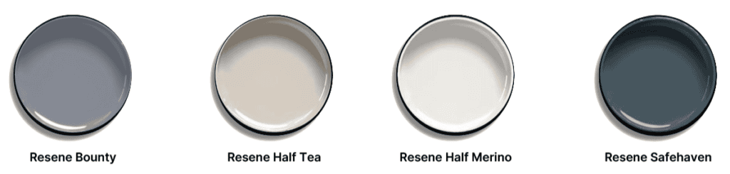
The journey begins at the front door, painted in Resene Safehaven, where a ceiling in Resene Half Coast and walls in Resene Half Merino establish an intimate tone. From here, a cast of blues move from room to room, responding to the shifting coastal light. As the weather changes, so do the tones, revealing depth and nuance throughout the day.

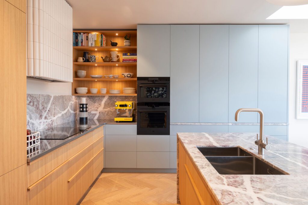
In the kitchen, cabinetry in Resene Bounty brings a soft, calming blue that sits easily with European oak joinery and Fior di Pesco marble. The paint colour balances the richly veined stone, allowing each material to contribute to a layered, cohesive whole.

Here, Resene’s considered colours shift with Wellington’s changing skies, creating interiors that feel bright and uplifting in the morning sun, yet warm and enveloping as southerly weather arrives.

Starlight Cinema by Houndstooth Interiors

A finalist in the Interior of the Year Civic category, Taupō’s newest cinema is a place designed to transport its visitors to another world — of colour and a healthy dose of nostalgia.

Image: Florence Charvin

For generations, the cinema has been a place of escape; somewhere everyday life fades to black before the opening scene. At Taupō’s new Starlight Cinema, that sense of anticipation begins long before the lights dim, with colour setting the stage for an experience designed to transport visitors from the moment they arrive.

A finalist in the 2026 Interior of the Year Awards, Starlight Cinema marks the return of a much-loved community institution after years without a dedicated local cinema. Rather than creating a conventional commercial fit-out, designer Holly Houndstooth reimagined the entire cinematic journey as an immersive sequence of spaces, where colour, light, and materiality work together to heighten emotion at every turn. “The design vision was to create something joyful, immersive and unapologetically vibrant, proving that bold, design-led experiences should not be reserved for big cities alone,” Holly explains.

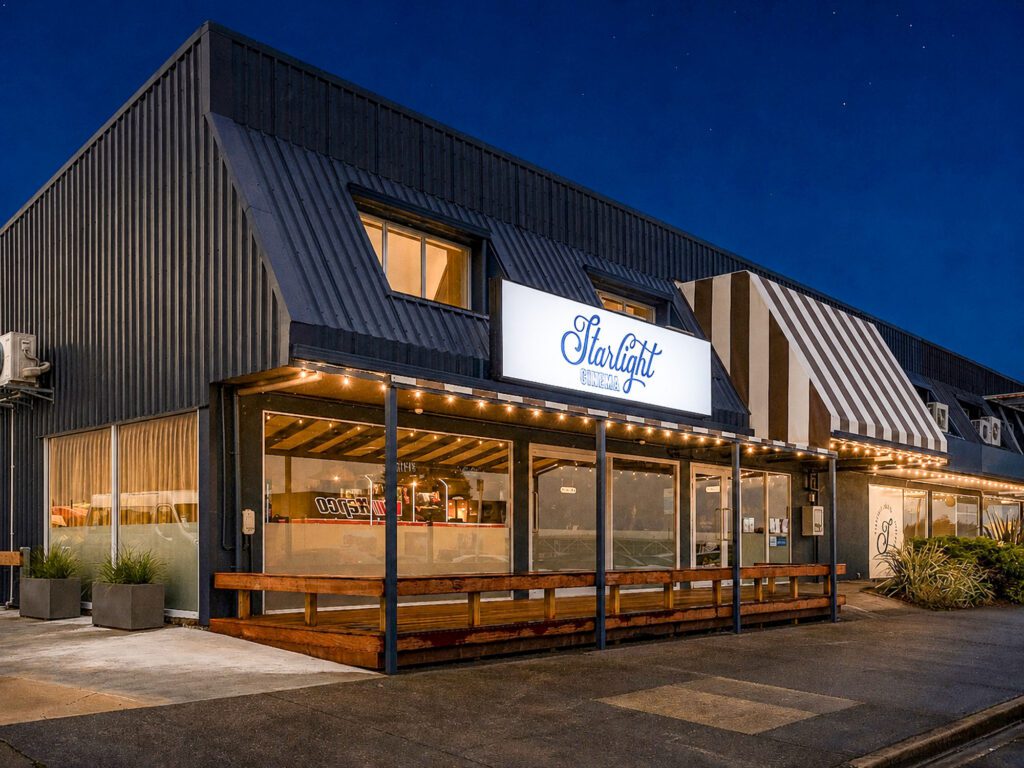
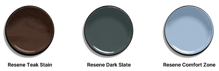
Resene played a defining role in bringing that vision to life. The building’s exterior is wrapped in a custom-mixed interpretation of Resene Dark Slate, extending across both the cladding and window framing to establish a confident civic presence, while Resene Saddle introduces warmth beneath the soffits before continuing through the lobby ceilings to create a rich, enveloping atmosphere on arrival.

Image: Florence Charvin

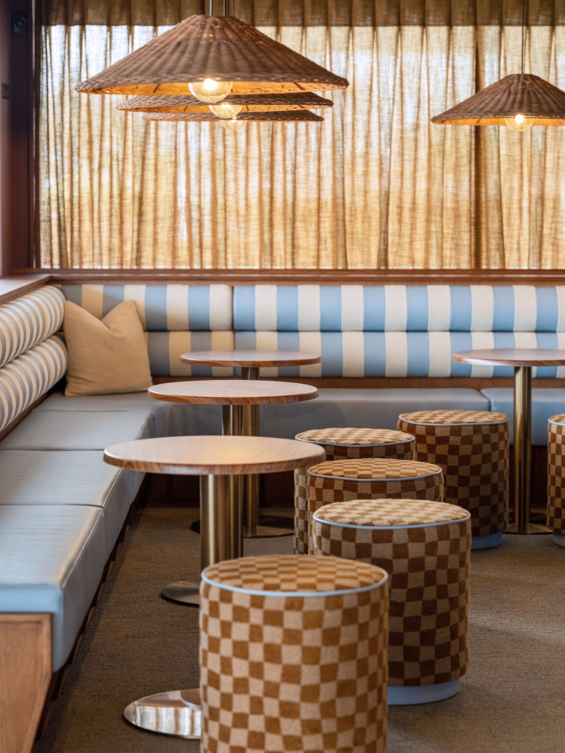
“Colour became the emotional backbone of the project,” Holly explains. “Powder blues and layered textures were carefully orchestrated to create contrast, nostalgia, and excitement, reimagining the traditional cinema journey through a distinctly contemporary lens. Every space was intentionally colour mapped to shape atmosphere, from intimate waiting lounges and dramatic corridors to playful amenity spaces and the warm glow that sends guests back into the community.” Timber detailing is enriched with Resene Teak Stain, introducing another layer of warmth and tactility throughout the interior.

Perhaps the project’s most distinctive gesture is the use of Resene Comfort Zone. Originally selected for the cinema’s feature signage, the sophisticated pastel blue quickly evolved into a defining brand colour, extending across illuminated light boxes, signage frames, plaques and the dramatic exterior hero sign. It even informed the custom upholstery, colour-matched to create a seamless visual identity that threads throughout the building.

Latest video features

In the Coromandel, a home with a humble profile and a thoughtful design makes the most of a stunning location.

Built with awe-inspiring attention to detail, this Arrowtown home is a fresh interpretation of a familiar Otago rural vernacular.

This sculptural Northland bach is a perfect north arrow on a remote farm high above the sea.

With the sun on its bow and the community at its stern, this is a house in which the elements are always front of mind.

Trending articles

Design News

Centre Stage at Interior of the Year

Colour is one of architecture’s most expressive materials. Here, we explore the Resene palettes used in two Interior of the Year finalists where bold gestures