Interior designer Nicola Ross speaks about the full-height joinery, shoji-inspired detailing and quiet material choices behind The Treehouse’s kitchen, and why restraint is not the same as minimalism.
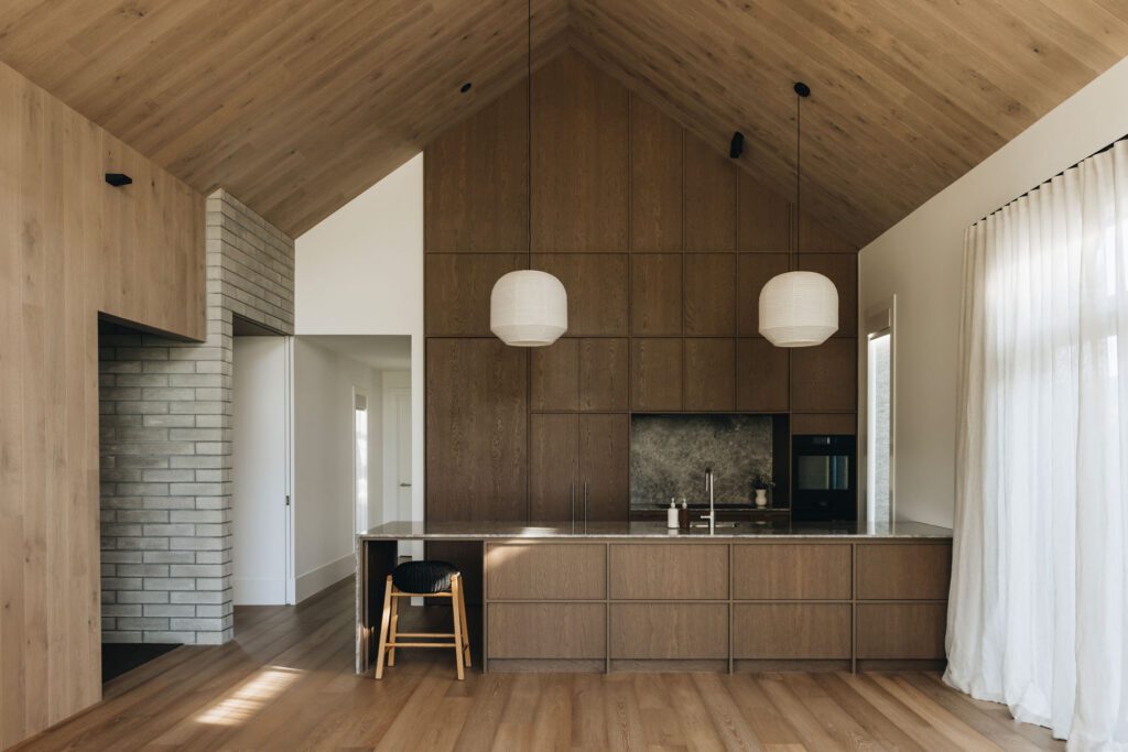
The Treehouse was designed by Nicola Ross Design for repeat clients building within a golf course development, with architecture by Pak Design.
Ross’s brief was to develop an interior language for an already strong architectural shell, one that would bring warmth and a sense of calm to the home. Working across spatial planning, joinery, material selection and detailing, she treated the interior as a single composition rather than a set of separate rooms, built around the full-height kitchen joinery that went on to set the standard for every decision that followed. We spoke to Nicola about the project and how the kitchen was indeed, the heart of the architecture.
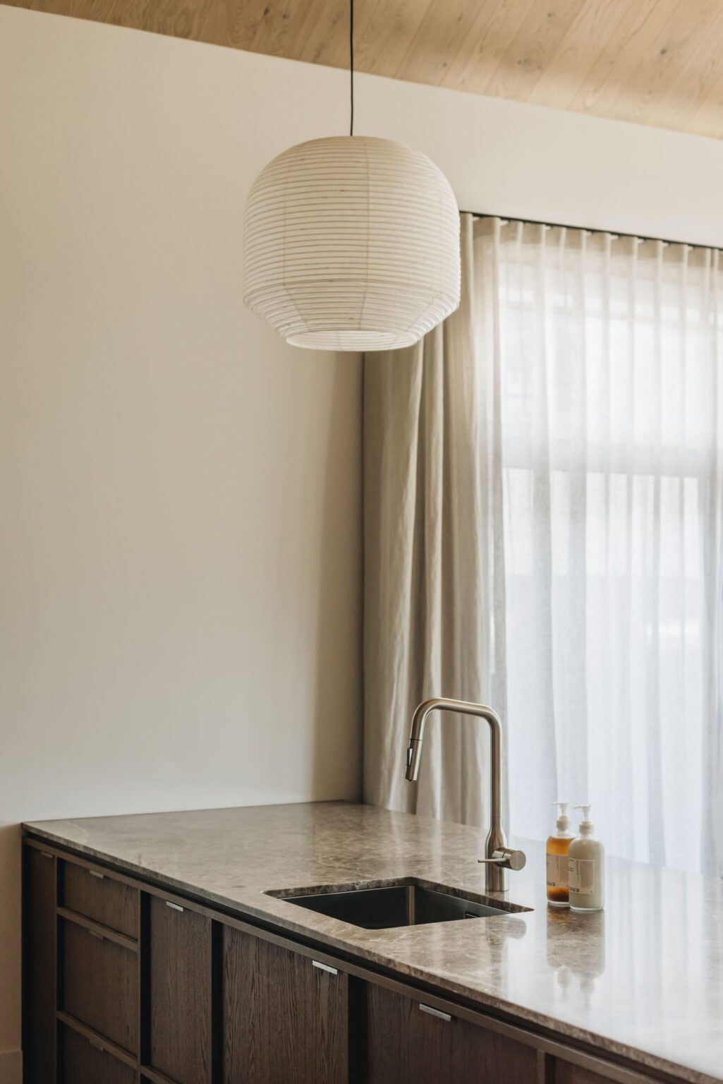
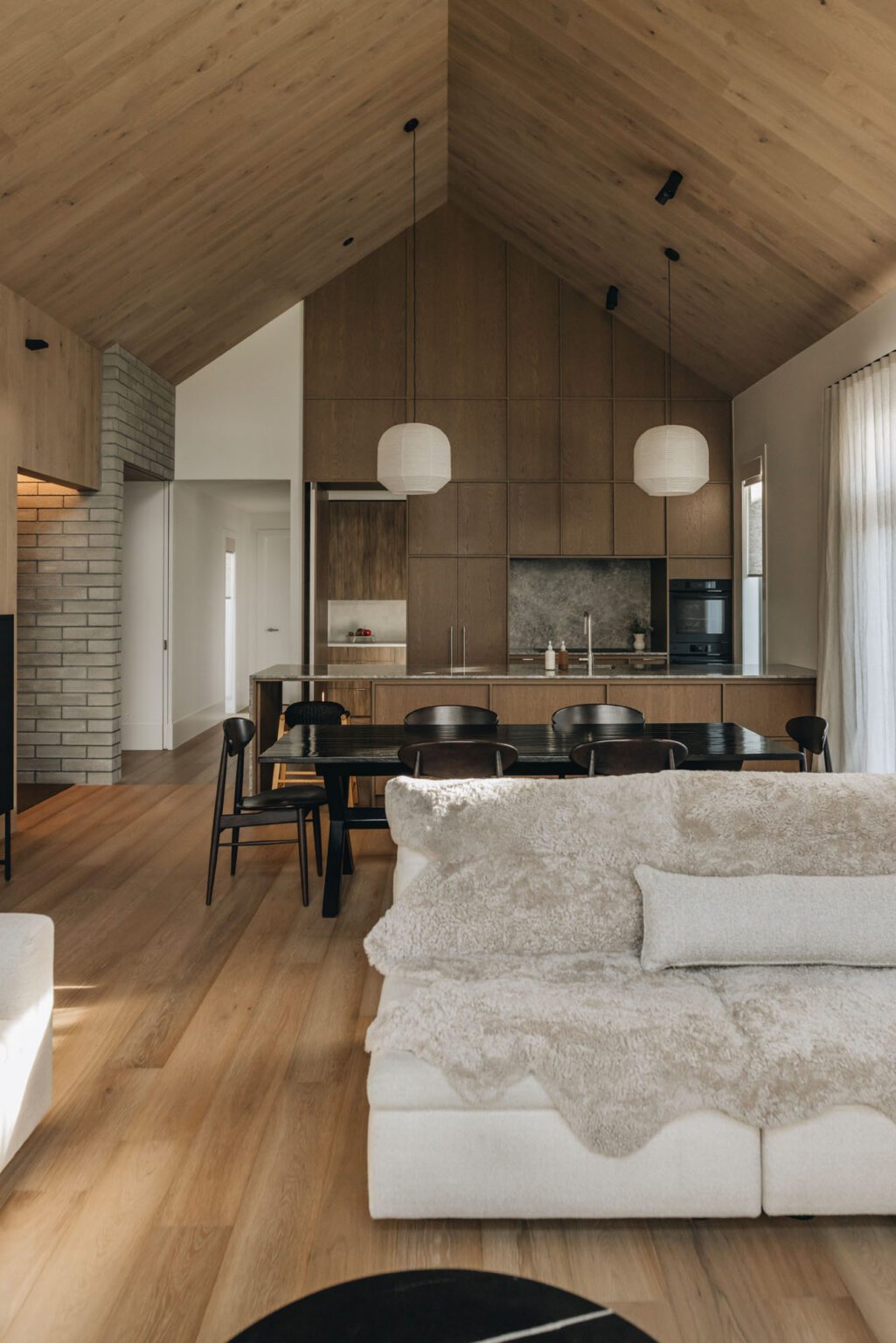
The kitchen joinery runs floor to ceiling rather than stopping at a benchtop and letting the wall take over. What does taking it all the way up actually do to a room?
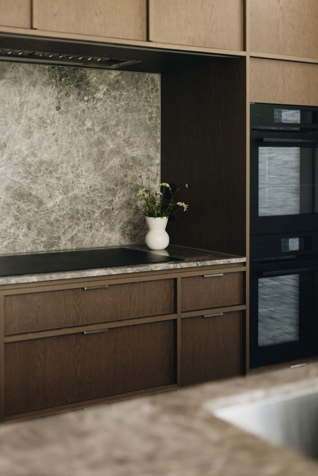
In this home, the full-height joinery holds the volume of the room it sits in. At one end there is a fully glazed wall looking out across the golf course, so the kitchen needed something with enough visual weight to balance that scale.
Early in the preliminary design I explored whether the raked ceiling could continue down the hallway toward the utility areas, but that wasn’t possible.
Taking the joinery to full height resolved the volume and gave the kitchen a stronger architectural presence. Without this treatment, it would have been a compressed joinery arrangement that, while perfectly fine, wouldn’t have the same visual impact, nor would it feel as nice to be in.
It also allowed the entry and utility hallways to read as a lighter block beside it, which helped delineate the different spaces without needing to add more elements.
I prefer to think of joinery as an active participant, something that contributes to the architecture, rather than cabinetry simply sitting within it. Here, it quietens the room, anchors the volume, and makes the space feel better to be in.
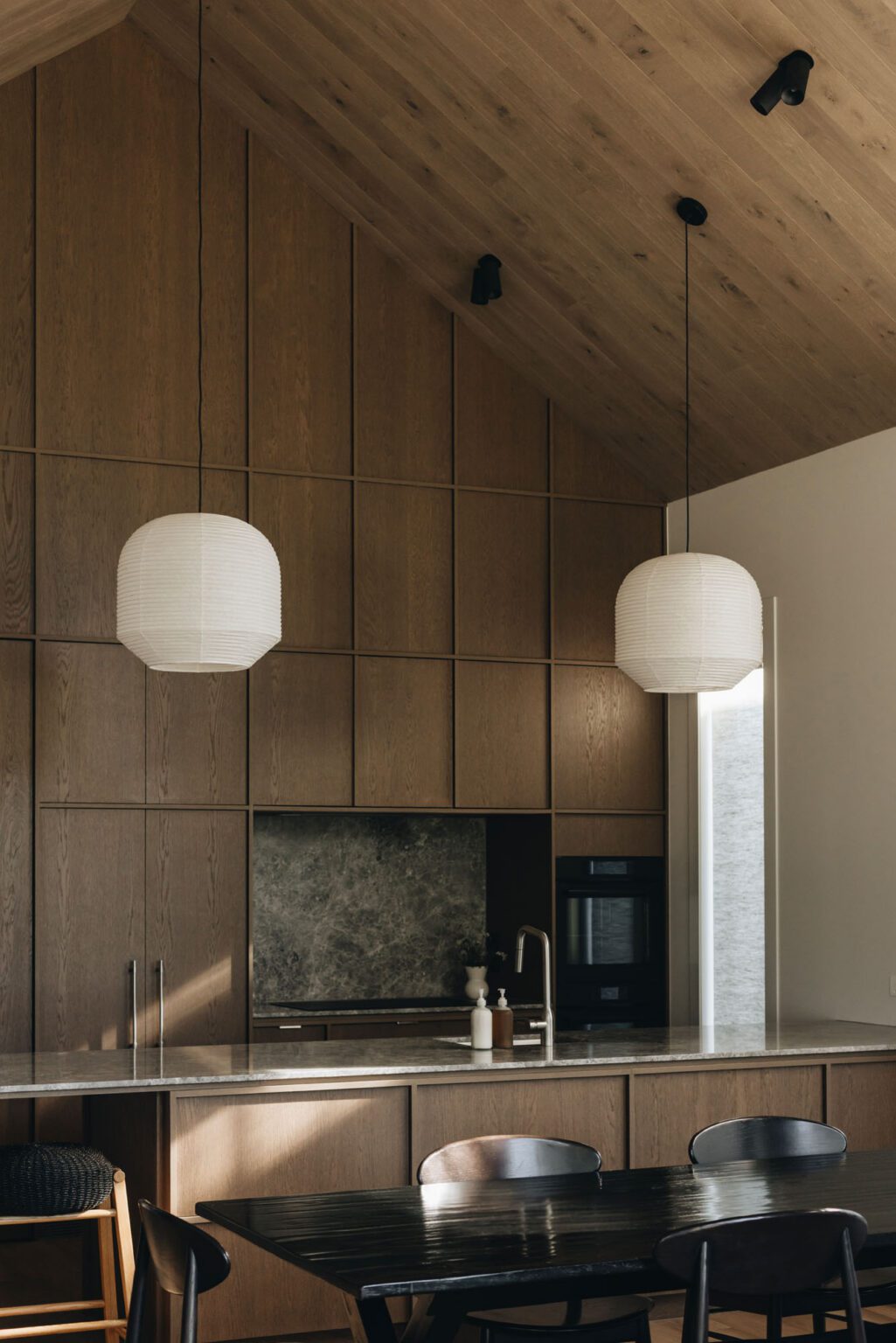
There’s a fine grid running across those timber fronts. You’ve mentioned shoji screens as a starting point. What were you borrowing from them?
In the brief the clients expressed interest in a mid-century Japanese influence in the home. The shoji screen reference borrows the idea of linearity, repetition and a sense of order.
I have a background in joinery manufacturing, so I am always thinking about how a composition will be built. With such a large expanse of cabinetry, we needed a way to manage the construction and junctions without losing the simplicity of the overall idea.
The linear grid does both jobs. It gives a subtle nod to the shoji reference, but it also became part of the construction methodology that made the full composition possible. The detail isn’t simply decorative; it has a reason to exist.
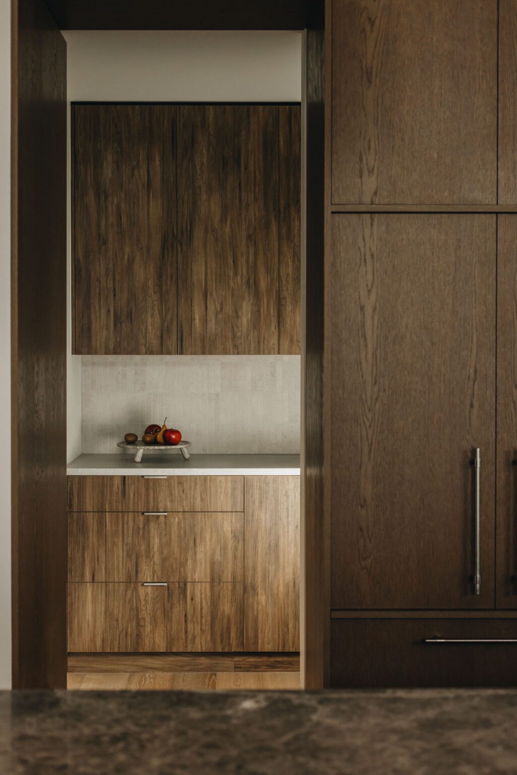
Looking at the photographs, it’s genuinely hard to tell where the scullery door is. How much of the design was about hiding doors, and what were the challenges?
A lot of the success of that wall comes from using the positive detailing as the break point between each unit, so the scullery door could be absorbed into the same rhythm rather than read as a separate element.
I worked from a horizontal datum that runs along the top of the cabinetry the door sits beneath. All of the usable kitchen joinery sits below that line, while above it the same linear detailing continues in repetition. The vertical elements align with the units they sit between, which gives the wall its order. That approach absorbed the material constraints of board size and grain direction.
That set-out allowed the cabinetry faces and the door to sit in line with the wall and read as one composition. A pivot door into the scullery allowed it to sit cleanly within that wall but still give a generous, easy access point when open. It can disappear when closed, but it still needed to work properly as a door rather than just look seamless.
I’m not going to pretend it wasn’t demanding joinery to manufacture and install, because it was. But understanding how something actually needs to be constructed beyond the concept image is where this starts. Our studio managed the joinery component of the home and brought in the team at DMAC Joinery to work through it with us. They are every bit as obsessed about joinery as I am, which is exactly the level of precision a composition like this needed. Working closely with them and the builder, to get the wall set-outs precise from the outset, is what made it possible.
This is also why I am happiest being involved at the preliminary design stage. If I can influence the wall set-out and spatial planning early enough, it opens up opportunities for details like this to be resolved as part of the architecture rather than added afterwards. For me, working out how to make those ideas both buildable and useful is part of the fun.
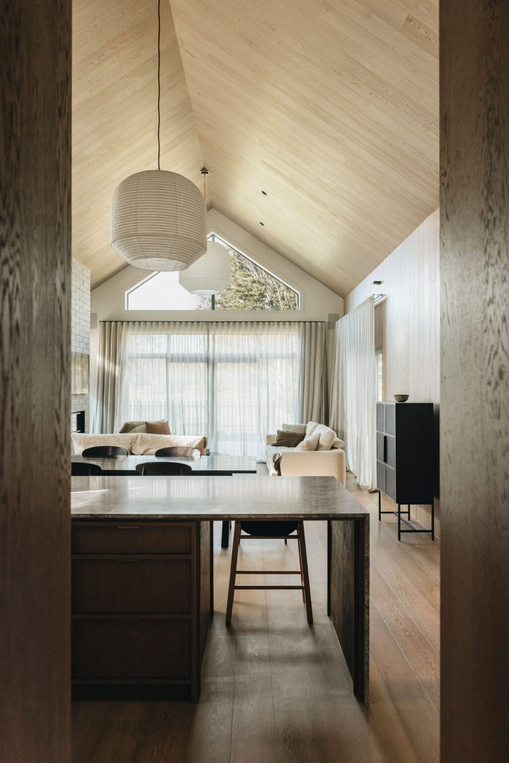
You’ve said that once the joinery existed, it set the standard everything else had to meet. Was there anything you had to throw out or redo because it no longer measured up?
When I came into the project, the kitchen was really the starting point for me. At that stage there were still quite different options being considered, from a flat ceiling through to the volume that was ultimately built.
I tend to look for the big idea in a project, the thing that gives everything else a direction. With the kitchen, I knew I wanted to create a space that could balance a large volume without feeling like its size; it still needed to feel nurturing, calm and relaxing to live in.
My process is rarely completely linear. I usually start by thinking the space will be easy, then hit the point where I question what I’m doing with my life, and eventually there is a moment where everything clicks and I’m happy with it.
So it wasn’t really a case of throwing things out or redoing them. Once the kitchen reached that point, it became the reference for the rest of the interior. What could have simply been a nicely detailed interior now had a point of view, and every subsequent decision had to earn its place, both in terms of why it was there and what it contributed to the way the space felt.
The site has a two-storey neighbour, so the lower floor loses direct sun by early afternoon. When did you realise that was the condition you were designing for rather than a problem to solve?
This development sits on a golf course, and I’ve been lucky enough to work on a number of homes here, so I already understood one of the realities of the site: the houses tend to maximise footprint in relation to land cost, which means neighbouring buildings can have a big impact on light.
So the loss of direct afternoon sun wasn’t really something I saw as a problem, more a condition of the site. The more useful question became how to make the interior feel good within that softer, lower light, rather than trying to make it behave like a bright, sun-filled house all day.
The architect had also clearly understood that condition in the way the home opens out to the golf course with large areas of glazing. That connection to the landscape gives the house a sense of retreat within the wider natural outlook, so for me the interior needed to support that feeling rather than fight against it.
What does a material like washed grey oak do in low afternoon light that a whiter or glossier finish wouldn’t?
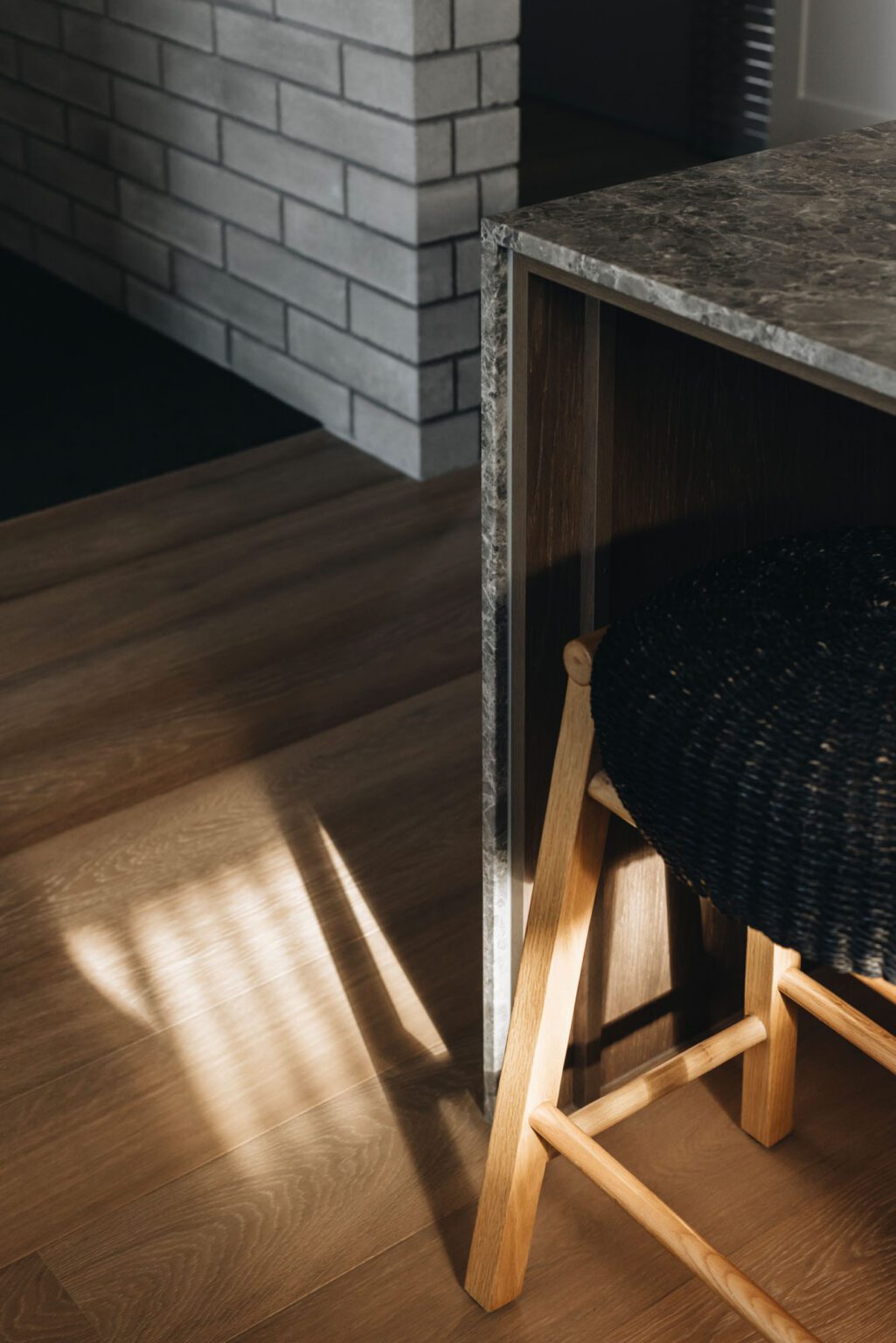
I love materials because the right ones can completely transform the way a space feels. We did use Resene Milk White as the neutral through the home, so there is definitely white in the palette, but it is tempered by warmer colours and materials.
With the oak, the grey wash acts almost like the black point in the material. As the light drops, that darker tone recedes and the warmth within the timber starts to reveal itself. The grain and shadowing become softer and more pronounced, which gives the room a really soothing quality. The finish created a dry look to the timber that absorbed light.
If we had simply used white everywhere, I think the space would have felt much less friendly, emptier and less resolved in terms of how it feels to be in. The lower light and shadows would have read as one-dimensional. The timber colour and structural pattern give that changing light something to settle into, so the room feels layered rather than flat.
The palette gets lighter as you move up through the house. Is that something an occupant consciously notices, or is it more of a background feeling?
I think it is something you feel more than consciously notice.
The white-painted entry wall and utility hallway act almost as a lighter block that draws the eye toward the stairs. The architect had also introduced tall windows into the stairwell, so as you move out of the hallway and begin to go upstairs there is a real sense of release.
At the top of the stairs, the hallway reveals a bedroom opening out to the golf course through the same floor-to-ceiling glazing, so the shift from the more grounded lower level to the lighter upper floor is something you physically experience as you move through the house.
I like that change in feeling. It gives the home a sense of progression rather than every space having exactly the same weight or atmosphere.
Full-height sheer curtains appear in almost every room. What are they doing beyond privacy?
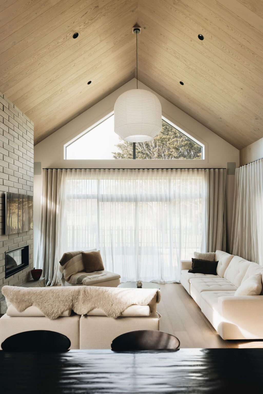
There are a lot of materials in this house doing different things, and the window treatments are part of that. They soften the larger expanses of timber and brick and bring another layer into the room.
The fabric itself is a very pale grey linen with a gauzy quality. It diffuses the light beautifully, and the cooler undertone helps temper the warmth of all the timber. When the light hits the sheers, they take on a lovely illuminated quality that changes the atmosphere of the room.
I treated the sheers as a structural material element in the home because they add softness and help the spaces feel more sheltered and comfortable.
They also became a way of framing views. From the hallways into the bedrooms, your eye is drawn right through the room and out to the landscape, with the curtains sitting around that view rather than simply covering the window.
They allow that view to change too. Open, the landscape feels very present; drawn, it becomes softer and more abstract. That ability to alter the relationship with the outside was really important.
The original plan was to run the brick up as a column to the ceiling, and you extended it sideways across the entry and into the kitchen wall instead. Can you describe what you saw standing in the unfinished space that made you change it?
On a project like this, where my work runs through so many parts of the interior of the home, I have been thinking about the details for a long time before they become built elements. I attend site meetings as a matter of course, because every build, no matter how detailed the drawings are, will have areas that need to be discussed and resolved in the actual space.
This came out of a meeting with the clients, architect, builder and myself, where we were walking through the house and reviewing a number of details.
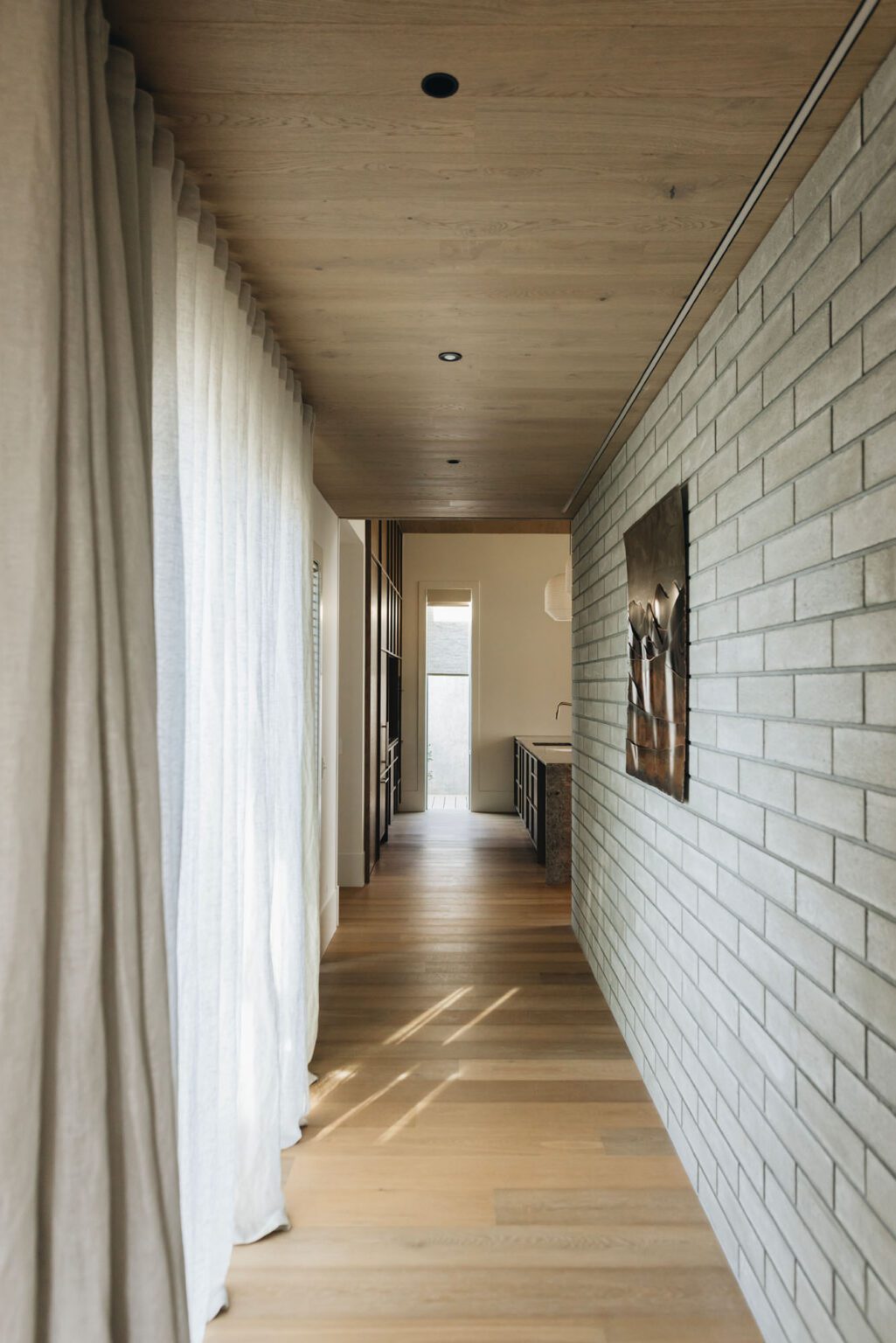
The original proposal was for the brick to continue up as a single column and terminate into the timber ceiling. That would have split the wall, with the timber ceiling needing to run on either side of it.
Standing there, I felt that area was already carrying quite a lot visually. We had the media room opening, the entry hallway with a cavity slider, the hallway toward the utility spaces, and a number of different heights and junctions all meeting together. The timber kitchen wall was already a very strong visual element.
By continuing the brick horizontally into the wall above the utility hallway, it created a clearer threshold into the entry hall and allowed the brick and timber to sit more comfortably together. It relaxed the whole composition and gave each material room to breathe.
That was a call made on site, mid-build. How do you have that conversation with an architect and a builder?
I sit in that space quite often through the course of a build. For me, those conversations are really a negotiation about how to get the best outcome.
It’s not ego driven. I have a cohesive vision for how the interior should feel and function, and how it builds on the architectural shell of the home. Part of my role is to advocate for that, and for the client, while also respecting the expertise of the architect and builder. That can show up in changes to wall or door set-outs to make the most of the joinery and better suit the client’s needs, or in on-site decisions like this one.
If I see something on site that I think is going to compromise that intent, I’ll explain what I’m seeing and why I think it matters. From there, we work through the practicalities together and find the best way to resolve it.
I look at it as everyone is ultimately working toward the same thing, a home that feels considered, cohesive and right for the client.
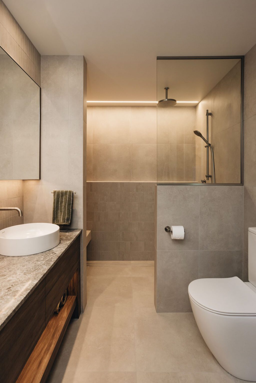
The splashback and island top complement the brick beautifully. What did you use there?
We used a limestone from CDK here. It has a cool grey tone that balances the warmth of the timber and helps connect the brick back into the overall material palette.
This is a home for repeat clients. What did you already know about how they live that shaped decisions here?
The last home I worked on for these clients, my scope was limited to the joinery design, so I already had a good understanding of how they used those parts of the house and what mattered to them day to day.
This time I was brought in much earlier, which meant I could influence the spatial planning across the home as a whole. They came to both projects with a clear sense of the style they are drawn to, and from there I was given a lot of freedom to develop the concept and carry it through.
For this home they wanted a mid-century Japanese influence, and together with the golf course setting that naturally led toward a strong connection with the landscape. I brought in the Japanese influence by using its underlying spatial principles: restraint, threshold, enclosure, repetition, filtered light and material continuity.
Biophilic thinking shaped the material language. Timber, brick, limestone and layered textiles were chosen to warm, ground and connect the interior back to the natural world.
The lower floor is essentially the everyday heart of the home, while the upper level accommodates extended family as needed. For me, that functional structure is always the foundation. Everything comes from there and has to support the way the house is actually going to be lived in.
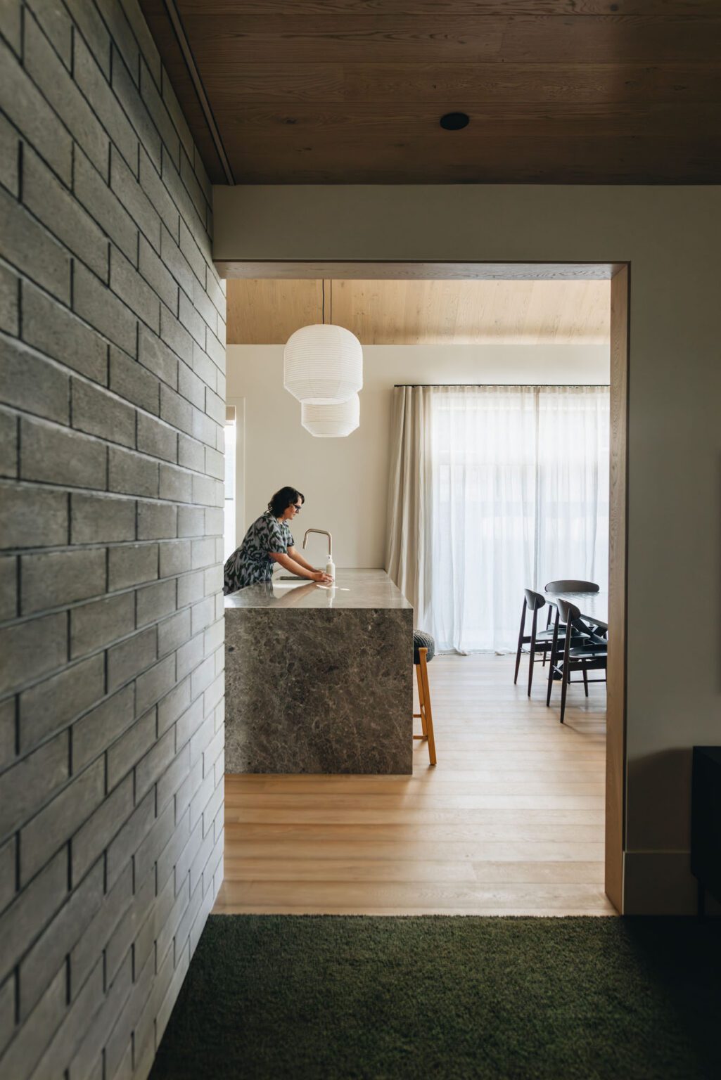
You describe restraint that isn’t minimalism. Where’s the line? What would have tipped this into feeling austere?
Someone described this home to me as having a simple look, which I took as a great compliment because creating something that feels simple is often much harder than creating something that is obviously complex.
I want to create homes that want to be lived in, not looked at. The restraint here comes through in things like the tonal relationship between the timbers, and the repetition of colour across wallpaper, feature walls and tiles.
I tend to think about colour structurally. It needs to do something, to ground a room, soften it, create depth, connect materials, or change the way a space feels.
Because I am creating the interior as a whole, from the joinery design through to wall claddings, colour and material, the restraint really sits in the balance between all of those elements.
I can look at a floorplan and understand how a space is going to feel to move through and be in, so part of that restraint starts with managing the amount of visual static created by material changes, patterns, junctions and competing elements. I always feel better in spaces where that noise has been reduced, so that is something I consciously bring into my work. Whether you are aware of it or not, it is still going to create a positive effect on how you feel in that space.
The living area is a large volume and I think it could very easily have felt austere if we had stripped away the beauty and warmth of the timber, or simply chosen the wrong tone of timber. Those material choices give such a large space warmth and depth rather than allowing the volume to feel empty.
The powder room is another example. It is a small, immersive space, and without the texture, colour and materiality it would have felt quite flat and perhaps a bit sad.
So for me, restraint isn’t about having less for the sake of it. It is about knowing what each element is contributing, reducing unnecessary visual noise, and understanding where the balance needs to sit.
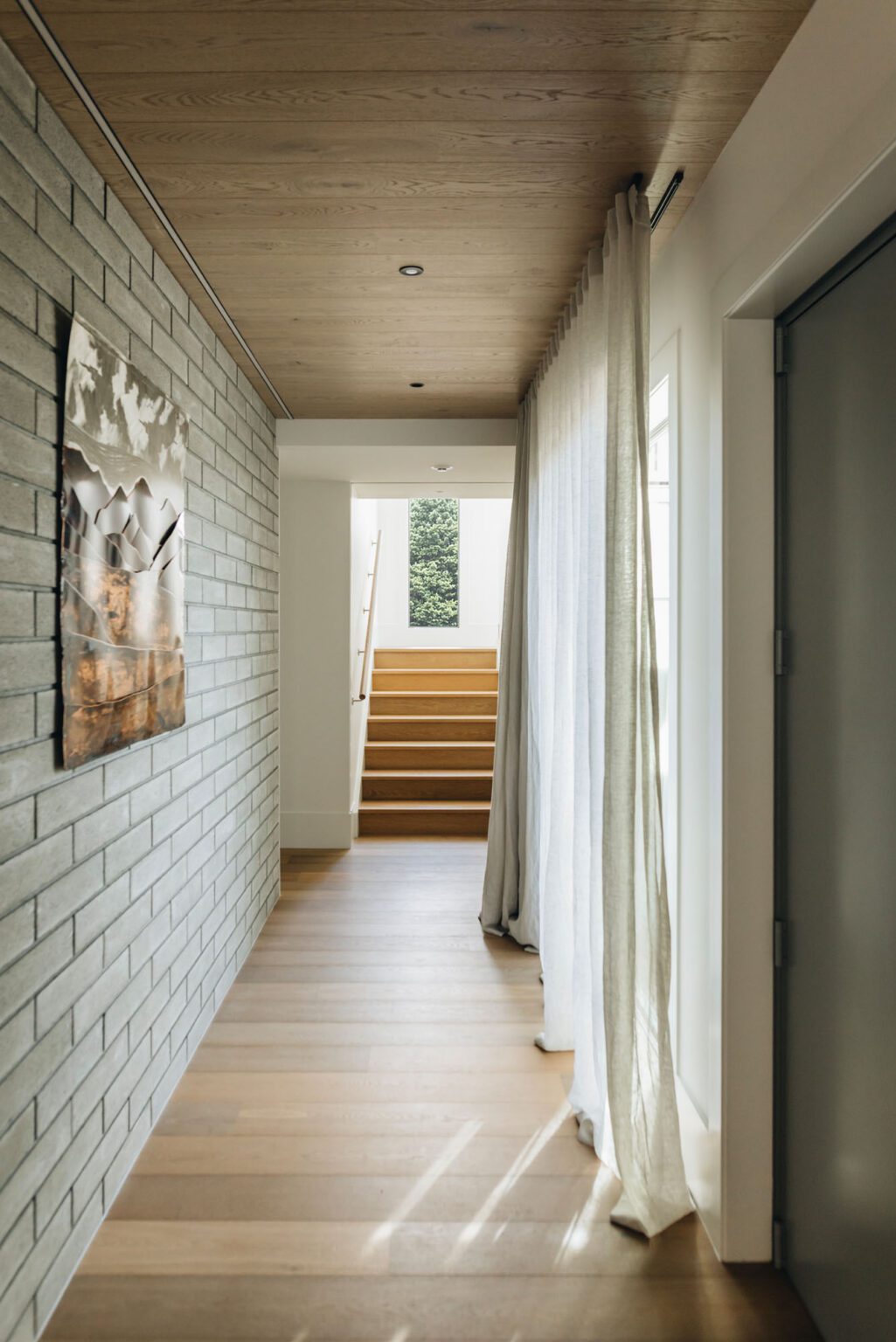
If someone is renovating a standard kitchen with a normal budget, what’s the one idea from this project that you feel would elevate their own?
If we go back to pattern recognition, the idea that can be applied at any budget is the organising line. Choose the thing that creates order in the room, it might be the top of the cabinetry, a splashback line, a window height or the way tall units align, and then make the other elements respond to it.
That kind of alignment brings cohesion to a space regardless of budget. It makes the kitchen feel more considered because the eye can understand the order of it.
For me, that is often more valuable than adding another expensive finish or feature. A well-organised room will usually feel better than one with more things in it.
Which decision here cost the most, and which one gave the biggest return for the least money?
That is a hard one to isolate because the success of this house is cumulative. There isn’t really one expensive decision that created the outcome, or one cheap decision that suddenly transformed it.
Some of the biggest returns came from decisions that were more about planning and alignment than cost, controlling datum lines, reducing unnecessary visual breaks and resolving junctions carefully. Those decisions have a huge effect on how a room feels without necessarily adding cost.
For me, the value is in getting the framework right first. Once that is resolved, whatever you spend on materials works much harder.
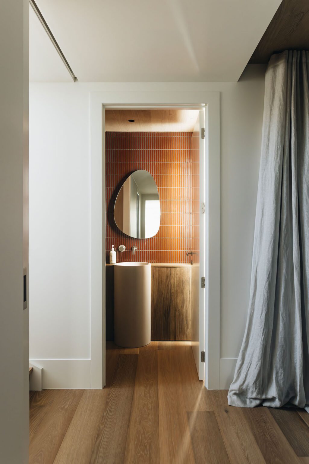
What’s the maintenance reality of pale timber floors, a stone splashback behind a cooktop, and handleless fronts, honestly?
The reality with timber floors is that you do have to care for them, but I wouldn’t say the maintenance is unusual. You vacuum them, you clean them, and over time they will show some evidence of use.
With the under-bench cabinetry, I’m not a fan of push-to-open fronts in high-use areas. We used positive detailing in our own studio joinery about six years ago and learned very quickly that if you lean against the bench, the fronts can pop open. In this kitchen there are handles, they are just tucked up under the positive detailing so they don’t interrupt the composition.
The fridge has more visible handles because it needed to be easy to use, and there is also a personal layer there: the clients’ daughter works for a designer hardware studio, so we included some of their pieces across the home.
With stone, I think the maintenance question speaks to a wider shift in interiors. For a long time, we have often tried to remove as much risk as possible and choose materials that can go through daily life without showing any marks. There is definitely a place for that, but there is also something lovely about materials that develop a patina and record how a home has been lived in.
I have marble in my own kitchen and I am enjoying seeing the wear beside the sink, the evidence of meals made, cups of tea brewed and everyday life. If one day I wanted to strip and reseal it, I could. For me, a home doesn’t need to stay perfect. It needs to support the people living in it.
You work out of Foxton but have projects in many towns and cities. Do you feel small-town NZ, rural NZ and larger cities all have different design needs, or is there anything that unites those contexts?
They definitely have different practical requirements because each site asks something different of the home. Rural properties, for example, will often need more storage, utility space and practical areas than an urban home might.
I think one of the biggest shifts since Covid is that more people have flexibility in how they work, and that has opened up smaller towns and rural areas to people who might previously have felt they needed to stay in larger cities. As technology continues to evolve, the ability to live and work from almost anywhere is becoming more achievable for a lot of us.
We are an example of that ourselves. We moved from town to live rurally in Foxton, with enough land for chickens, vegetable gardens and flowers, while still being five minutes from the studio. Part of what drew us here was the ability to create a life with more space, not just physically, but space to make, grow things and live a slower life.
At the same time, I can travel when I need to and complete a large amount of work online for clients outside the area. That balance would have been much harder to achieve not that long ago.
What doesn’t change is the person. We are all quite individual creatures, and our likes, dislikes, routines and the way we want to live are deeply personal. I don’t think location changes that.
One of my favourite parts of the job is sitting down with someone at the preliminary stage of a home and really understanding how they live, and how they want the home to hold that life. Being able to work through the floor plan at that point, before everything is fixed, and make sure it genuinely supports the way they want to live is one of the most rewarding parts of the process for me.
The guiding principle I hold onto in every project is that, when construction ends, life begins in the space. What remains is how it feels to inhabit. That lived experience is the weight of the work.