


A Hawke’s Bay family set out to transform their Bluff Hill cottage into boutique accommodation, but, as the design progressed, they fell in love with it and decided to make it their permanent home.
Engaging the help of local interior design studio, Little & Fox, client Geraldine’s brief was to create a holiday feeling not only in summer but also through the winter months. She also wanted each room to have its own identity, which is where colour entered the conversation.
Project lead Nelly Conway explains that, as a practice, Little & Fox isn’t afraid to experiment with colour and pattern. This project — affectionately named ‘North Tree’ after the striking gum-nut that the house overlooks — was no exception.
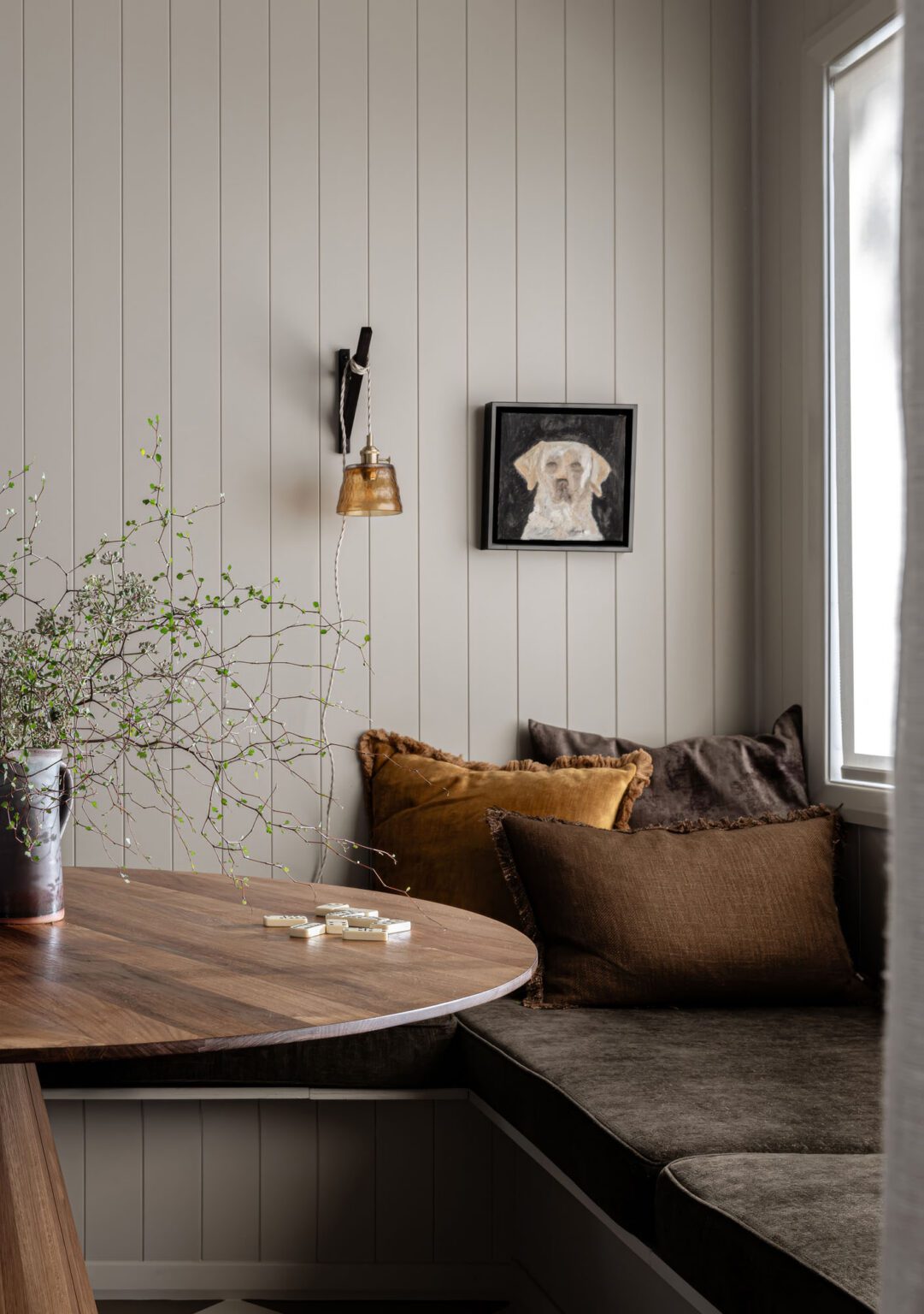
“We leaned into the darker colours, and made every room stand out on its own,” Nelly says. Every colour has a ‘muddiness’ to it; even the whiter-toned walls in the living area are closer to a light clay.
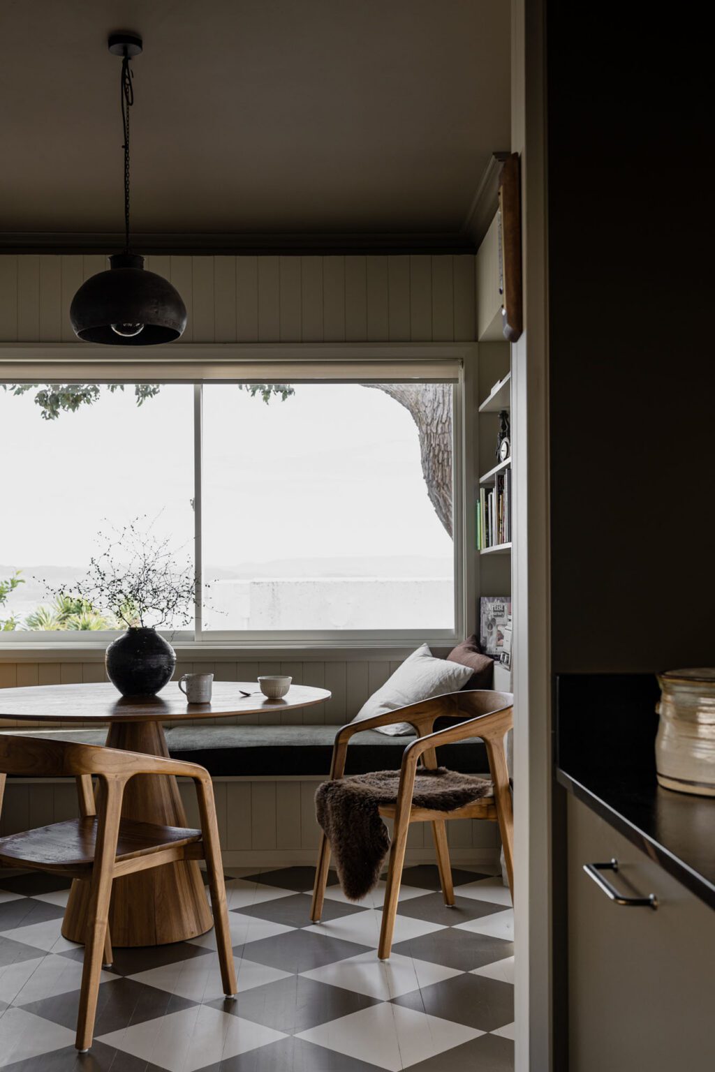
Being situated right above Napier Port, the site aspect influenced the subdued tonal range — the intention was to harmonise with the landscape rather than to pull focus.
“When you open the front door, you immediately look straight out to sea,” Nelly explains. “We didn’t want to detract from that.”
That means a colour palette that looks spectacular against a backdrop of both bluebird days and more dramatic skies as the occasional storm rolls through.
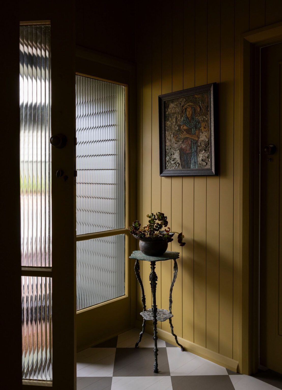
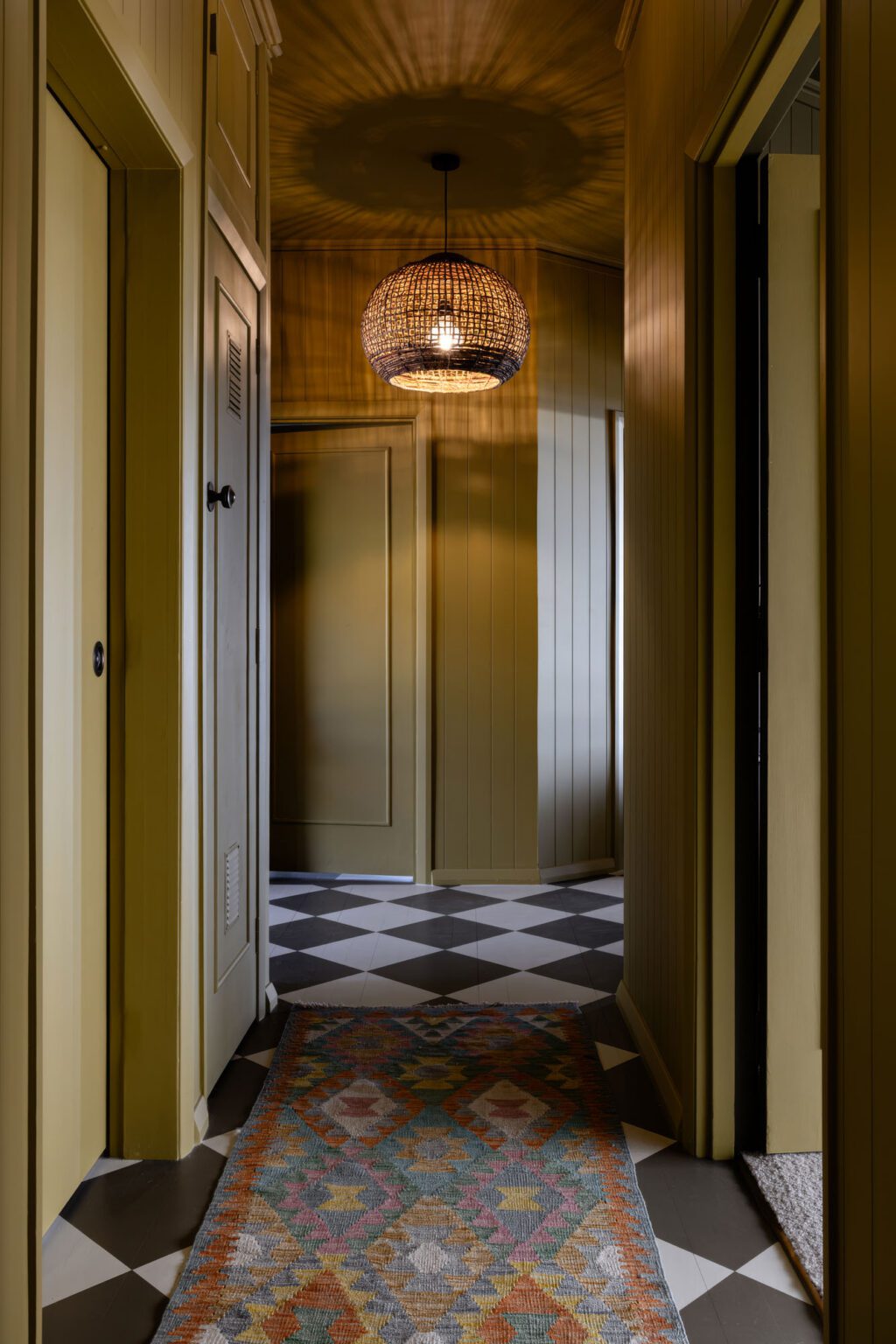
On arrival, the residents and their guests are welcomed into a mustard-hued entranceway. The client was initially concerned it would be too bright, but was reassured after seeing a reference image of Little & Fox founder Asha Payton’s own kitchen in exactly the same shade.
“She was able to trust the process because it is quite a bit darker once you see it en masse,” Asha says.
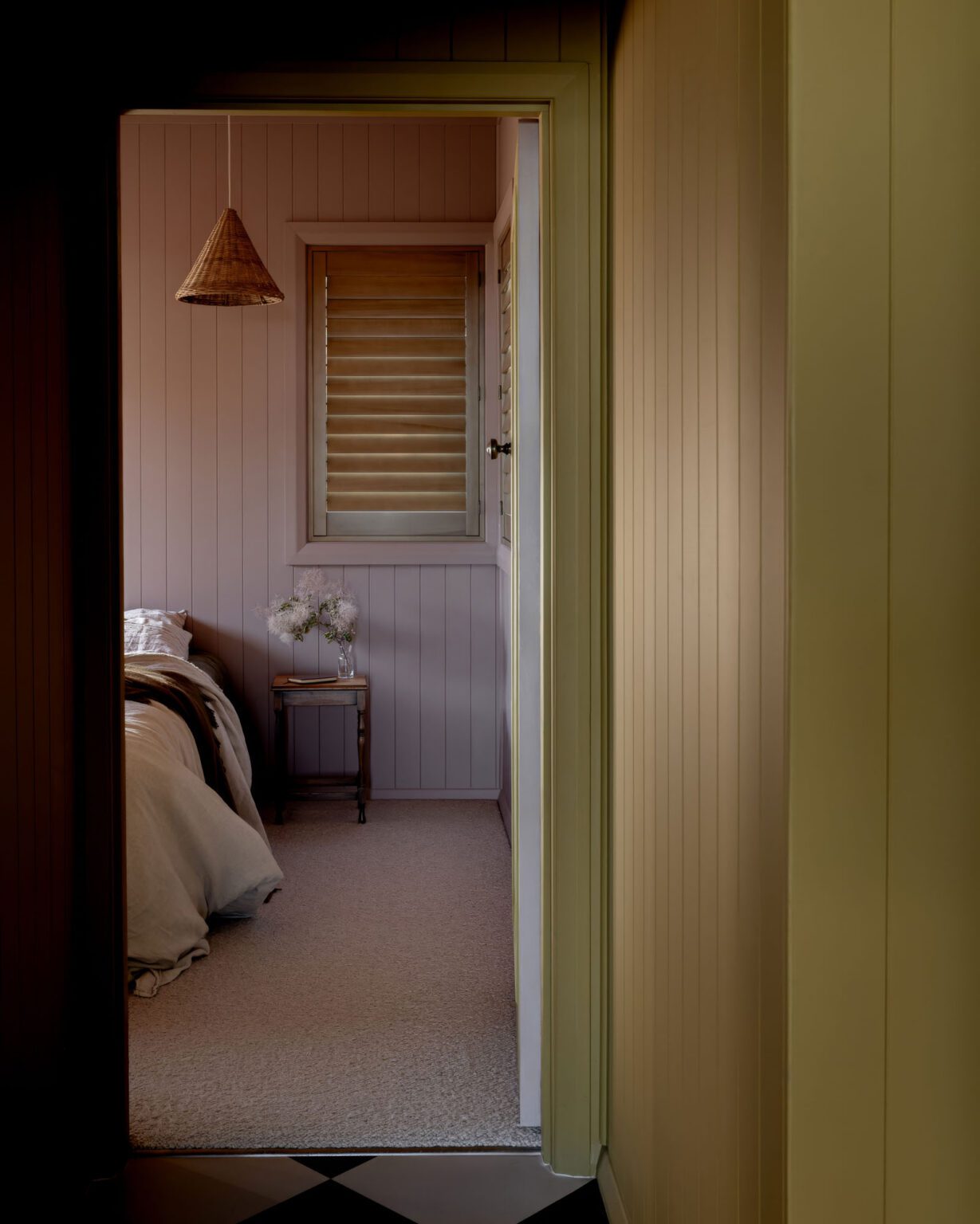
Each of the three bedrooms has been painted in a different colour: the primary bedroom, a warm brown; the back bedroom, a light, putty-toned pink; and the front bedroom, an earthy olive green. Drawing on the same muted chroma, the three shades feel individual yet cohesive, with each complementing the dark brown ceilings and pale wool loop-pile carpets
Arguably, the star of the show is the flooring. Rather than leaving the native timber floorboards as they were, the team suggested a hand-painted checkerboard pattern.
“The floor is pretty technical and [the client] required a bit of convincing,” Asha tells us. “We thought she would never say ‘Yes’, but she did, so that was exciting for us. I think the learning from that is: if you have an idea, there’s no harm in putting it forward.”
Over three weeks, each square was hand-measured and painted by local contractors, CC & Co Interiors. Nelly explains that it will gently gain a patina with age, and sees it as a “piece of art on its own.”
Once the colour scheme was established, the designers introduced the client to local contemporary artist, Robyn Fleet, whose work draws on similar dark, moody hues.
“They had tea [at Fleet’s studio] and talked about art,” Asha explains. “Some of the art was just going to be used for the photography, but two pieces have stayed, which is really lovely.”
Shiplap panelling, timber window shutters, and vintage-inspired exterior ship lights can be found throughout the home as subtle references to the coastal vernacular.
After Little & Fox shared the project on social media, positive feedback started pouring in — particularly around the impactful colour palette. Nelly declares that a client’s happiness with a project, rather than the public perception of it, is always the main focus, but she was pleasantly surprised by the response.
“The fact that everyone has been so blown away by [North Tree] is quite humbling because it doesn’t seem like a big thing when you’re just picking a colour for a room,” she says. “Then you see it at the end and think, ‘Wow, we did that’.”
What began as a holiday retreat evolved into something so much more personal to its owners: a home that feels like a getaway every day of the year.
Judges’ Citation
Conceived as boutique accommodation designed to perform equally well in a Hawke’s Bay winter or on a summer’s day, North Tree Cottage found its defining design move in a checkerboard floor meticulously measured, traced, and hand-painted, repeated across key spaces to introduce rhythm, personality, and an immediately legible identity. The remaining colour palette, drawn from the surrounding landscape and layered across deep olive greens, rich browns, warm neutrals, and yellow and pink tones, was applied not merely to walls but also to ceilings, joinery, and architectural details to produce immersive, mood-rich spaces where sunlight moves across darker tones throughout the day, revealing depth and texture.
This is a knowledgeable, well-researched approach to colour theory, reflection, and refraction, restrained in its references and confident in its execution, producing warmth and intimacy without sentimentality. That the project exceeded its brief entirely is the most telling measure of its success; the owner, having fallen completely in love with the property, has since made North Tree Cottage her permanent home.
Words Olivia Round
Images Geraldine Gawith
Interior of the Year is presented in partnership with