The 2026 Interior of the Year, designed by Auckland studio Material Creative, transforms a 1970s home in Vancouver, Washington into a richly layered, hotel-inspired retreat where bold colour, nostalgic glamour, and New Zealand design sensibilities converge.
When a U.S. food blogger with almost 600,000 followers sees a kitchen you’ve designed and says, “I love it; I want it,” you know it’s the start of a deliciously beautiful collaboration.
To be fair, the high praise for her work didn’t come completely out of the blue for Liv Patience, co-founder and creative director of Auckland-based design studio Material Creative; Liv had met vlogger Natalie Mortimer before.
“One of [Natalie’s] best friends is a Kiwi, and we met through her when she came on holiday, then stayed in touch online. Natalie loves New Zealand — and New Zealand design,” explains Liv.
The news got even better. Natalie and her husband, Scot, had just bought a ’70s house in Vancouver, Washington. Would Liv help them take it from a one-careful-owner, mid-century gem to a present-day playground for the couple and their three teenage children?
Would she ever!
“I thought, ‘Oh my gosh, can I just get my hands on it!’”
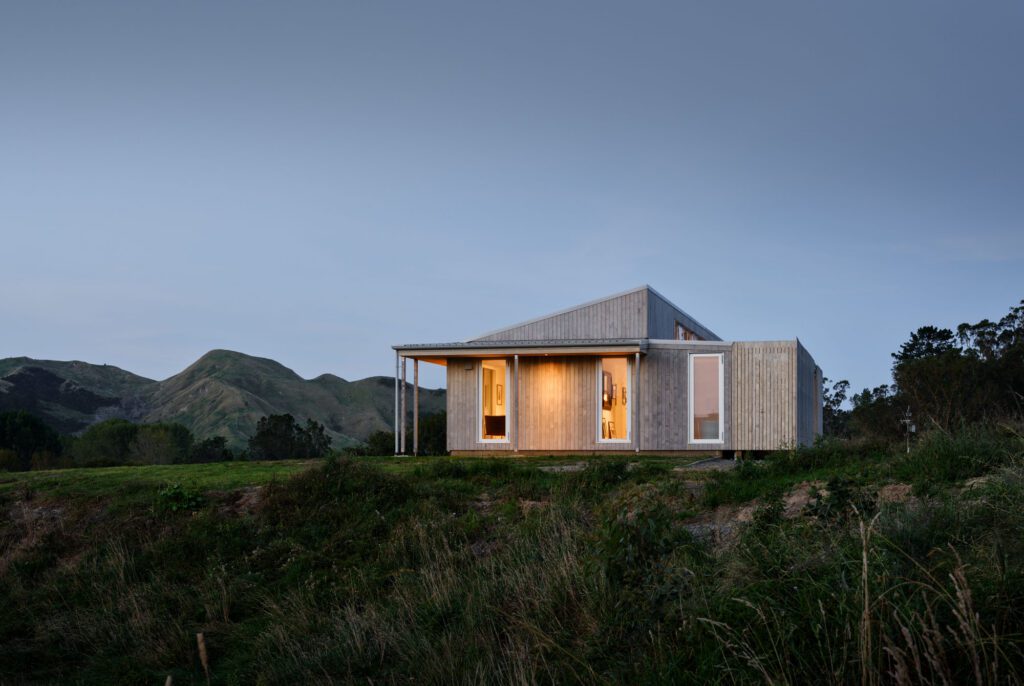
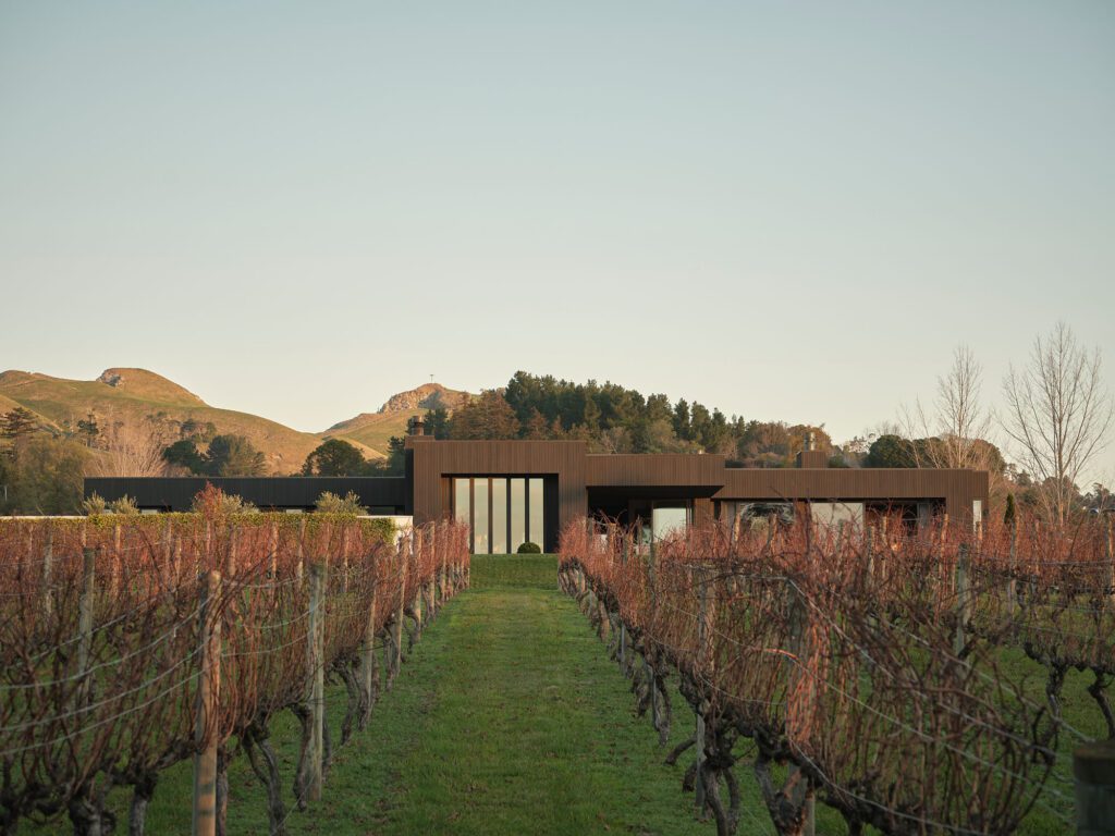
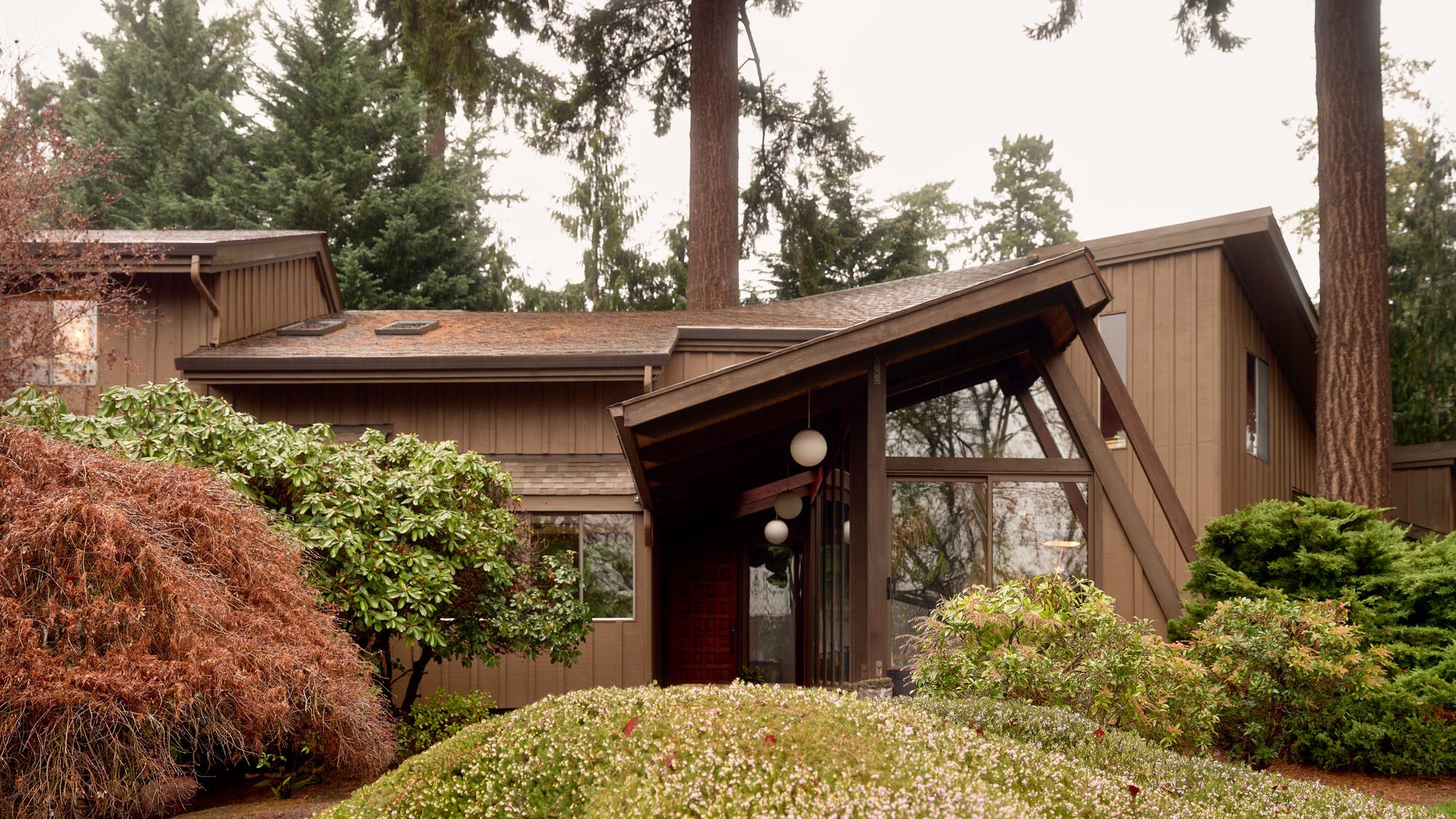
Clad in mid-brown board-and-batten, with a timber shake roof, the dwelling blends into its woodland backdrop in a quiet cul-de-sac. Well-established shrubs nestle up to its flanks. At the entry, a glasshouse occupies the liminal zone between inside and out. Beyond, the interiors were unprepossessing: dark timber-lined ceilings, white walls, and the ubiquitous greige carpet.
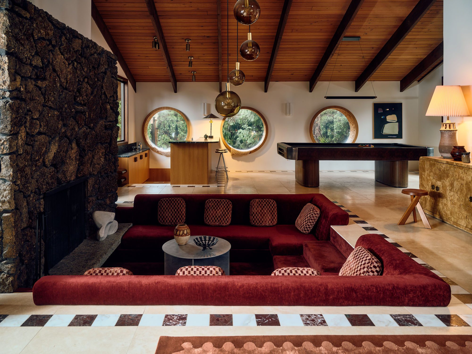
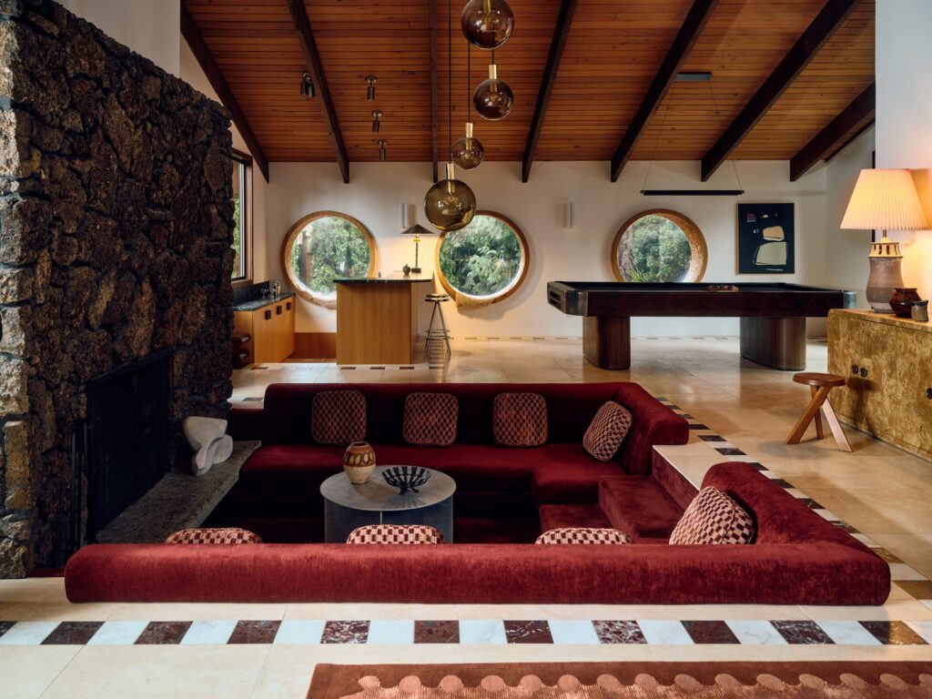
With a wall separating the kitchen from the circulation zone and its big glass windows, this space felt dark and overly woodsy. The stove was awkwardly positioned on one corner of the central island. Yet there were features guaranteed to thrill the heart of a modernist lover: a double-height void over the main living zone; a sunken lounge; a trio of porthole windows that framed the gnarly trunks of an ancient redwood. Add enthusiastic and adventurous clients and you pretty much have a dream project.
Material Creative has grown a following for its commercial, hospitality, and hotel projects that embrace vivacious colour choices and take texture a step further. The owners were all in with this direction.
“They’re a very creative family. They love food and music and collecting, and art fairs and makers, and are very social,” says Liv. “Natalie said she wanted it to feel like you were stepping into a boutique hotel.”
They also decided to embrace the spirit of manaakitanga.
The Kroehler Color Harmony Guide, a mid-century cheat sheet for pairing paint, pattern, and furniture, became a working reference. Dusky rose and deep burgundy, green onyx, burr (known as burl in the U.S.) poplar timber, with its pitted swirls, chequered patterning — this upbeat palette did not faze the owners.
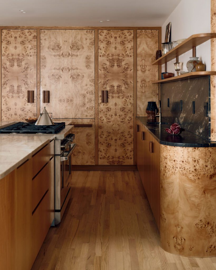
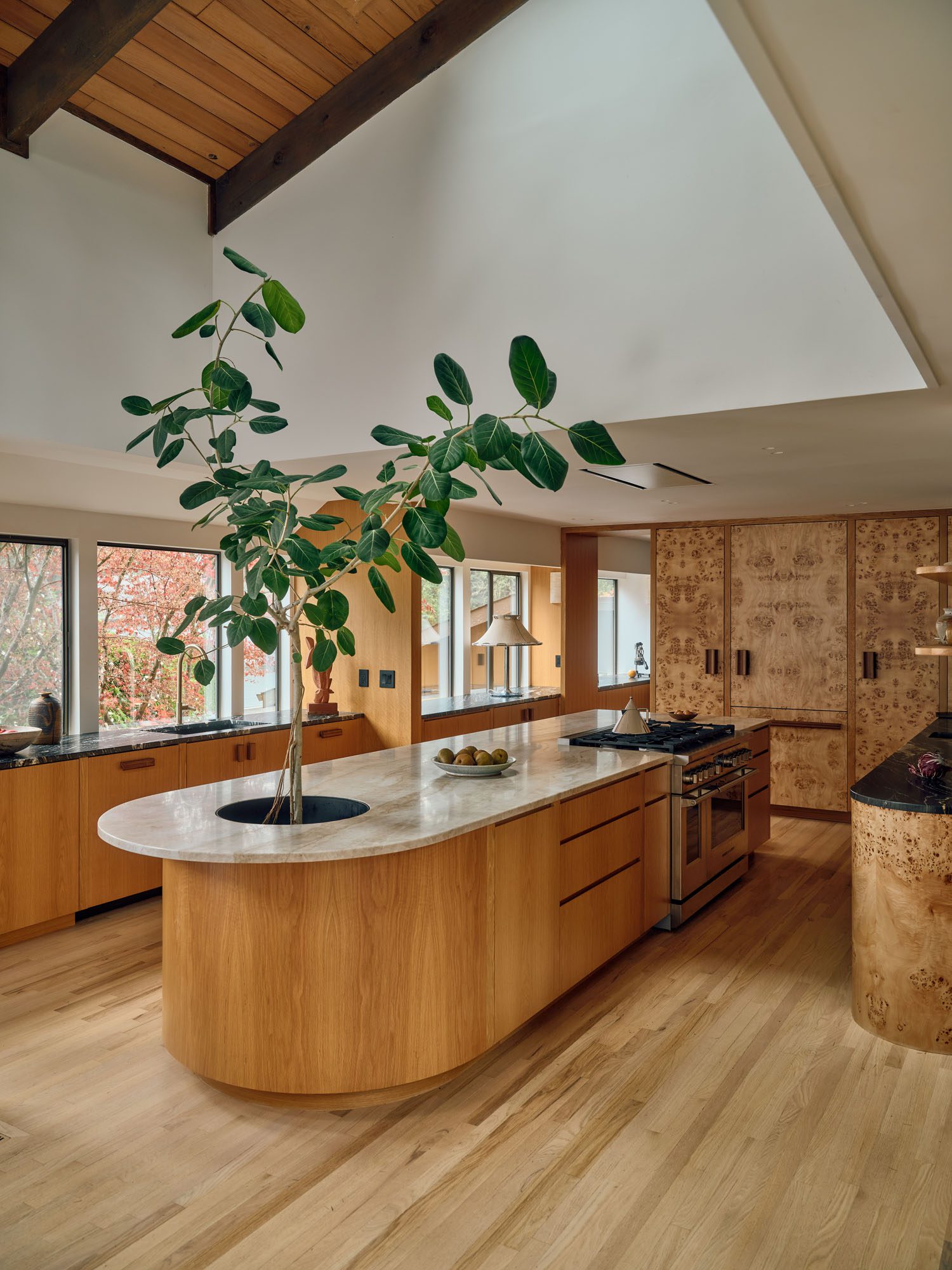
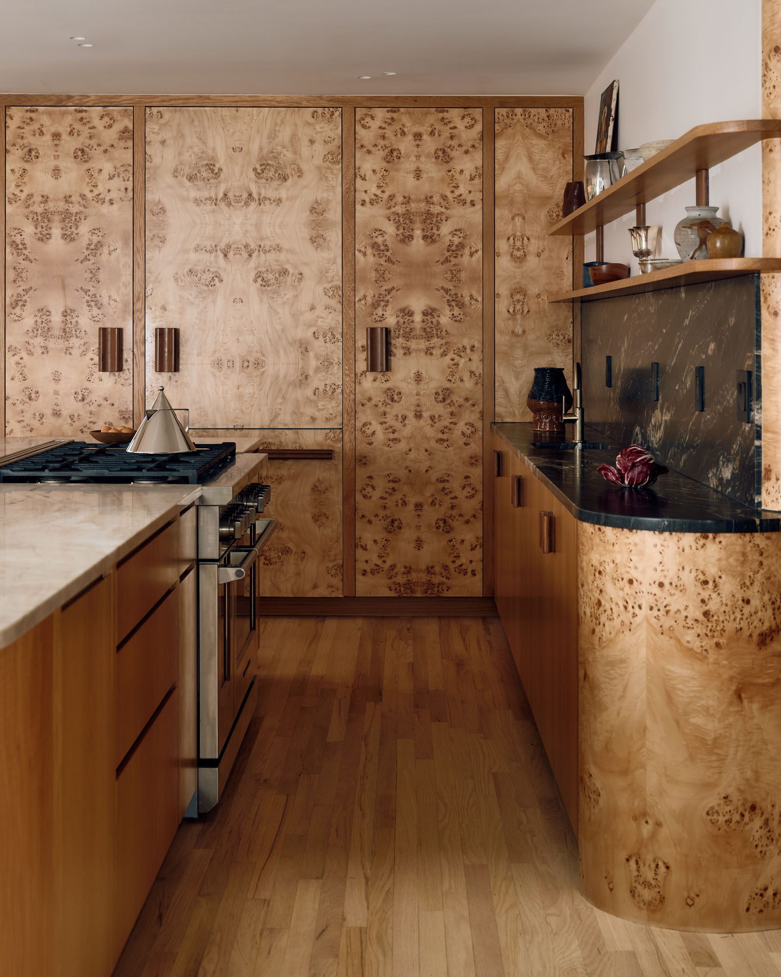
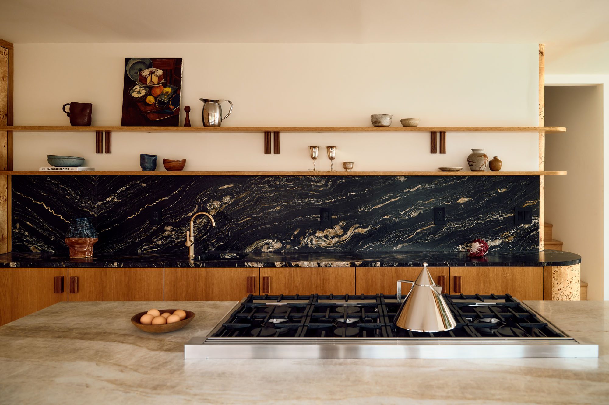
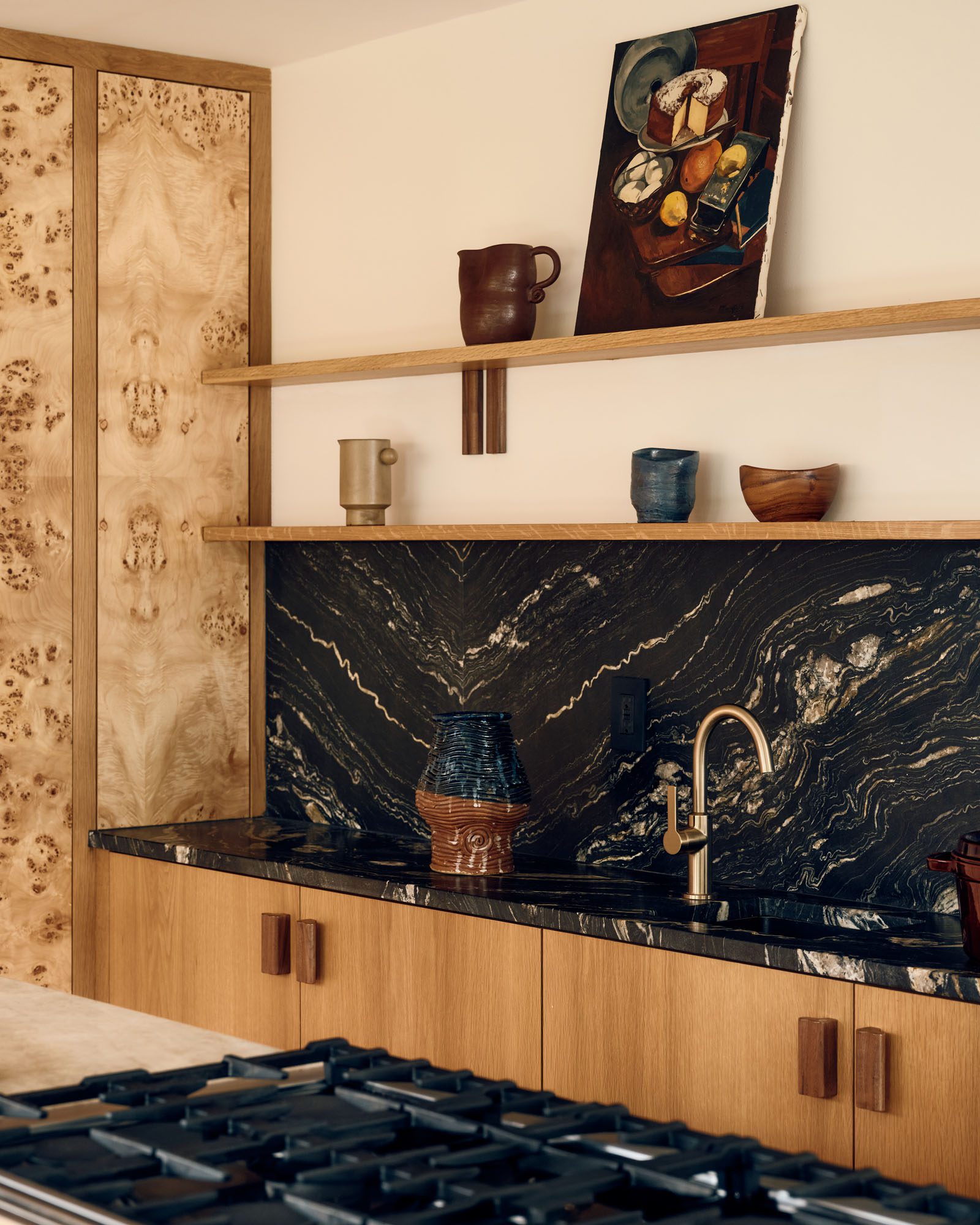
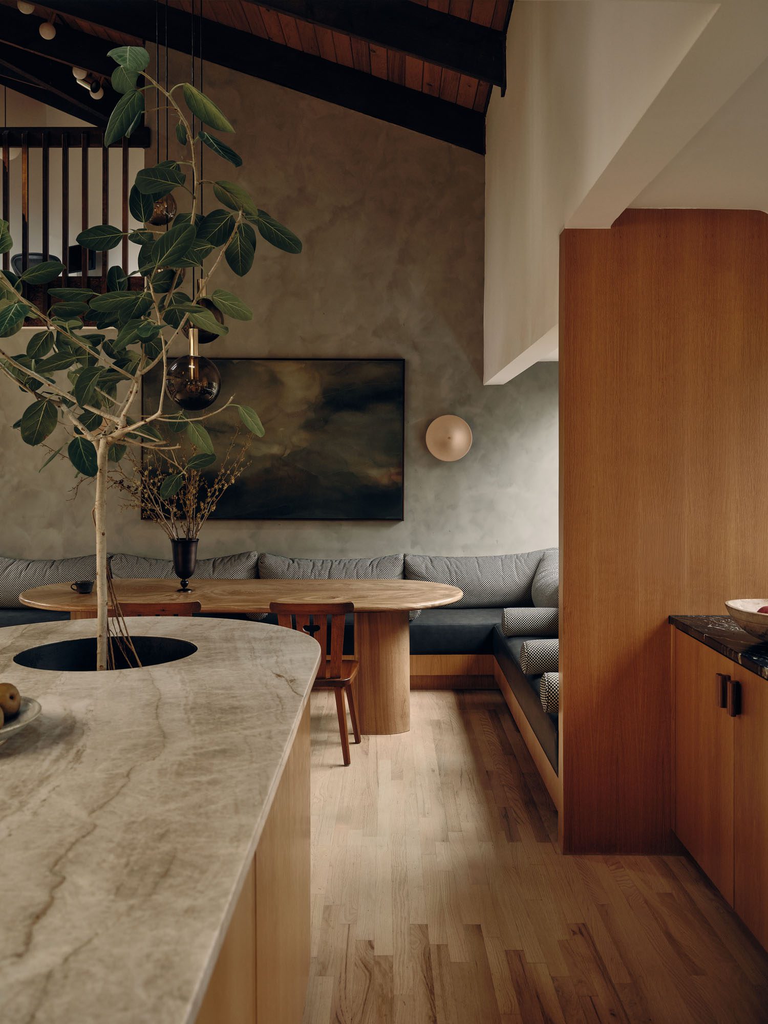
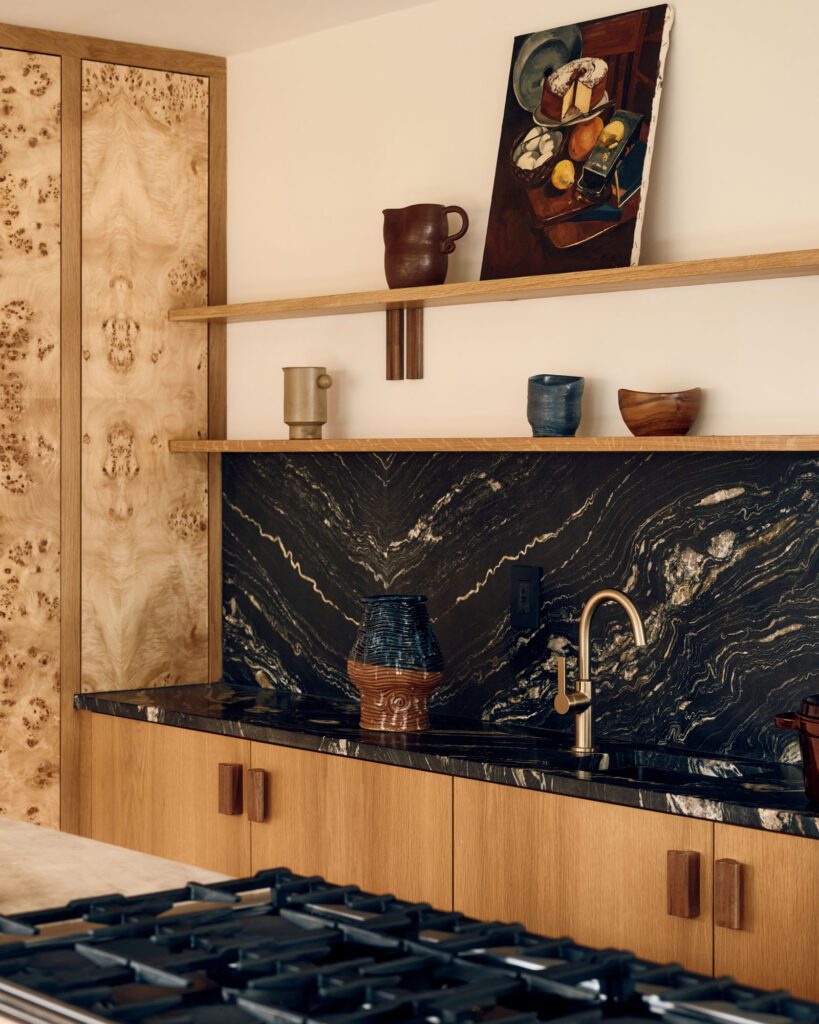
Spatially, little changed. However, to bring more light into the kitchen, Liv removed a wall between it and the dining room and pulled another back for more connection to the glazed hallway. Now, when viewers of The Modern Proper tune in to their favourite food vlog, recipes are presented against the dashing drama of a black-stone backdrop with open shelving for display, which Natalie changes up with the themes or the season.
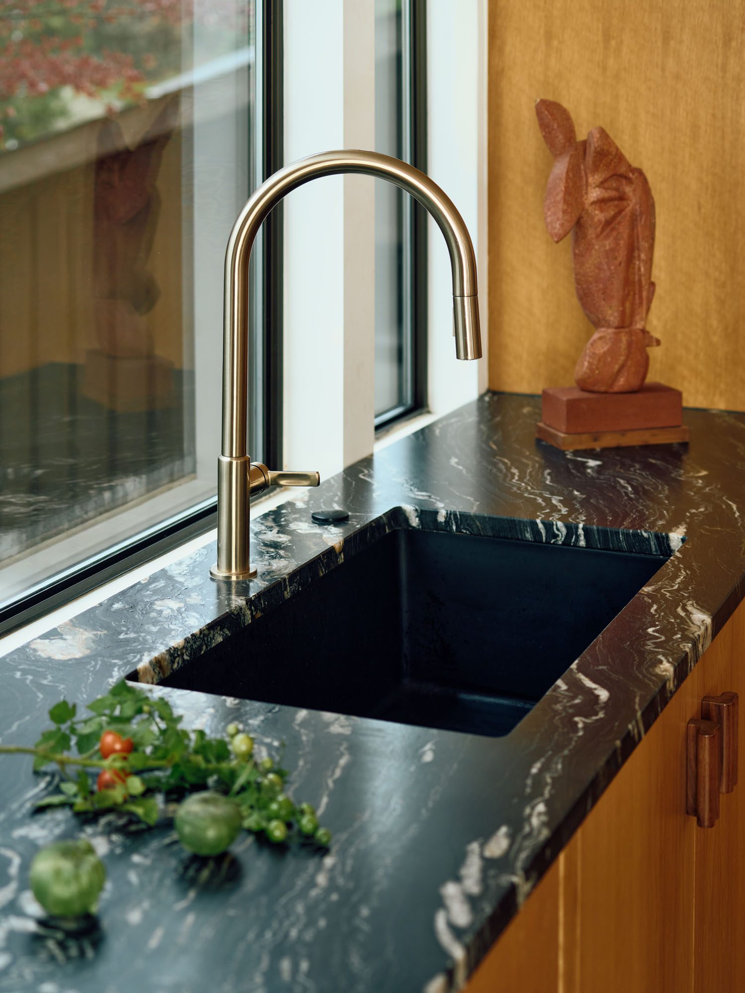
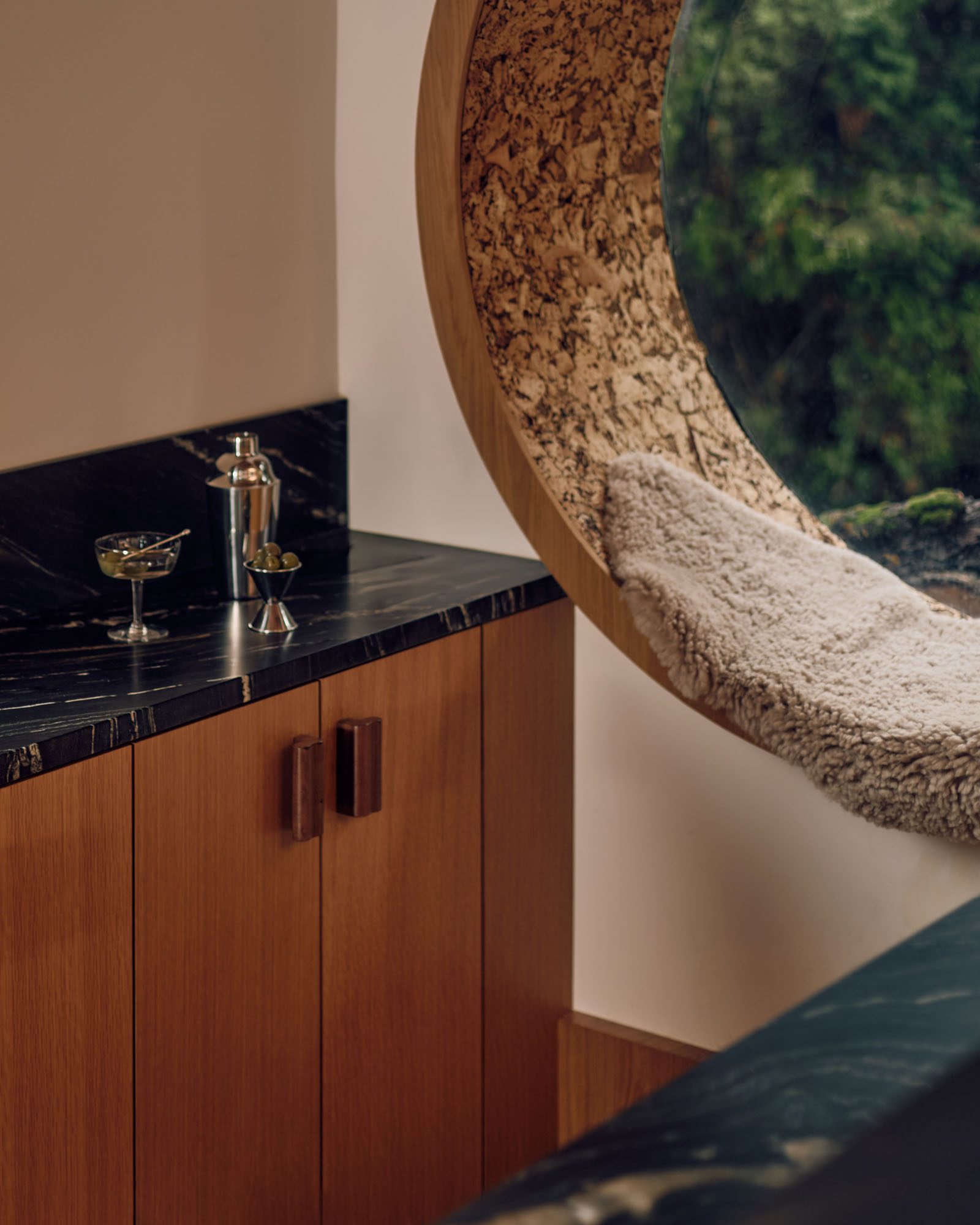
This Belvedere black quartzite, with its rich gold veining, is counterpointed by creamy Taj Mahal quartzite on the island — a more neutral surface that is better for photographing and filming food. The burr poplar veneer cabinetry, so emblematic of the 1970s, is teamed with walnut handles.
“It was common to combine timbers in that decade, too,” says Liv.
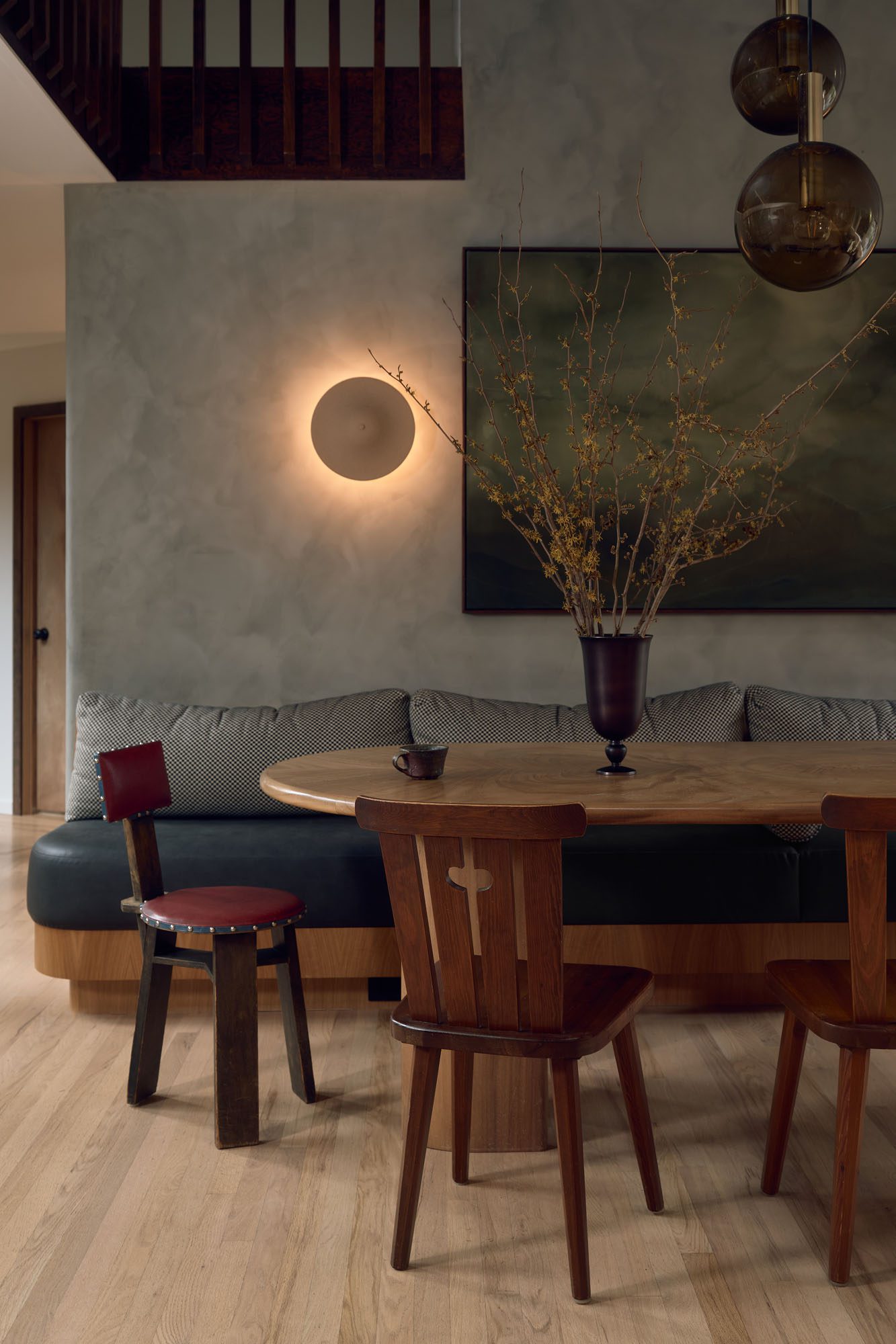
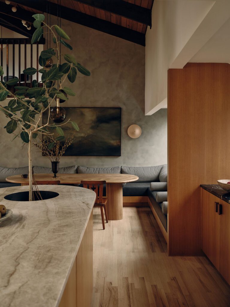
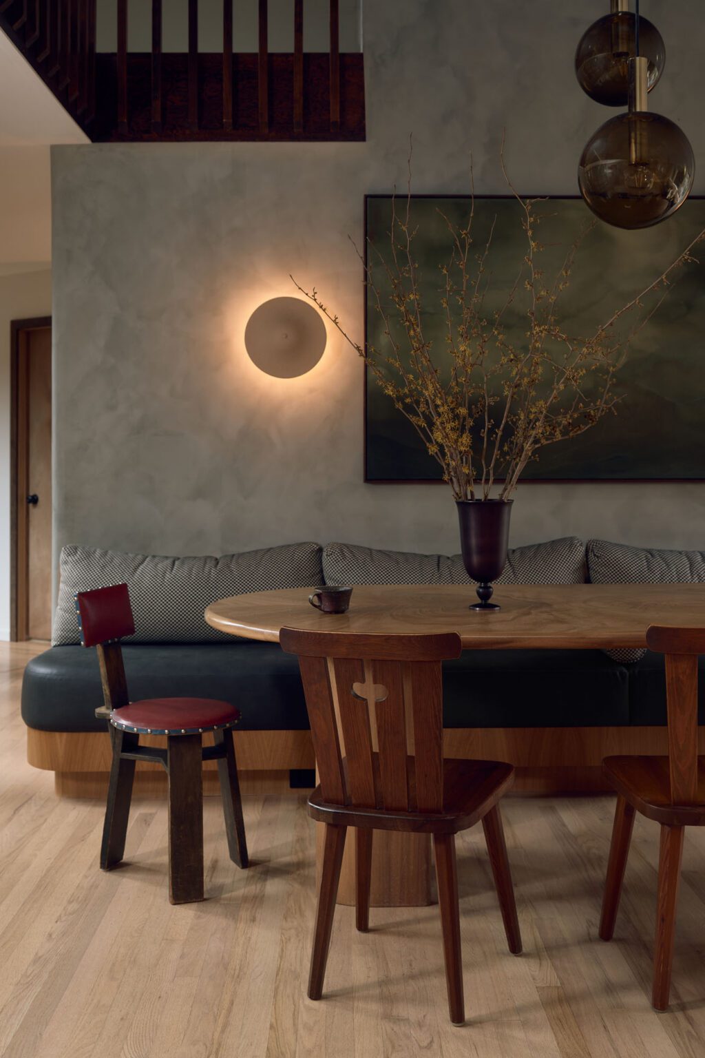
Leaning into that era was a given, but the contemporary interpretation is an elevation of the aesthetic. Case in point: the built-in banquette that occupies the dining zone. With a curved edge that echoes that on the island, and generous deep seating, it flows naturally from the kitchen.
“The kids love to scooch in there for their evening meal,” says Liv, who has first-hand experience of this design thinking at work.
On a recent visit, she watched as the family of five efficiently compiled an evening meal of taco bowls before dashing out to sports club — Dad cooking mince, someone chopping avocado, the table being set. In no time at all it was sit, eat, and go.
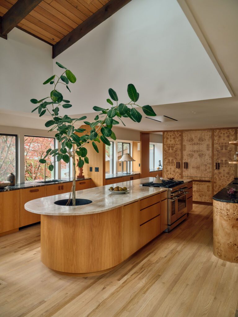
On the banquette, chequered back cushions and bolsters zig in with a change of pace. An abstract work commissioned from local artist, Brenna Therese, ties into the rich green of a potted Ficus Audrey that appears to emerge from one end of the island.
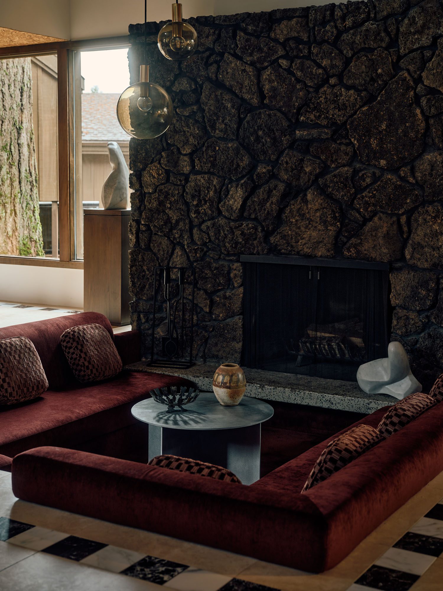
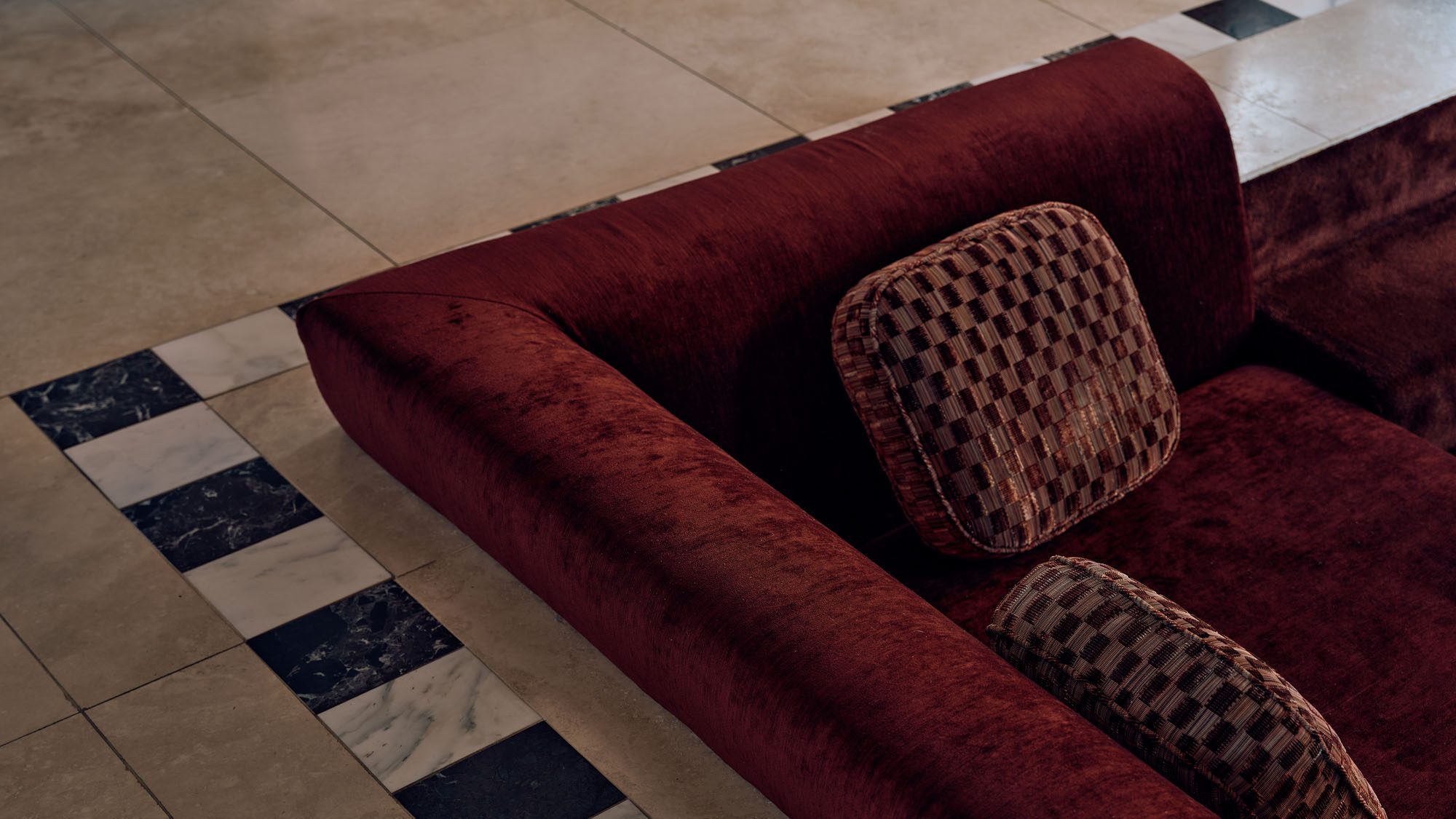
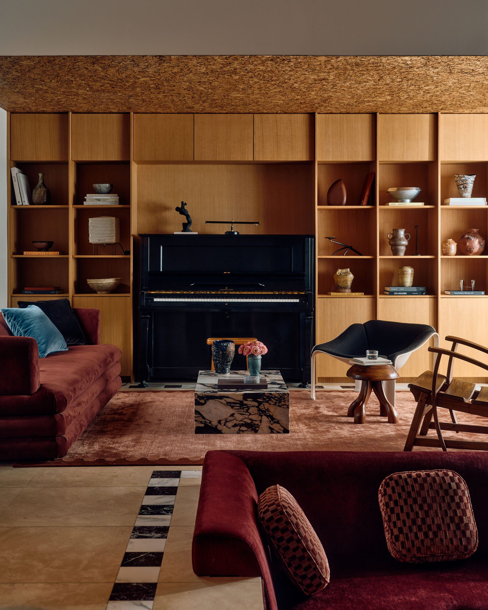
Whimsy is an important pillar of the design programme — surprising, playful details that are nevertheless intentional. Nowhere is this more evident than in the open-plan living room, a party epicentre where Mad Men-esque style meets the moment. A conversation pit around the stone fireplace is drenched in burgundy velvet, and there’s a ruby red shagpile. A Pierre Frey velvet check on cushions breaks up the saturated scheme. Marbled check tiles that run around the perimeter of the pit and the room amp up the decorative fun.
While the carpet was replaced with travertine tile flooring, a hefty billiards table inherited with the house stayed put. It has been joined by a built-in bar, where a cocktail can be sipped as you sit in a porthole — very James Bond. Lining the deep rims of the windows in cork, then adding Wilson & Dorset sheepskins for comfort brings the experience back to earth.
“We wanted to add New Zealand elements,” explains Liv, who also included Fisher & Paykel appliances in the kitchen and Snelling Studio lamps in the main bedroom.
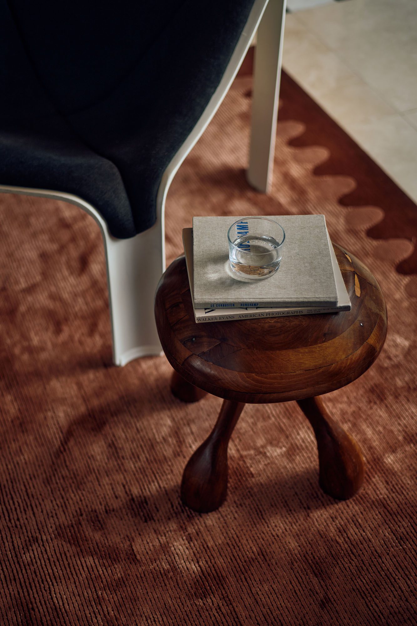
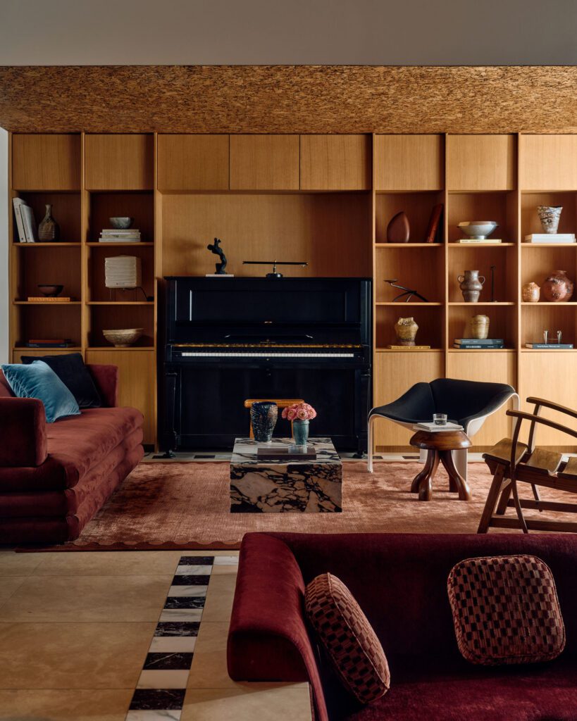
On the opposite side of the conversation pit, a piano room echoes the burgundy-velvet plushness. Special cabinetry was built in around the upright instrument to integrate it into the décor — and the everyday. On many evenings, the family will gather on a Sarah Sherman Samuel sofa, with scalloped detail that tied in with the scheme, or sink into a classic Pierre Paulin lounge chair that the couple collected on their travels, to listen as notes drift out through the windows into the neighbourhood.
Working remotely on a project of such intense detail had its moments — matching materials specified in New Zealand to the U.S. version, for instance — but, by far and away, it has been a career highlight for Liv.
“The willingness of Americans to trust the process and their designer is incredible,” she says. “Not only did Natalie and Scot faithfully follow through on every aspect we suggested but we are forever connected and friends for life.
Judges’ Citation
Untouched by its original owner until 2021, this 1977 mid-century home in the United States offered remarkable architectural bones.
The designers recognised the quirky generosity of the original envelope, transforming a constrained and somewhat pokey time capsule into a contemporary and borderline maximalist home.
Responding to a brief grounded in manaakitanga, the project resolves extraordinary functional complexity with effortless clarity: selective spatial surgery opens the kitchen to light and connection, while a sculptural double-sided maple burl island balances theatricality with exceptional practicality, calibrated to perform equally for family life and professional food filming.
There is a confidence in the atmosphere of the home’s era at play here: the reimagined conversation pit wrapped in saturated burgundy velvet, a built-in bar nestled within a porthole window, a kitchen with a tree growing within it, cork-lined reveals, expressive stone and carefully curated New Zealand design references together produce an interior of rare emotional depth.
Bold, immersive, and hugely personal, this is a character home that honours its past while defining an entirely new future. A highly meritorious winner that expands the idea of how New Zealand residential interiors can behave, locally, or abroad.
Words Claire McCall
Images Pablo Enriquez
Interior of the Year is presented in partnership with