




Health & Wellness Interior of the Year: GP&Me by Wonder Group

For this neighbourhood GP’s office, Wonder Group has removed the generic in search of positivity. Forgoing stiff waiting-room chairs for comforting, curved banquettes, and institutional wall colours for a humming palette of golden beige, dusty pink and muted blue, the clinic becomes a welcoming hub for wellness.

When relocating her practice to a distinctive, former bank building on Auckland’s busy and multicultural Dominion Road, Dr Connie Juhn reached out to Wonder Group, inspired by the design team’s quintessential way with colour.

Looking to step away from the usual GP office, she aimed to create a welcoming, domestic-style interior that remained credible as a healthcare practice.

Lead designer, Stephanie Viterbo, says the team immediately aligned with the doctor’s vision.

Contemporary colour and varied textures helps create a soothing atmosphere for this GP clinic with a difference

“Connie is a colour queen herself,” she says. “She’s such a vibrant and effervescent person, and she was prepared to put a lot of trust in us creatively.”

While Connie’s initial mood board contained a palette of neons and primaries, she was also clear that a sense of trust and safety for patients and staff was paramount. This meant knowing where to draw the line between focused spaces, where distractions were not welcome, and zones where design elements could brighten someone’s day.

Wonder Group, for whom this typology was entirely new, met the challenge with rigour and astuteness, beginning by working alongside the client to understand the way the practice operates.

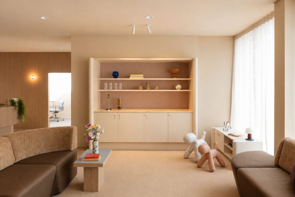
The waiting room is equipped with a beverage bar featuring a peach-toned splashback of Japanese tiles. Furnishing upholstery was chosen primarily for its antimicrobial performance, with colours and patterns reminiscent of a domestic setting

“No two clinics function exactly the same,” says Stephanie. “We mapped workflows with the doctors and nursing team, learned how patients move through the clinic, and understood where efficiencies and pain points existed.”

The team then immersed themselves in the relevant healthcare standards, building codes and compliance requirements, leaning on consultants and suppliers where needed. 

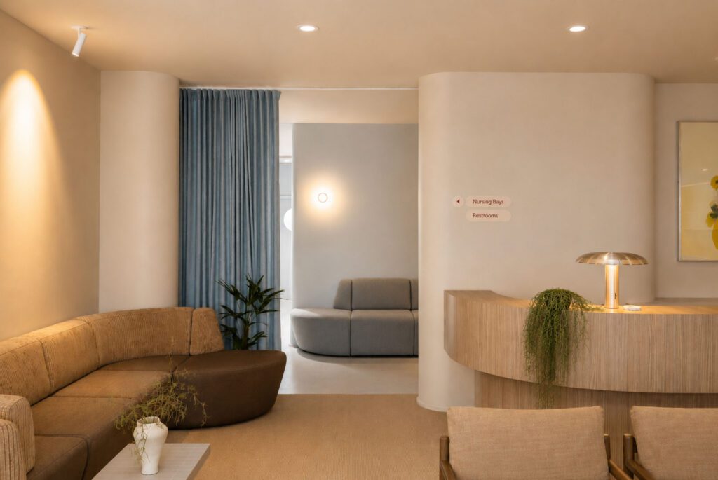
Curved walls soften the transition between zones, while colours allow for intuitive wayfinding through the clinic. The carpet is Interface Monochrome in Doubloon, a warm tan, from Inzide

“One of our biggest lessons was in understanding the difference between what is a regulatory requirement and what has simply become industry convention. That allowed us to challenge certain assumptions, push where appropriate, and create a clinic that remains fully compliant while feeling far more human and welcoming than a typical medical environment.”

This meant sourcing products that would meet healthcare performance requirements while contributing to the overall atmosphere. However, in terms of surfaces and upholstery fabrics, durability, hygiene and warmth were the leading factors in their decision-making, with stainless steel and Laminex high pressure laminate (HPL) used throughout high-use clinical zones for their robust, non-porous and easily cleanable properties.

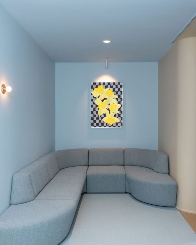
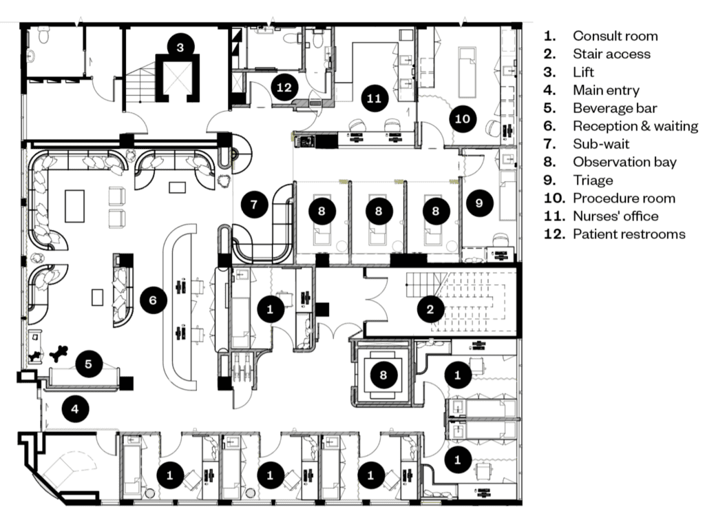
The consultation room features a secondary waiting space, providing another layer of privacy for patients
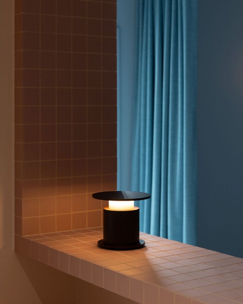
The Japanese tiles introduced in the waiting area carry through to the nurse’s station, which connects to the observation rooms

“For flooring, we selected Forbo Sphera homogeneous vinyl, chosen for its durability, seamless maintenance and extensive colour range, allowing us to move beyond the typical healthcare aesthetic,” says Stephanie.

Furnishings throughout the clinic are upholstered in Warwick HealthGuard and Halo commercial fabrics, selected for their stain resistance, antimicrobial performance and durability in high-use environments, Stephanie explains.

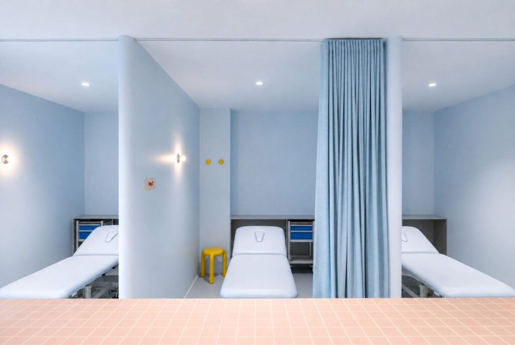
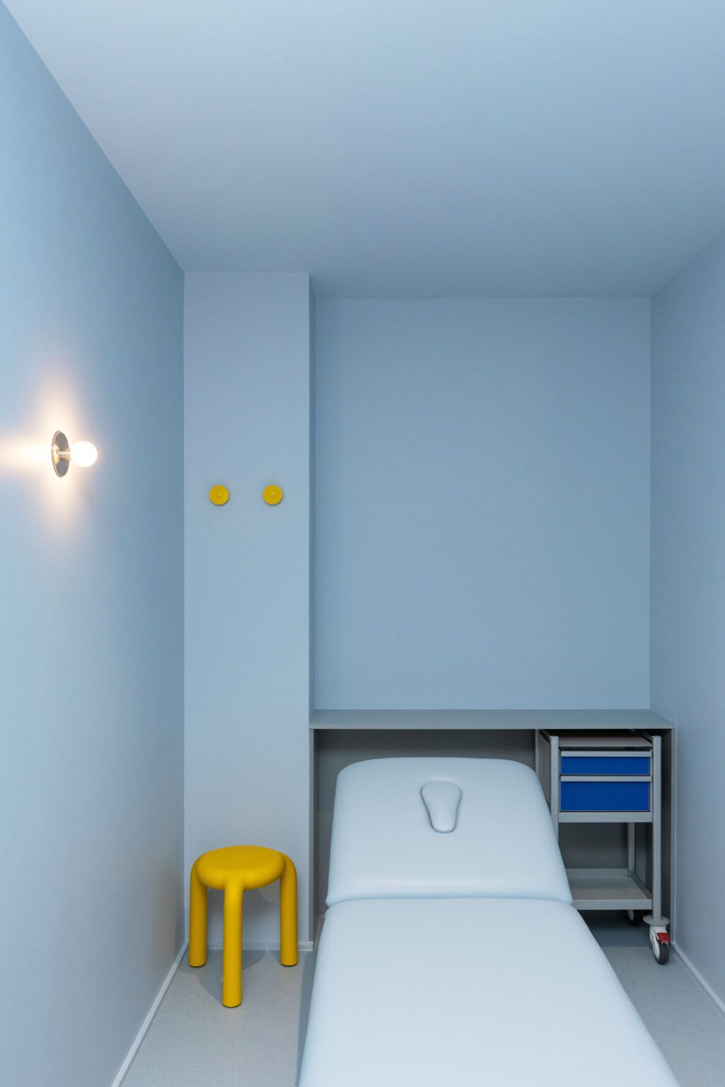
Primary yellow coat hooks and stools ease anxiety for patients, who can immediately see where to place their things on arrival in the spaces

“Every material was chosen to meet the practical demands of healthcare while reinforcing the clinic’s ethos, creating a space that feels optimistic, welcoming and genuinely human.”

Getting back to those vibrant colour choices, the entry point to the clinic is a buttery beige-toned waiting-room with a honeyed timber reception desk and flowing, custom Harrows seating in warm brown upholstery. To further the sense of comfort in this area, a beverage bar tiled with sandy-textured, pink Japanese mosaics lines one wall, while a children’s play area is minimal yet enticing with climbable Magis Puppy chairs. Curved walls soften the transition between zones.

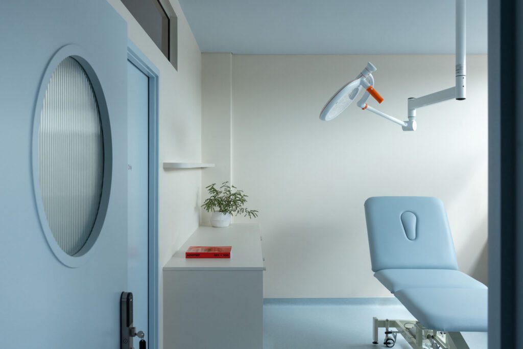
As a place where focus is paramount, the treatment rooms have a minimalistic, neutral palette. Forbo Sphera homogeneous vinyl floors allow for some colour while also meeting the high hygiene standards of a medical facility

“We knew that introducing a lot of colour could be quite a bold move and quite different for a lot of people. So we’ve got all of those warm, tactile colours through that first entry moment, like a little hug to ease you into it,” explains Stephanie.

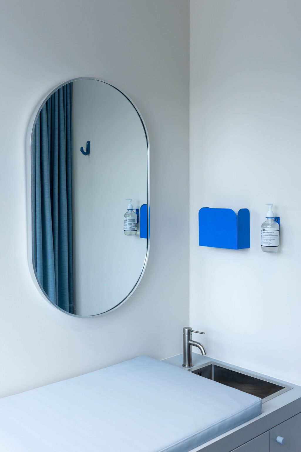
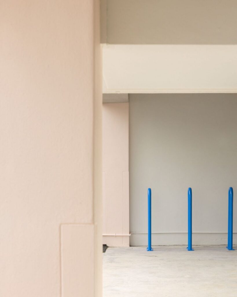
Pops of primaries appear throughout the clinic in the form of cobalt-blue handrails, sunny-yellow coat hooks, and TOOU Piccolo stools, with bright glass ornaments and floral artworks providing tonal depth beyond the more muted tones of the walls and furnishings.

“We wanted to work with colours that invoke a feeling of safety,” says Stephanie, “but also, there’s a little bit of joy in the space, a little bit of sunshine.”

Curves carry through to the treatment rooms in the form of mirrors, windows and bold blue wall pockets

Moving through to the clinical suite, a creamy Aalto Cirrus paint creates neutrality for the walls, while in the nurses’ offices and procedure area, a muted blush lends a gentle touch, in a tone that calls back to the beverage bar tiles. Chalky blue is used for the consultation and observation rooms, with carpets, walls, joinery and upholstery all in the same tonal field. Even the clinic beds were customised using colour matching.

“By using a monotone in these spaces, we help patients to feel settled and composed. The rooms feel tidy and not overly distracting,” comments Stephanie.

An understanding of the operations of the clinic helped shape the planning. The nursing station has clear sight-lines across all three observation bays, allowing staff to supervise patients efficiently while maintaining a calm working environment. A secondary sub-waiting area beyond the main reception space helps patients progress intuitively through the clinic.

The exterior was painted a soft pink, as a reflection of the client’s favourite colour

In terms of privacy and security, consultation rooms are detailed with acoustic door seals and insulated wall construction to minimise sound transfer and ensure conversations remain private. Integrated code access provides appropriate levels of security, while remaining discreet within the design.

With its new, pink exterior hinting at a departure from the norm, GP&Me is what happens when an owner with a vision meets a design team that understands colour and atmosphere, with every decision made to help patients feel comforted and professionally cared for within a warm, welcoming environment.

Judges’ Citation

General practice is perhaps the most familiar of healthcare environments, yet also one of the most overlooked. GP&Me demonstrates that even the most routine clinical setting can become an instrument of care in its own right, fundamentally reimagining the experience through interiors that instill warmth, exude dignity and foster human connection rather than institutional convention.

Every aspect of the journey has been reconsidered, from a welcoming curved reception that dissolves traditional barriers to lounge-like waiting spaces, integrated hospitality, and intuitively planned consultation rooms that replace anxiety with reassurance. Bursts of colour and custom detailing work together to soften the clinical environment without compromising on performance.

A compelling new model for local contemporary healthcare: one that demonstrates that medical environments are measured not only by efficiencies but by how they make people feel cared for.

Words Camille Khouri
Photography Jono Parker

Interior of the Year is presented in partnership with

GP&Me

Wonder Group, Auckland

Design  Wonder Group

Client  Connie Juhn

Main contractor  Team Fitout, Troy Stirling

Interior designers  Stephanie Viterbo, Buster Caldwell

Structural / Seismic engineer  EDC

Fire engineer  OnFire

Lighting designer  Novii

HVAC engineer  Airflow Engineering

Lift UE Lifts

Flooring  Forbo Sphera Element from Inzide

Carpet  Interface Monochrome from Inzide

Paint Aalto

Curtains  Zepel FibreGuard from James Dunlop

Consult room desks and beds  Custom by Fluid Interiors in Laminex

Furniture  Harrows, Woodwrights, Archer Medical

Joinery  Fluid Interiors in Laminex, terrazzo stone benchtop

Lighting  Novii, Inlite, Kitchen Hub

Doors  Best Doors, solid core timber with acoustic reeded glass vision panels

Tiling  Winckelmans from Obery and Contract Floors

Latest video features

In the Coromandel, a home with a humble profile and a thoughtful design makes the most of a stunning location.

Built with awe-inspiring attention to detail, this Arrowtown home is a fresh interpretation of a familiar Otago rural vernacular.

This sculptural Northland bach is a perfect north arrow on a remote farm high above the sea.

With the sun on its bow and the community at its stern, this is a house in which the elements are always front of mind.

Trending articles