
Harapaki House by Piper Architects

A sequence of arches traces the evolution of this 1940s brick-and-tile home, leading from its original rooms to a generous, light-filled living area. This extension for a family of five began with a desire for more space, sunshine, and a connection to the garden, while preserving the character already there.

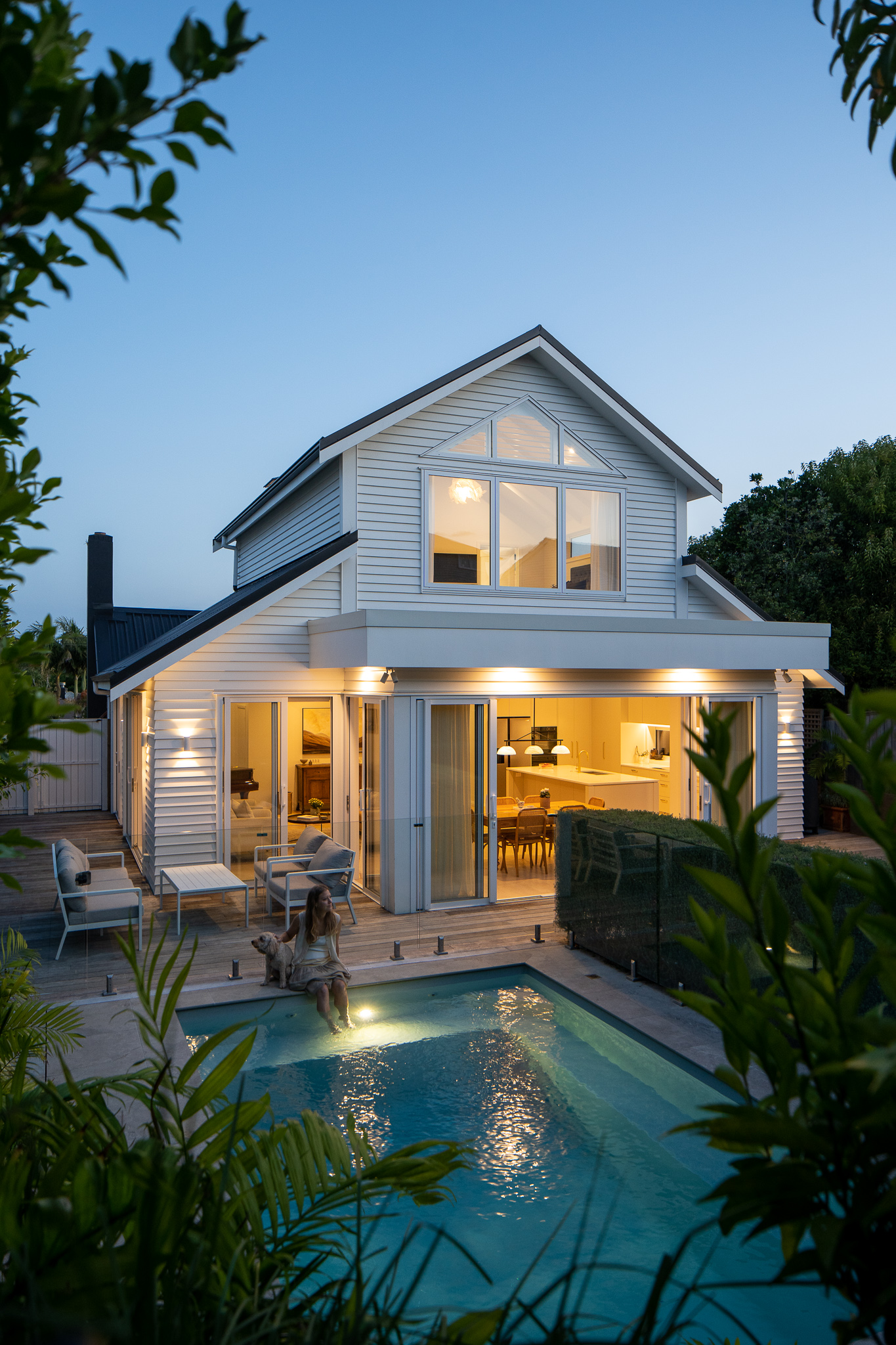
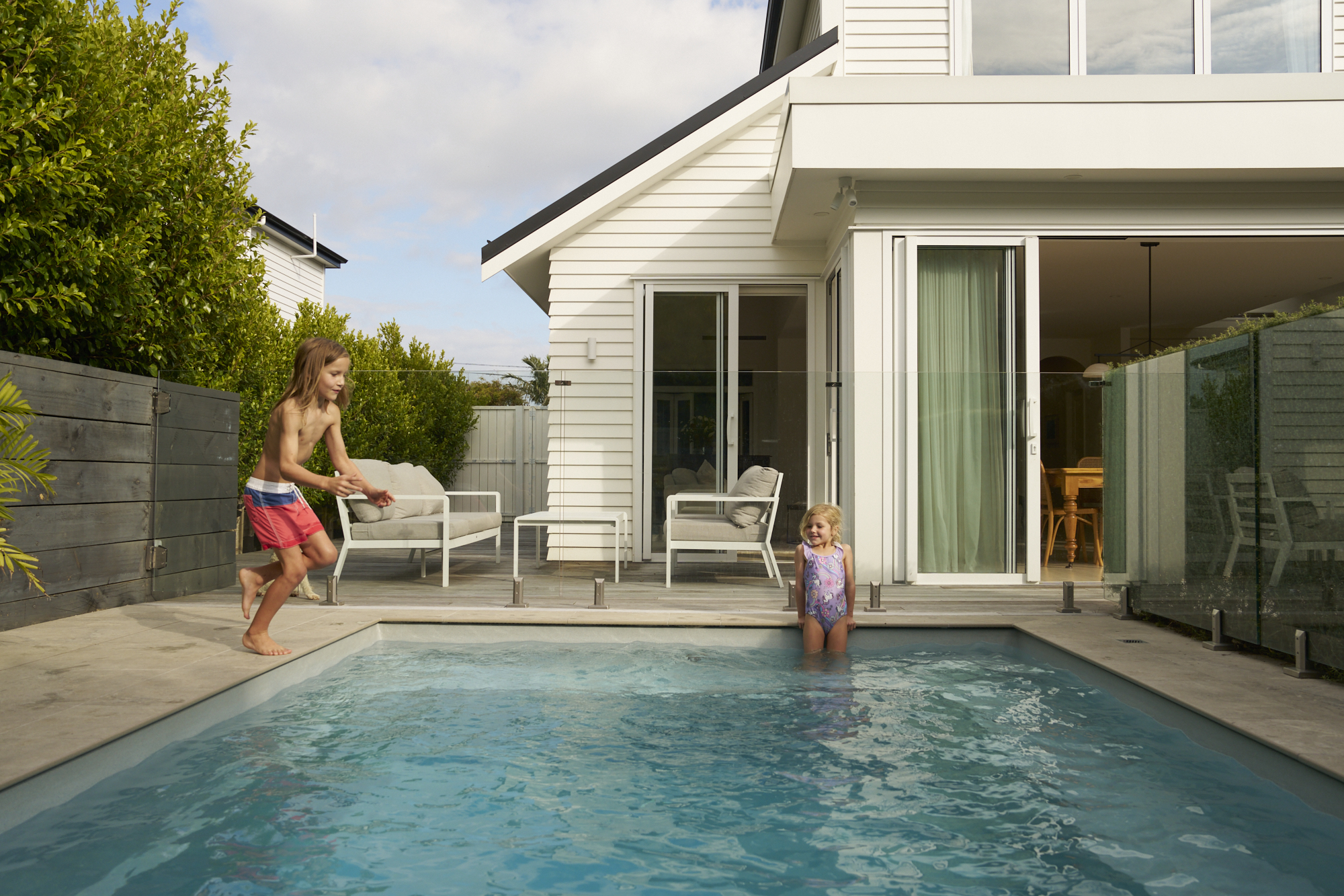
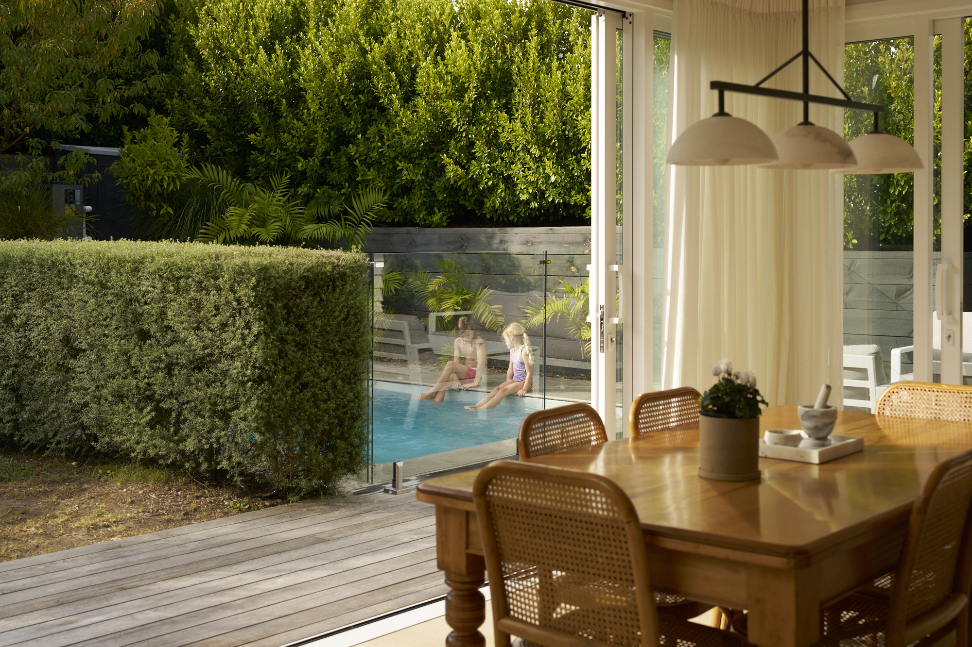
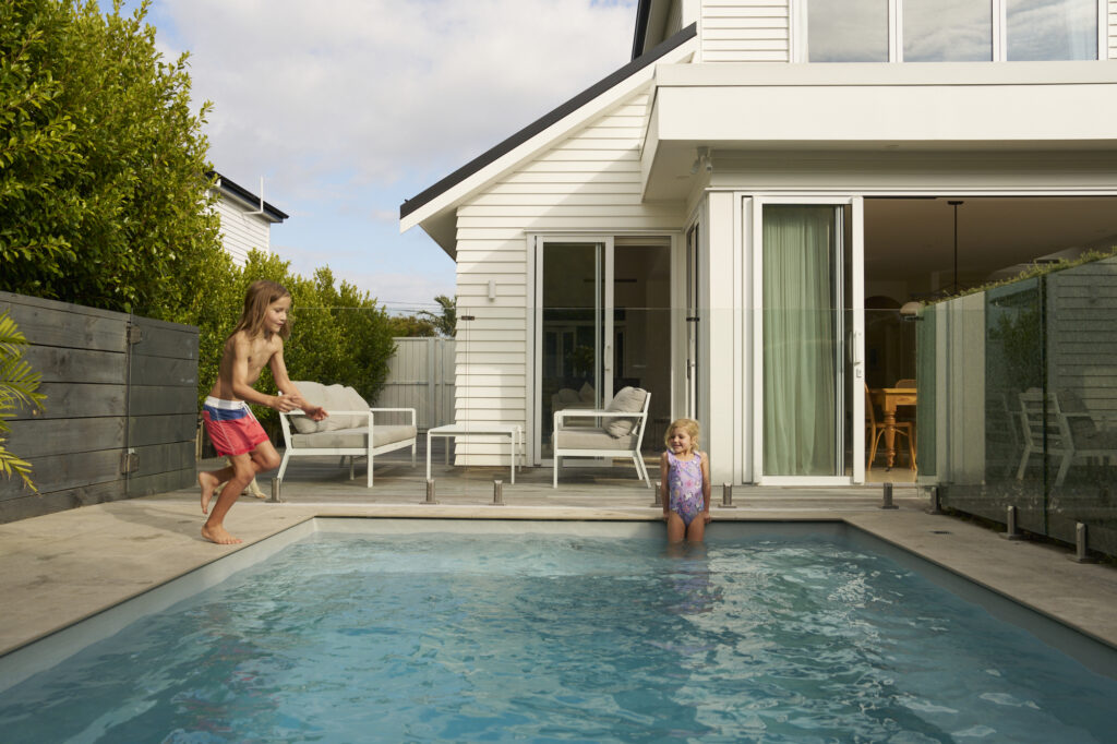
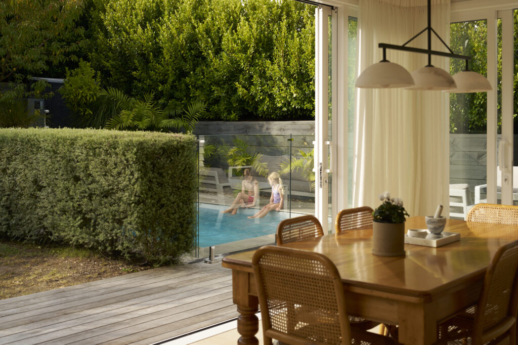
Positioned in view of the main living spaces, the pool keeps family activity connected to the house

The design draws on the original house’s proportions and details, threading the 1960s weatherboard addition through as a tactile memory of the past. Beyond the hallway, the home unfolds into a generous kitchen, living space, and an almost entirely glazed dining room that reaches out toward the garden. Pale timber, soft linen, and warm cabinetry gather the shifting light, while greenery adds depth and texture.

Rachael Piper of Piper Architects shares the decisions that brought these spaces together, and how light, landscape, and the rhythms of family life defined the home’s next chapter.

What was the client’s brief, and what became the home’s central architectural idea?

The brief was to transform the existing 1940s brick-and-tile house, approximately 100 m², into a home that could accommodate the clients’ growing family and provide enough space to entertain their wider family. The original house had three bedrooms, a relatively small living area, and a kitchen-dining space that could barely fit the family’s dining table. The brief also included a new bedroom, a generous kitchen, a parents’ ensuite, a pool, and plenty of greenery, while making better use of the sizeable north-facing site.

The clients had previously lived in a south-facing house and were particularly excited about having sunshine and natural light. They wanted the new house to feel generous, peaceful and open, with a strong sense of overflow to the exterior. Although the site rises away from the house, they wanted to maintain the living spaces on one level rather than introduce a level change.

The original house holds onto the qualities that define its identity, while the new work responds through proportion, material, and a shared relationship with the landscape. The threshold between them is intended to be felt, a subtle cue that the house has evolved, yet the experience of moving through it remains seamless.

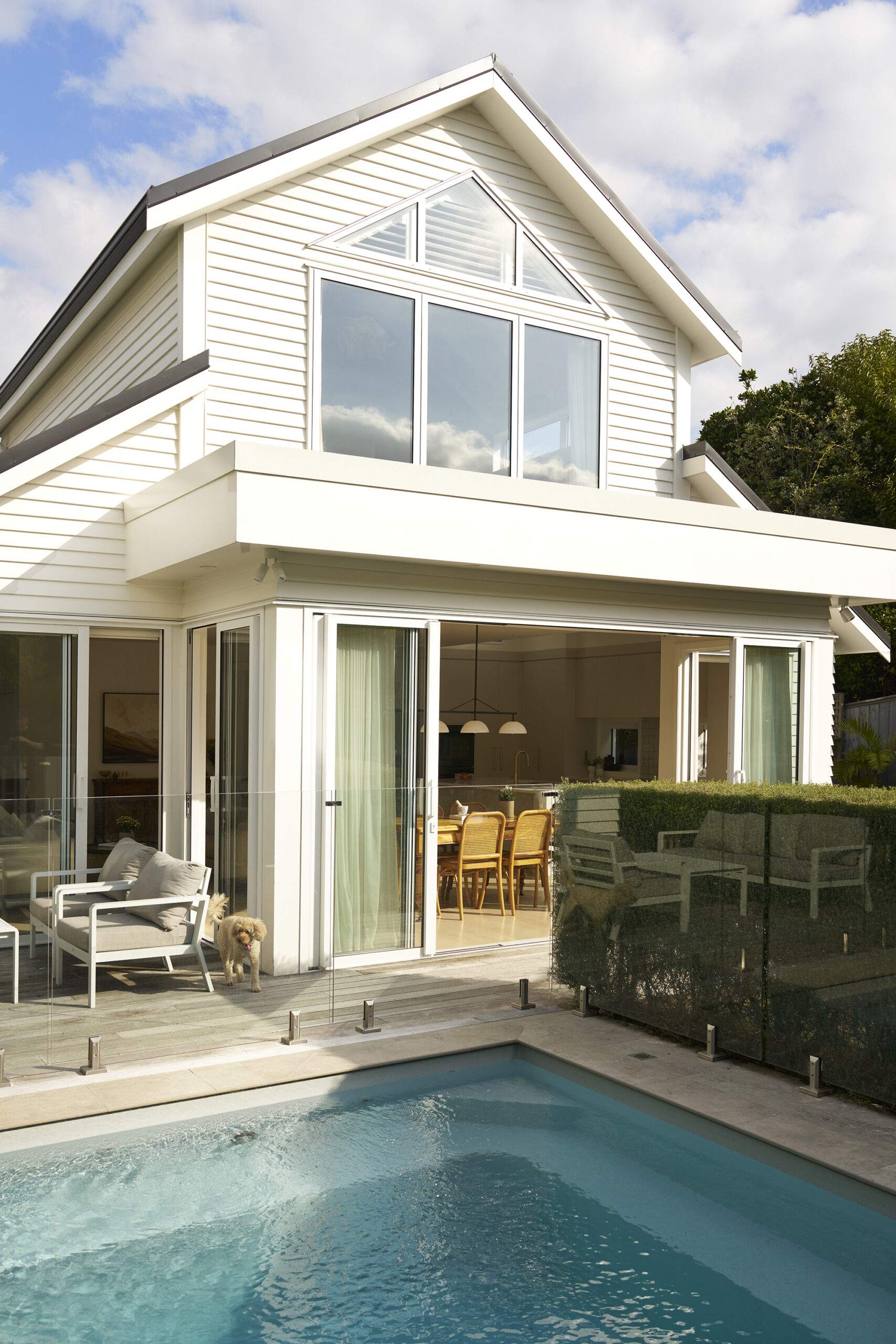
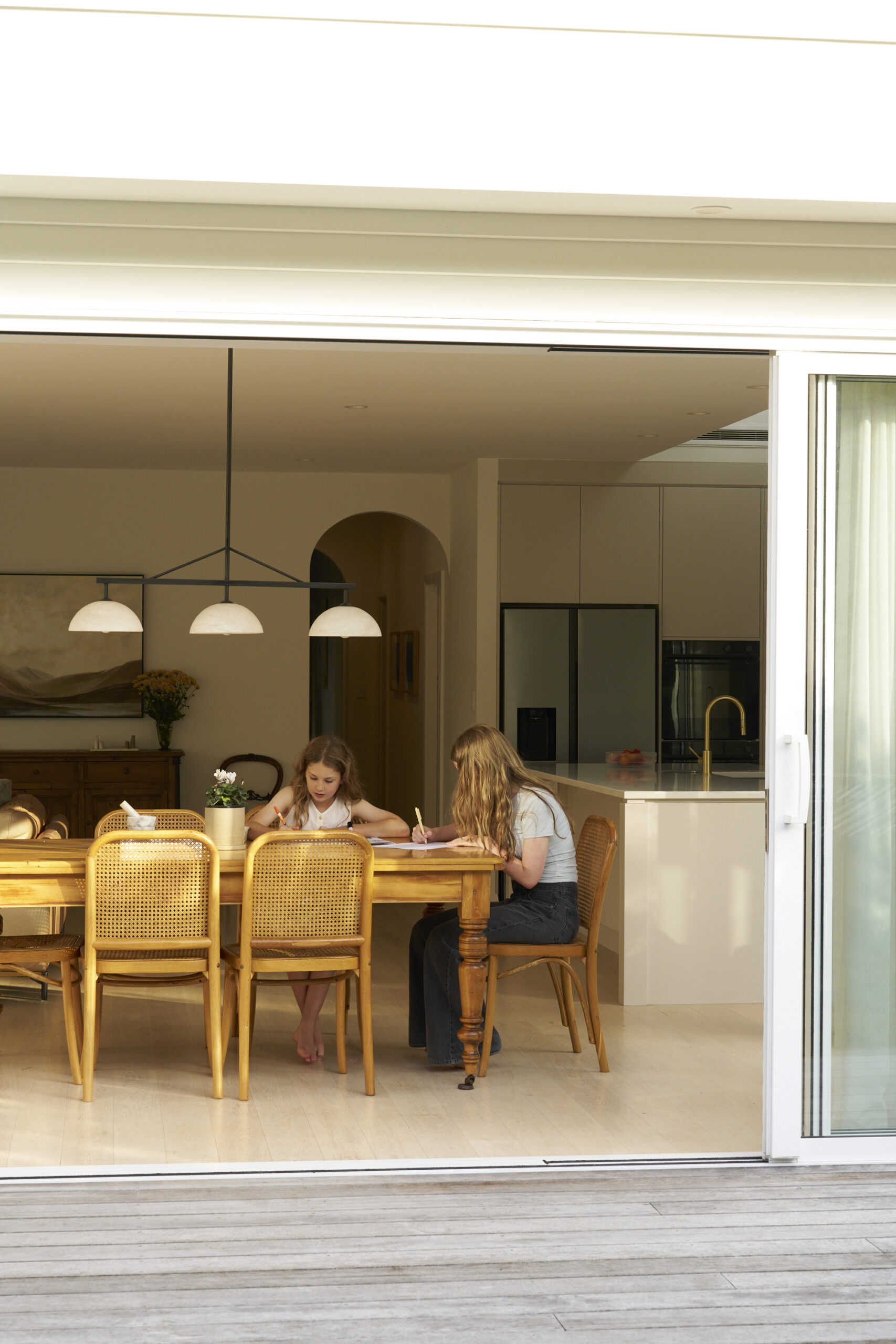
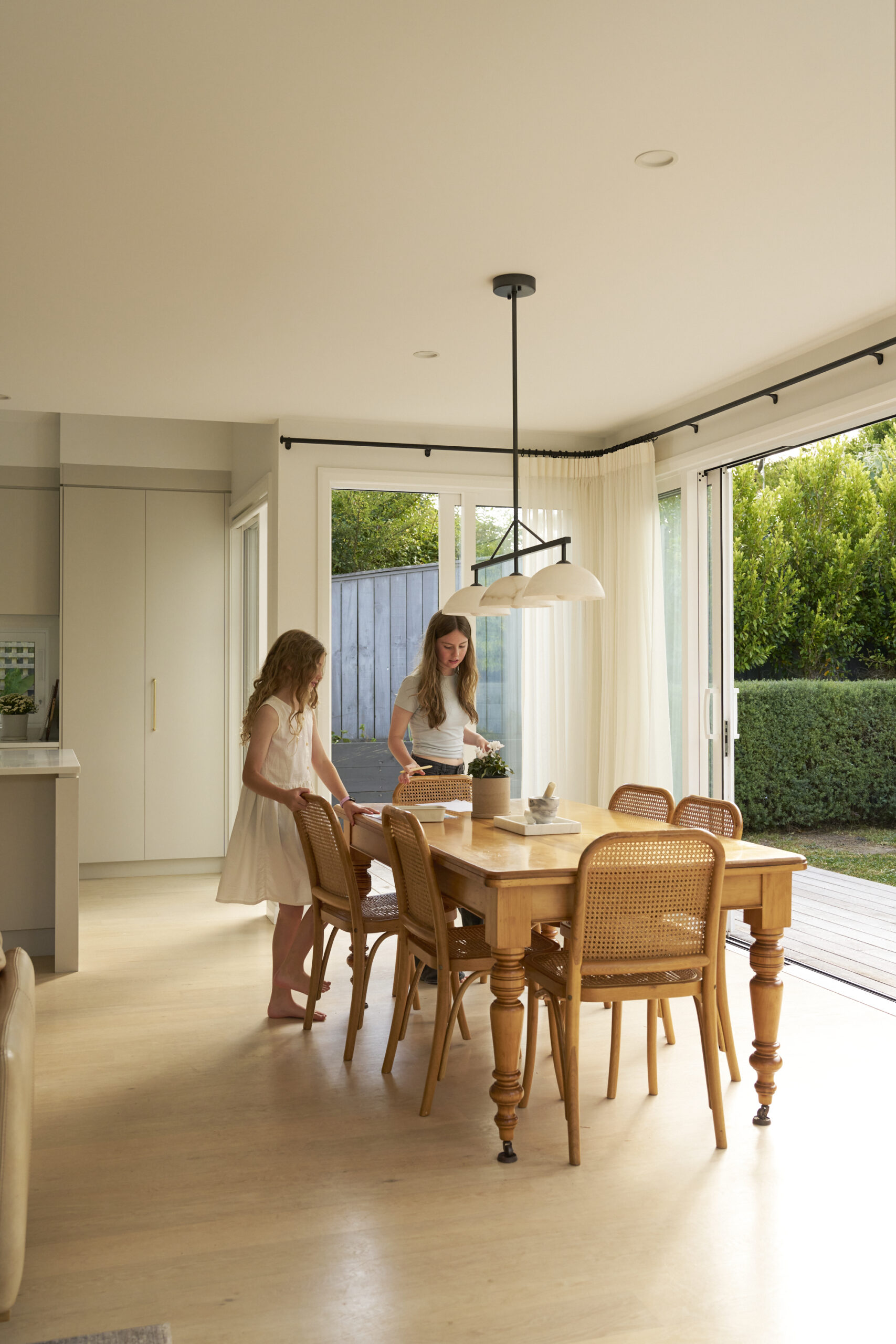
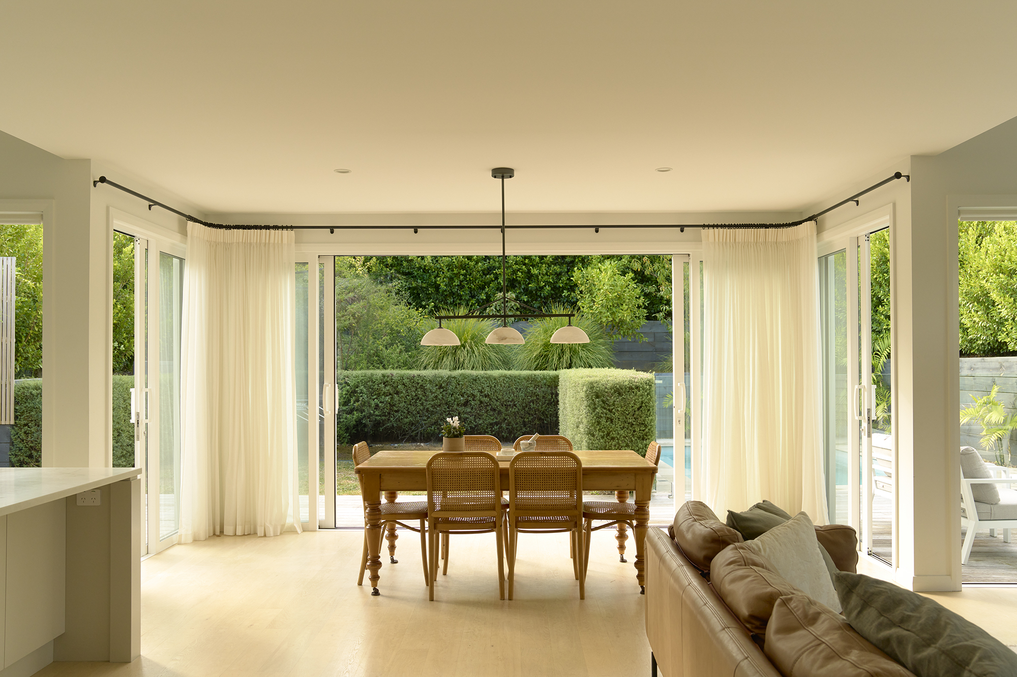
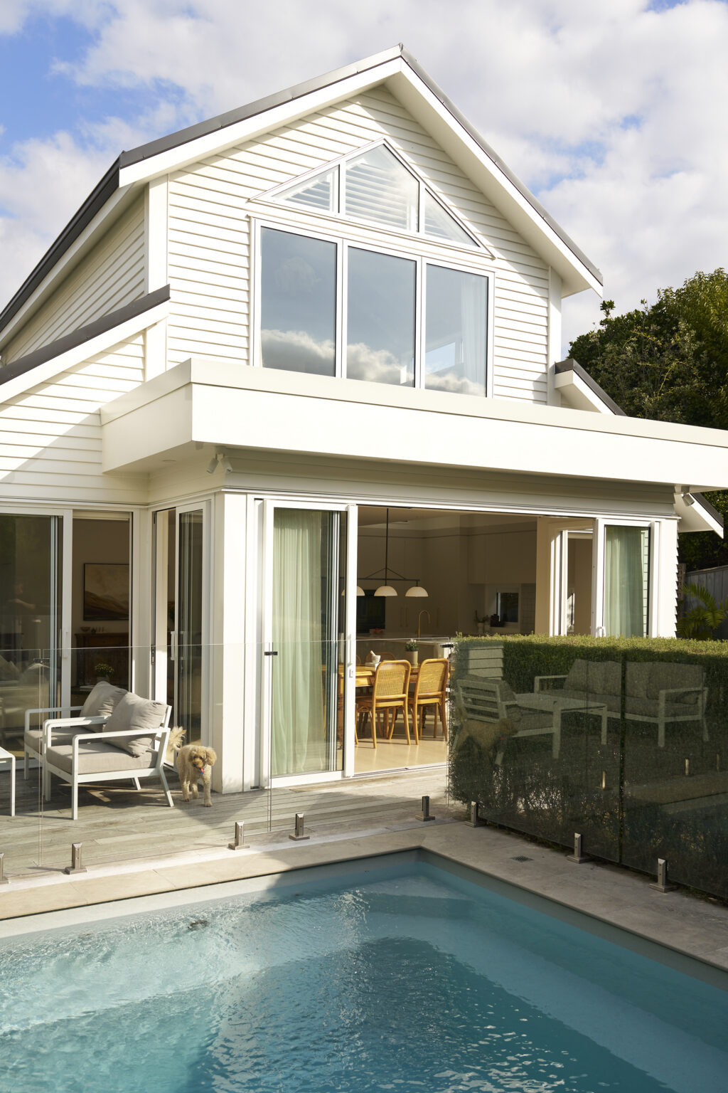
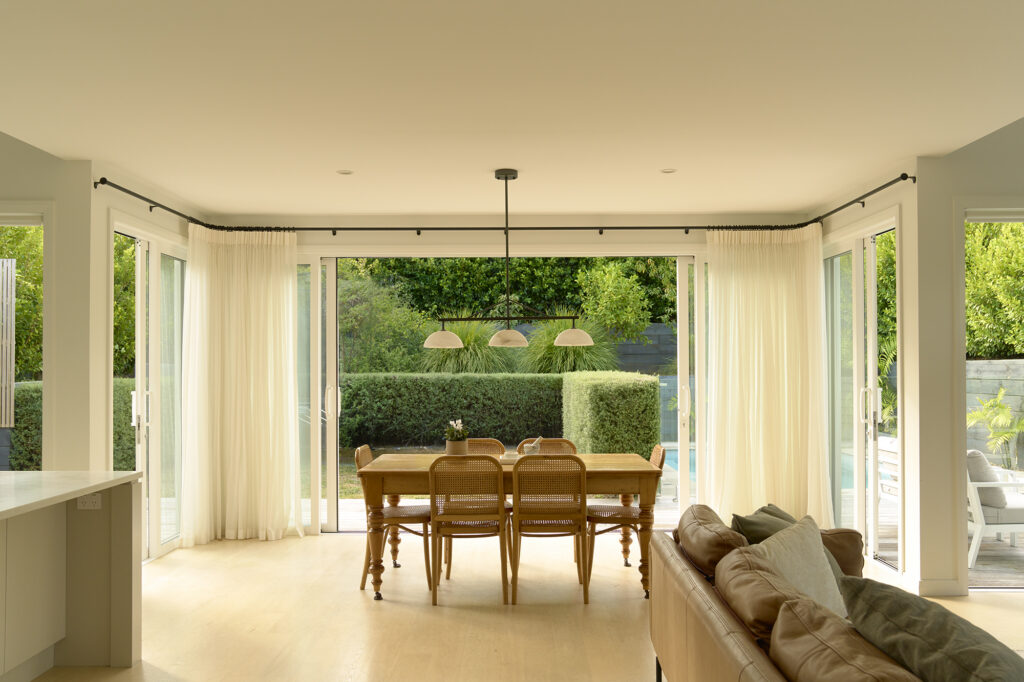
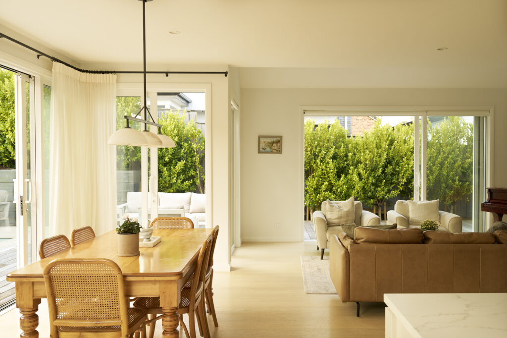
The dining room projects toward the garden, capturing light from multiple directions throughout the day

Was there a key decision early in the design process that ultimately shaped the project?

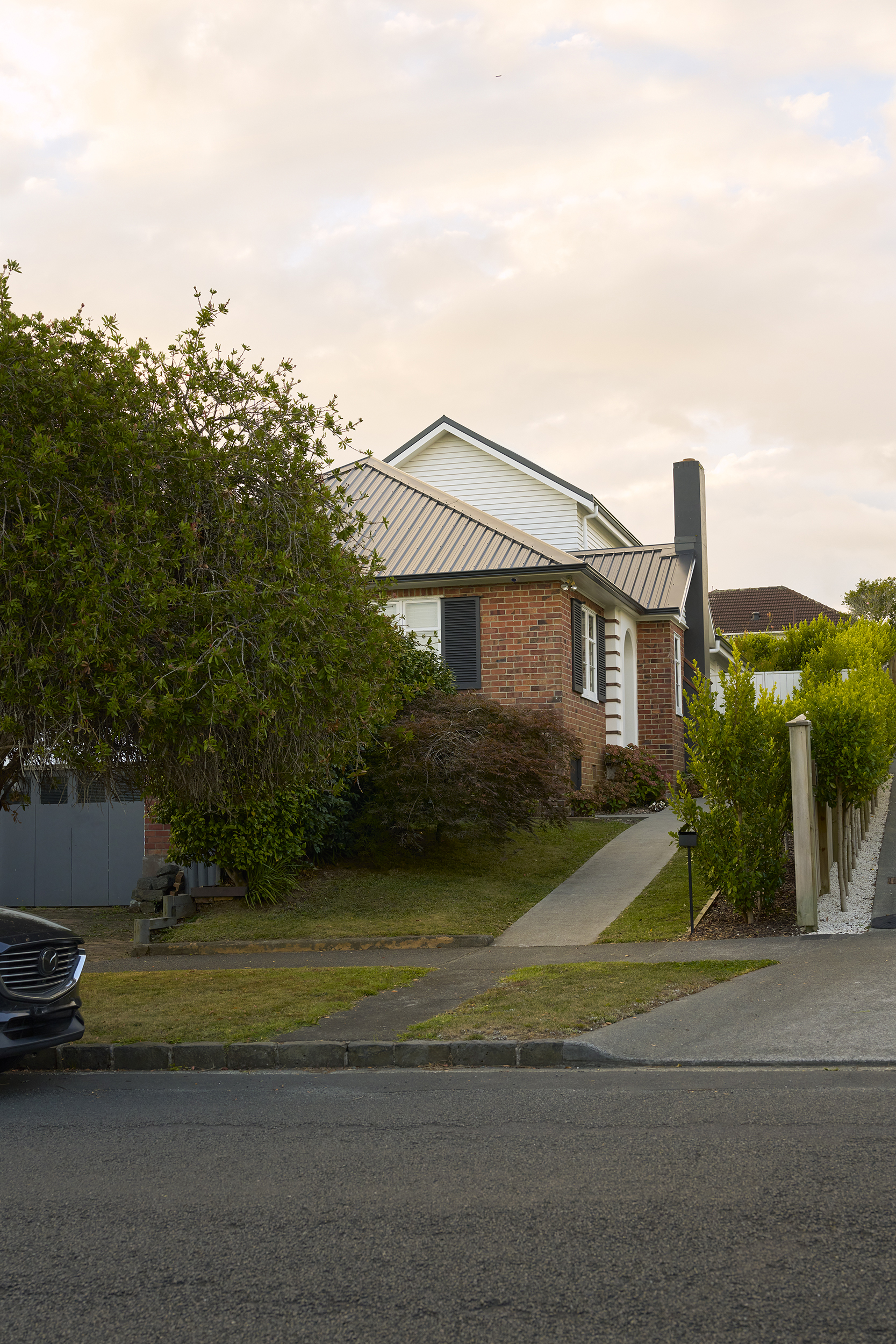
One of the earliest and most significant decisions was to retain as much of the existing house as possible. Rather than absorb the old into the new, the intention was to preserve its character and detail, allowing the extension to develop its own identity alongside the original as part of a larger whole.

A modest 1960s weatherboard addition at the front offered an architectural thread for the new work. Rather than replicate the original brick, which we kept in its true colour and character, the extension draws on the language of the weatherboard and carries it through to the rear.

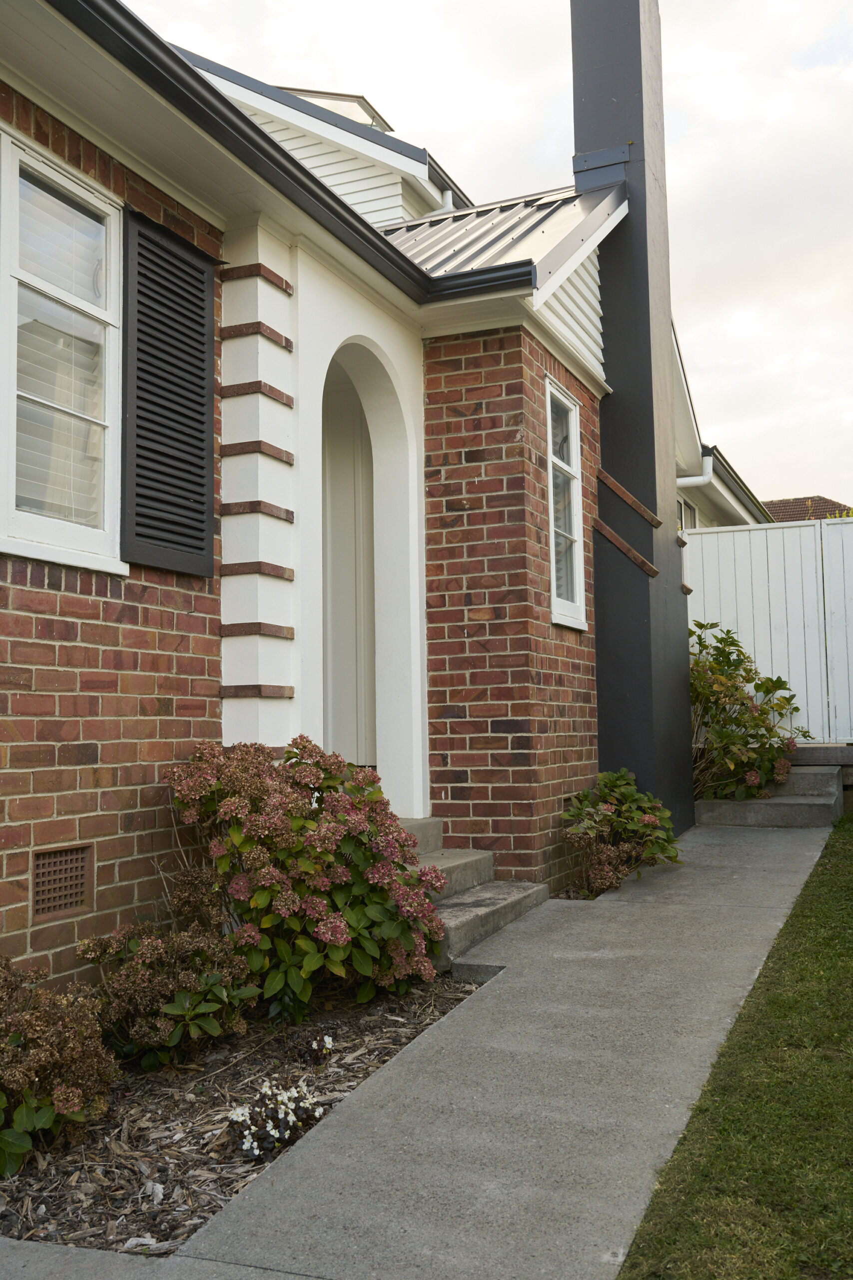
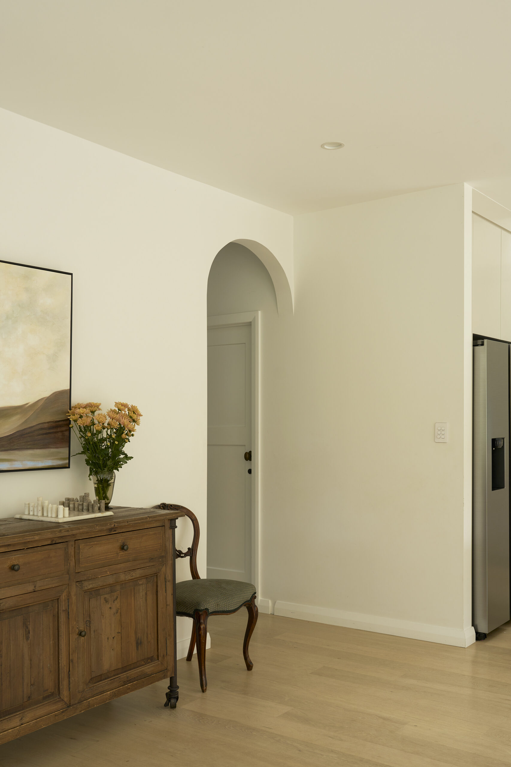
The clients wanted the new spaces to feel light and airy, yet classic. The original front entry’s arch became a reference point, inspiring new arches along the hallway to mark thresholds and signal the shift from old to new.

The connection between the two parts of the house is therefore less about matching them than finding the qualities they can share. The extension doesn’t imitate the original house; it inherits certain qualities from it and translates them into something contemporary.

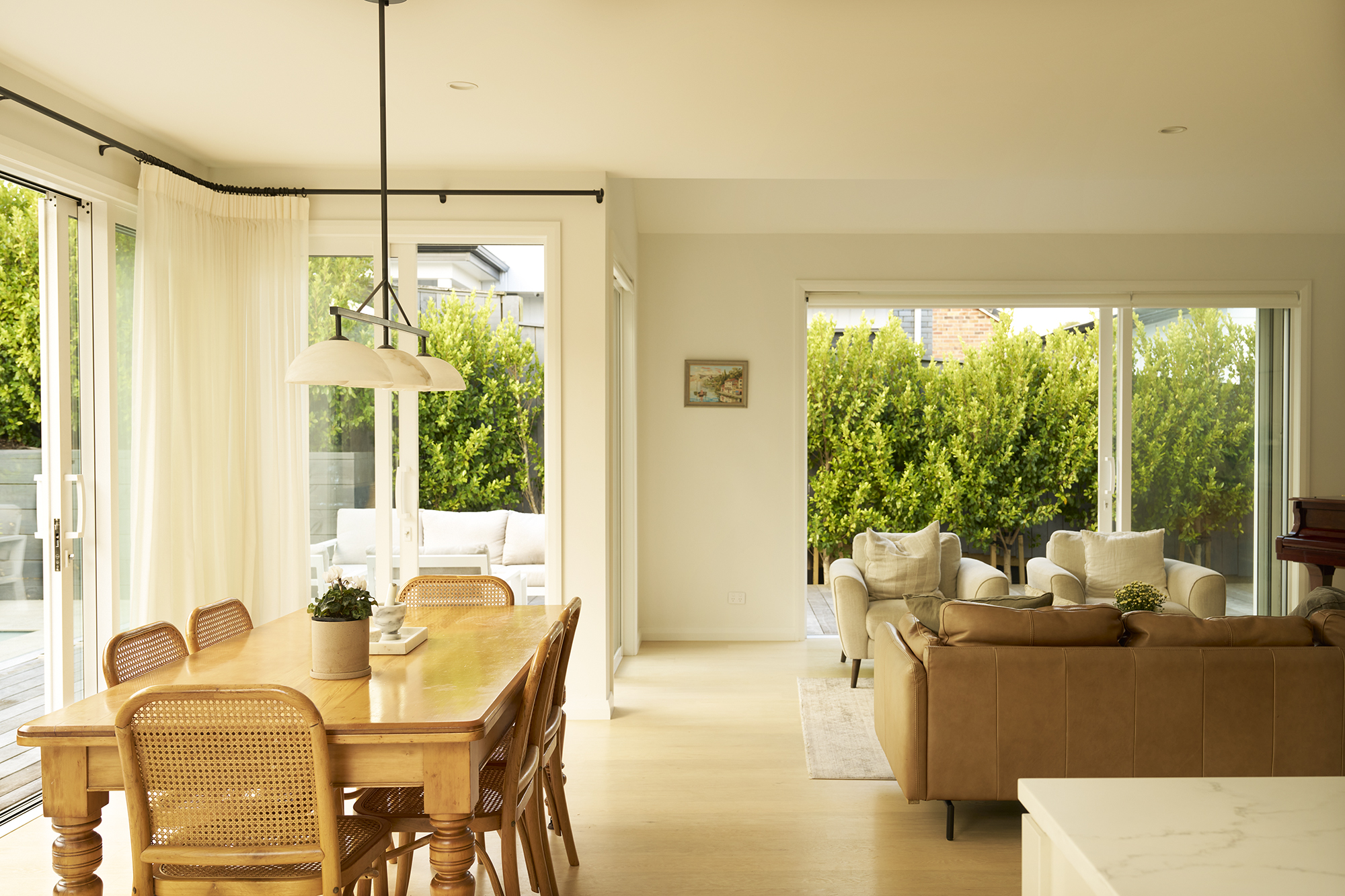
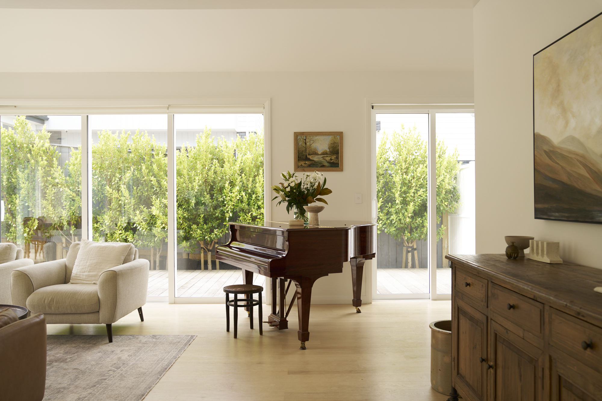
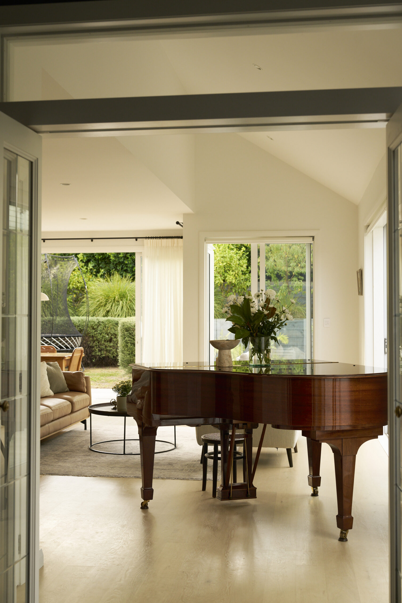
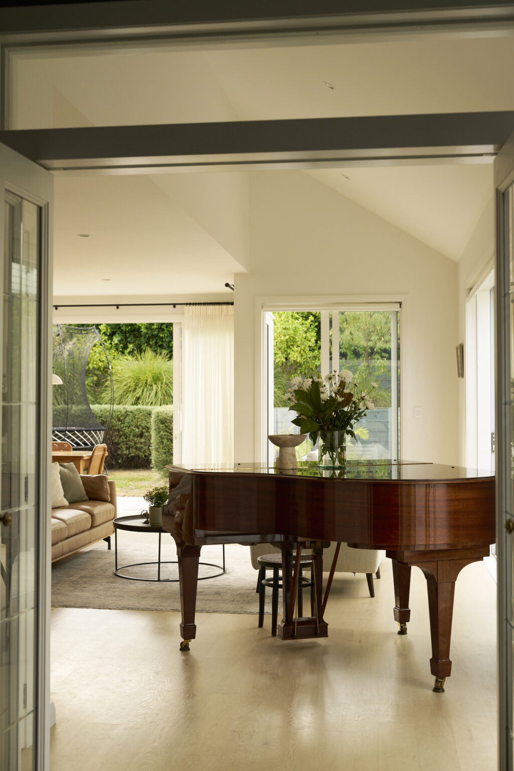
The clients’ traditional furniture brings deeper timber tones to the extension’s lighter material palette

Talk us through the plan and how the different spaces are organised in relation to one another.

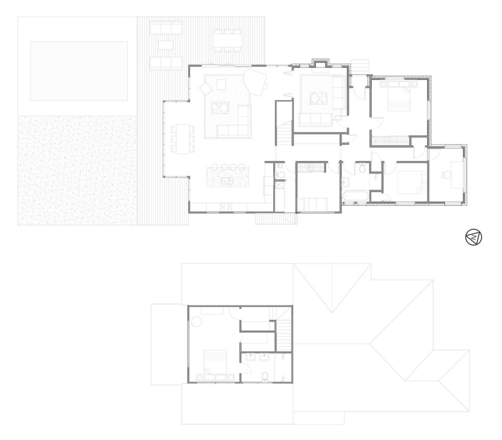
Function and flow were very important to the planning. The retained front door and entry hallway preserve the character of the 1940s home, with children’s bedrooms and the family bathroom opening from it. The staircase rises to the parents’ upper level, with their bedroom, walk-in wardrobe, and ensuite.

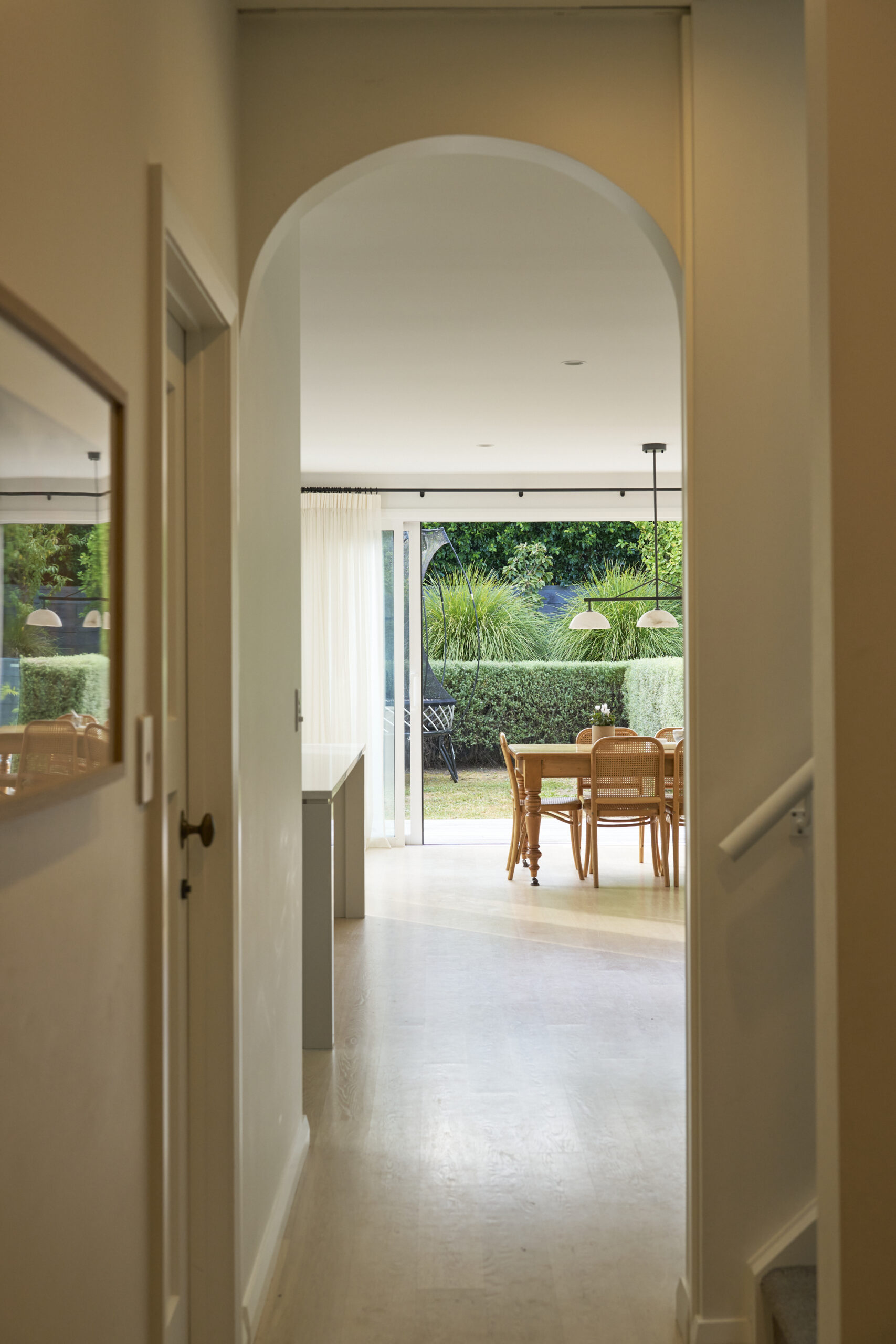
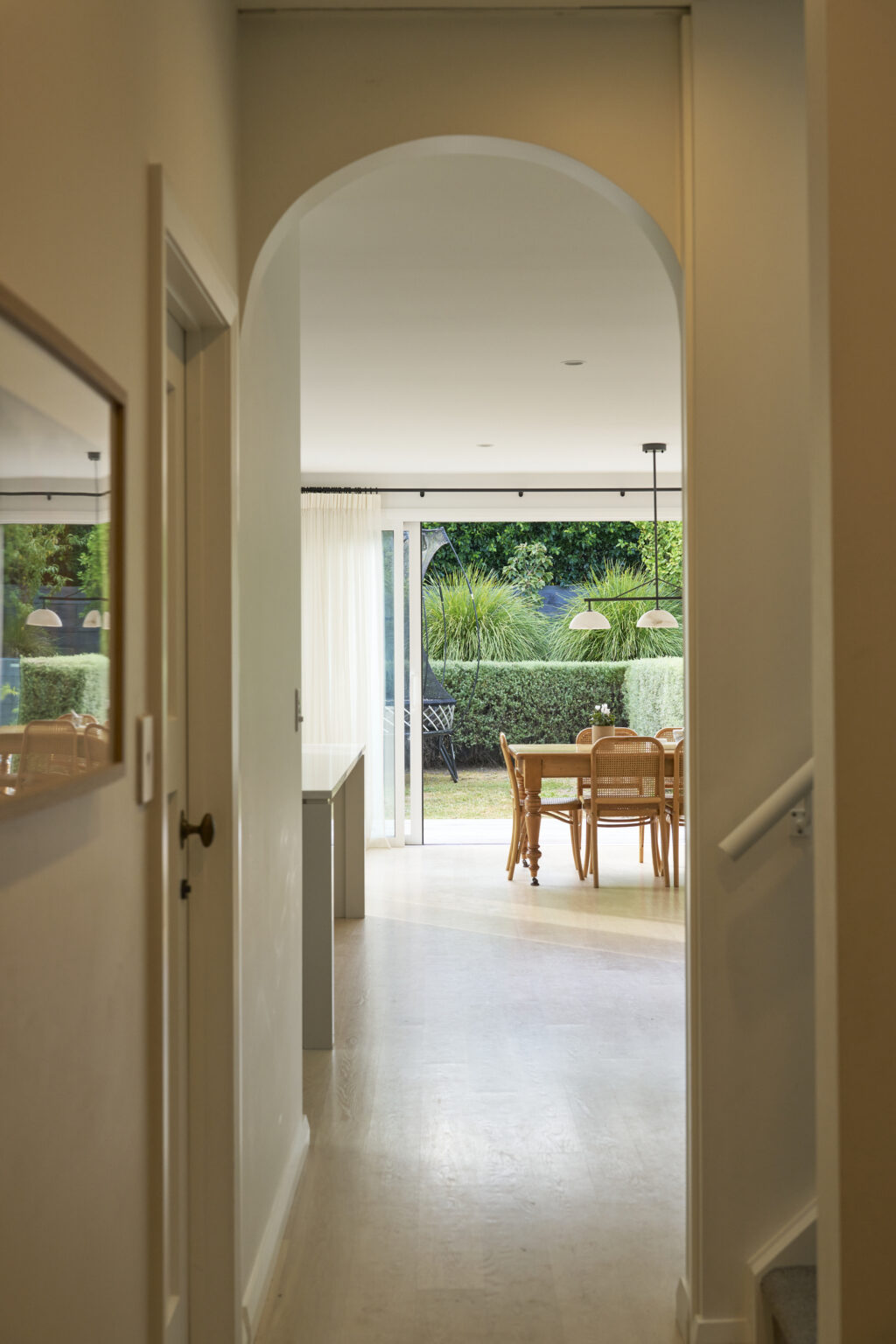
As you move along the hallway toward the addition, a series of arches marks your progression, leading you to the main living space. The proportions change here: the original house’s tighter, more cellular rooms give way to a generous open-plan kitchen and living area.

At the northernmost point, the dining room projects out to the garden. It functions almost like a lantern or sunroom, almost fully glazed to capture light from multiple directions throughout the day.

We also retained the original living room, with its fireplace and other original features, and turned it into the family snug and TV room. We sourced beautiful 1940s bifold doors with grid cut-glass detail for the opening between the original room and the new living space.

A sequence of curved arches marks the transition from the original 1940s architecture to the light-filled extension

How did you approach the relationship between the house and its landscape?

The garden is part of the experience of the extension. It gives the house greater depth than its physical footprint suggests, and its presence changes the sense of enclosure, light and scale throughout the day.

The pool sits in visual dialogue with the main living spaces, so the children remain in view as they swim. The garden, in turn, forms a green enclosure around the new rooms.

How did you consider natural light throughout the day and seasons?

Capturing natural light was fundamental to the design, especially given the clients’ strong desire to experience sunlight after previously living in a south-facing house. But this was balanced with the need for cross-ventilation and thermal control.

The extension has extensive glazing, supported by carefully positioned openings for ventilation and skylights that allow heat to escape. The windows on the kitchen back wall were introduced to extend depth and capture a cooler breeze when required.

More broadly, light was considered for its ability to change the character and mood of a space over time: where it falls, how it shifts from noon to 4 pm, and how its effects evolve with the seasons.

The restrained material palette gives that changing light somewhere to register – across walls, linen curtains – so the atmosphere of the rooms is never completely fixed.

The garden forms a green enclosure around the extension

What informed the external and internal material palettes?

The interior palette grew from the clients’ wish for a home that felt light, fresh, and peaceful. Instead of bold colour, we chose warm, pale materials that rest beside the greenery and pool beyond.

Soft linens, light-washed timber floors and warm-toned cabinetry are complemented by glazed Moroccan tiles in the kitchen. The intention was to create warmth and softness through the interplay of materials and their subtle temperatures.

The design also deliberately contrasts with the deeper timber tones of the clients’ traditional furniture. This lets the existing pieces sit comfortably within the new spaces without the interior feeling overly designed.

The restrained palette gives the architecture a quieter presence, letting light, texture, and the changing garden do more of the visual work. The richness comes from those less permanent qualities. Pale interiors, contrasted with the lush green garden, emphasise a lively sense of freshness.

Externally, keeping the original brick was essential, as it holds much of the house’s character. The new weatherboard element continues the thread of the later addition, while giving the extension its own identity.

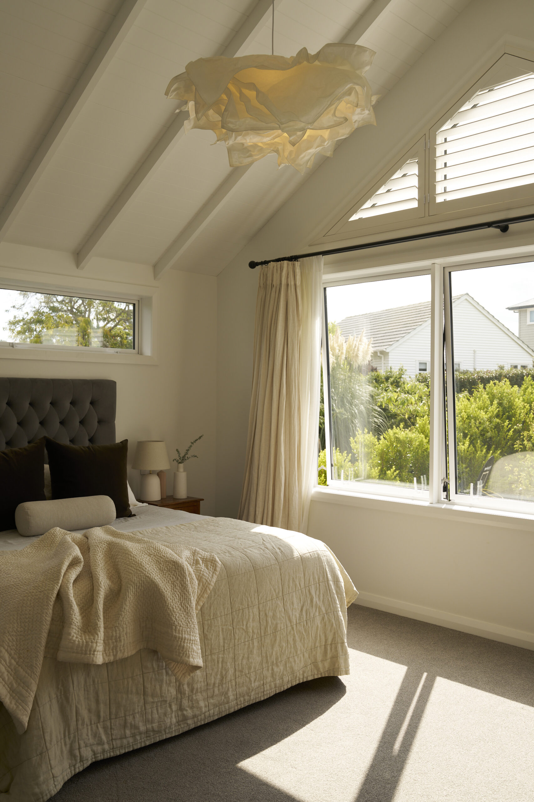
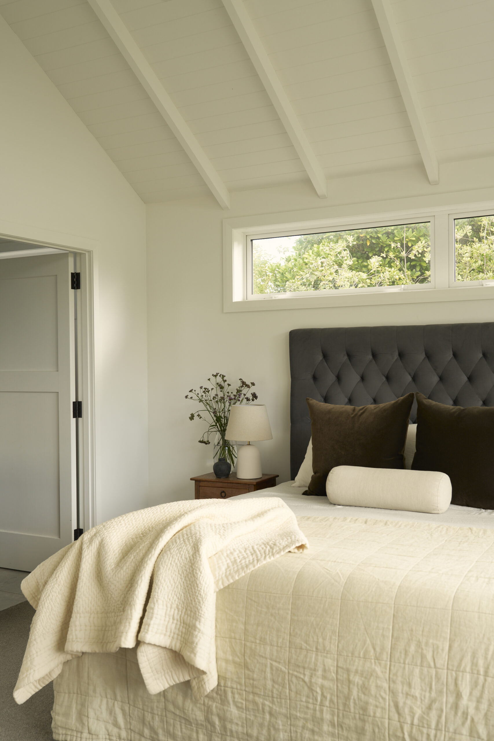
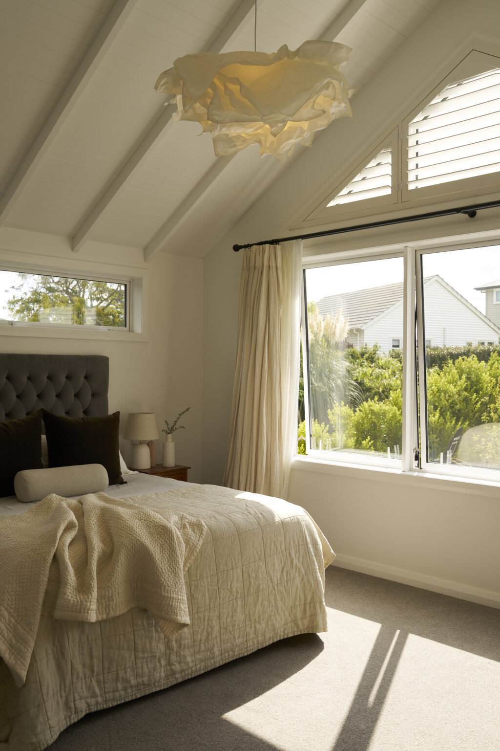
The upper level is reserved for the main bedroom and ensuite

Is there a particular space, detail, or moment that best encapsulates the original design intent?

The dining room perhaps best captures the project’s intent. It is unmistakably new, yet sits comfortably alongside the original house. Classical proportions and detailing create continuity, while its extruded, glazed form forges a new relationship with light and landscape.

For me, it also reflects the extension’s broader ambition: the new work does not seek to make old and new indistinguishable. Instead, each keeps its own character, yet both belong to the same house.

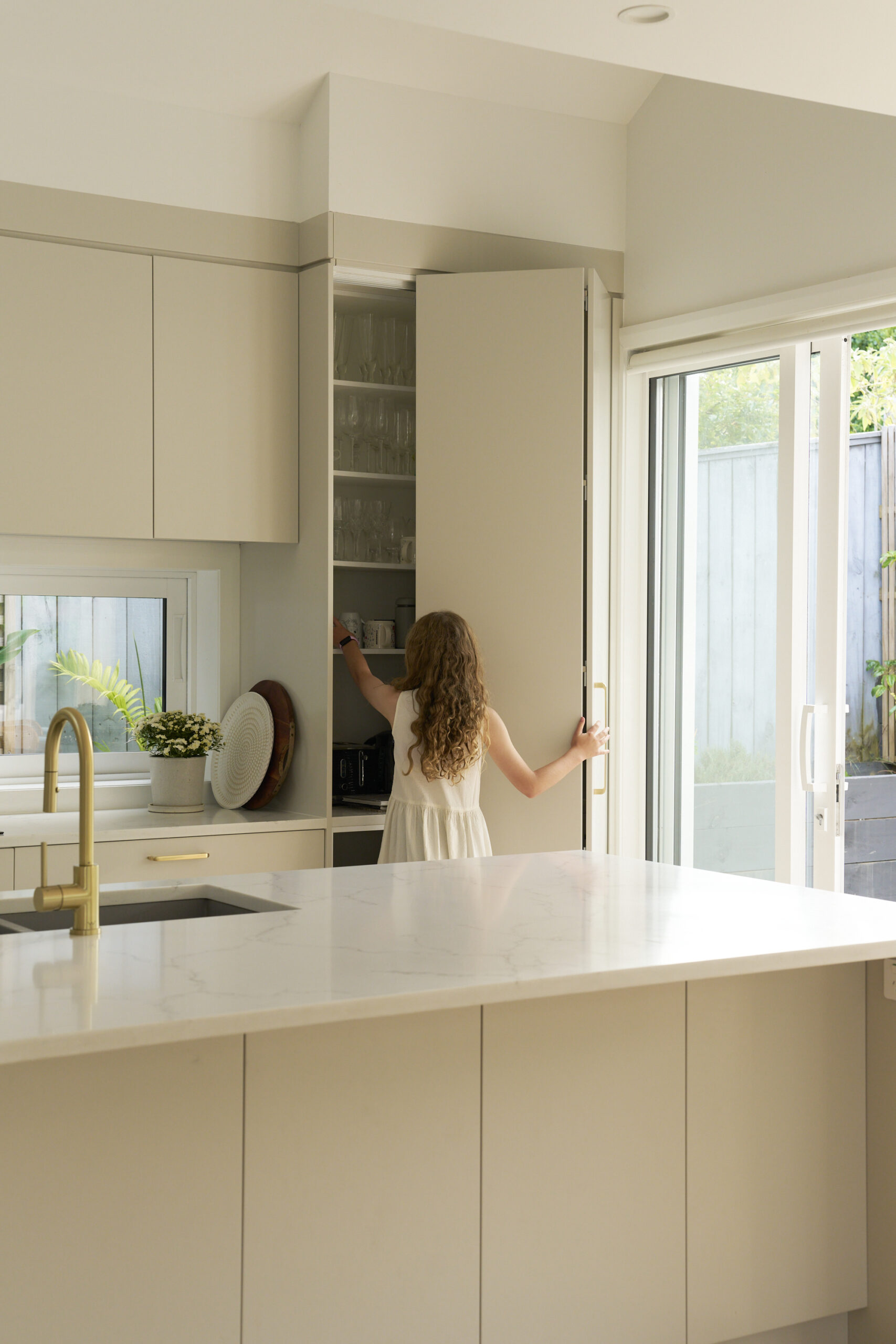
The kitchen embodies another key part of the brief. From here, the view opens to the garden’s wash of green, drawing the landscape into daily life. Together, these spaces capture what the clients sought most: light, space, warmth, greenery, and a sense that the house could open to the landscape without losing its original character.

Images: Tash Hopkins

Latest video features

In the Coromandel, a home with a humble profile and a thoughtful design makes the most of a stunning location.

Built with awe-inspiring attention to detail, this Arrowtown home is a fresh interpretation of a familiar Otago rural vernacular.

This sculptural Northland bach is a perfect north arrow on a remote farm high above the sea.

With the sun on its bow and the community at its stern, this is a house in which the elements are always front of mind.

Trending articles

Homes

Harapaki House by Piper Architects

A sequence of arches traces the evolution of this 1940s brick-and-tile home, leading from its original rooms to a generous, light-filled extension.