There is a particular kind of colour problem that hospitality designers rarely admit to: the room that already works.
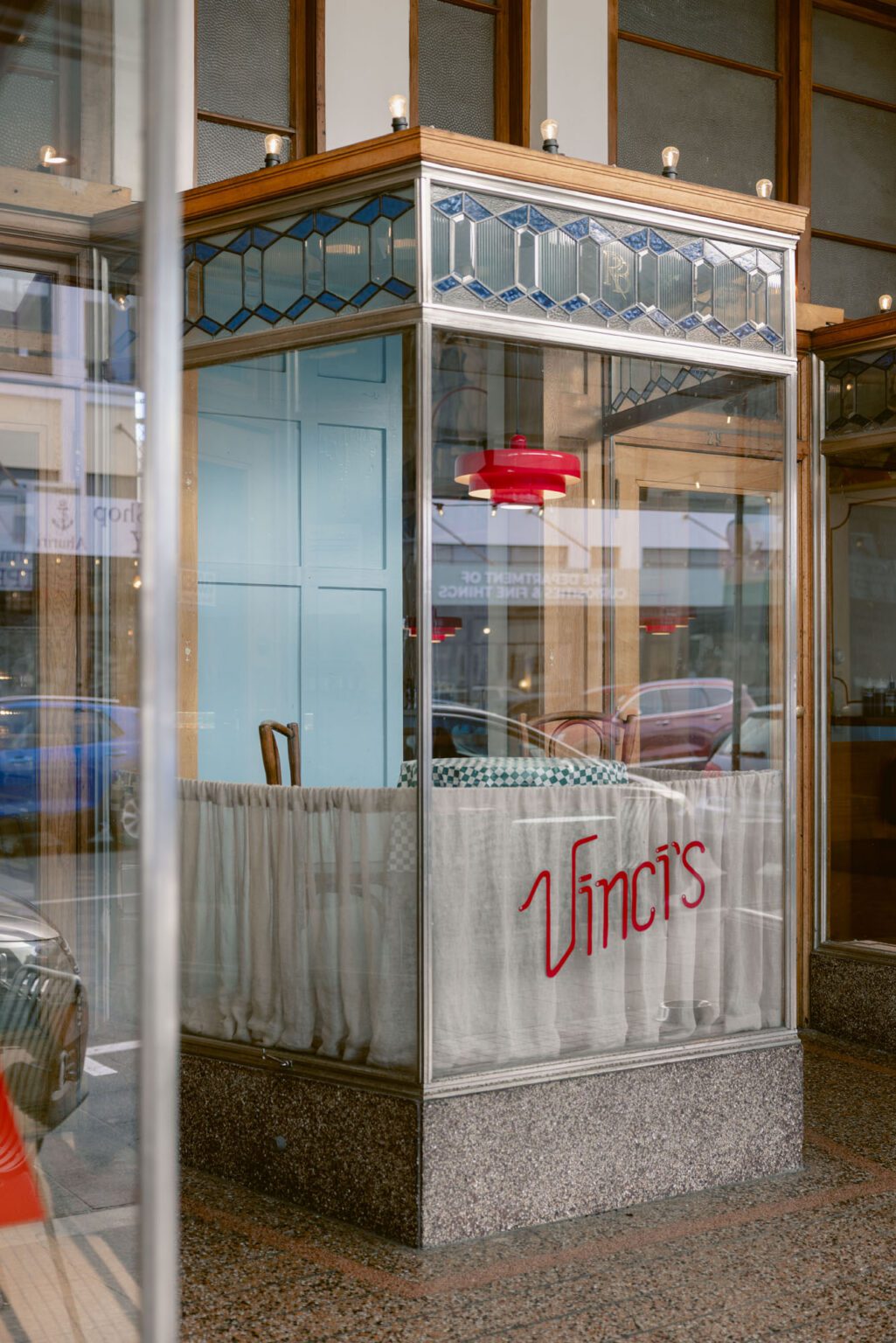
Vinci’s Pizza, housed in Napier’s 1932 Ringlands’ Building, had spent years accumulating an interior the way pizzerias of a certain vintage do, through murals, signage, wear and the daily choreography of feeding up to 1500 people. When the neighbouring tenancy became available and the floor space doubled, OTO Group’s task was not to invent a palette but to extend one, and the Resene colours specified across the project reveal how carefully that extension was managed.
The scheme’s logic begins with restraint. Resene Albescent White, a soft, creamy near-white, carries the interior walls, and it is a shrewder choice than it first appears. A starker white would have flattened the room and pushed it towards the generic; Albescent White instead has the faint warmth of aged plaster, the tone a wall acquires after decades of ovens, steam and conversation. In a heritage Art Deco interior, it reads as continuity rather than renovation. Against it, the room’s more assertive elements, the checkerboard floor, the timber booths, the murals, are given a ground that recedes without going cold.
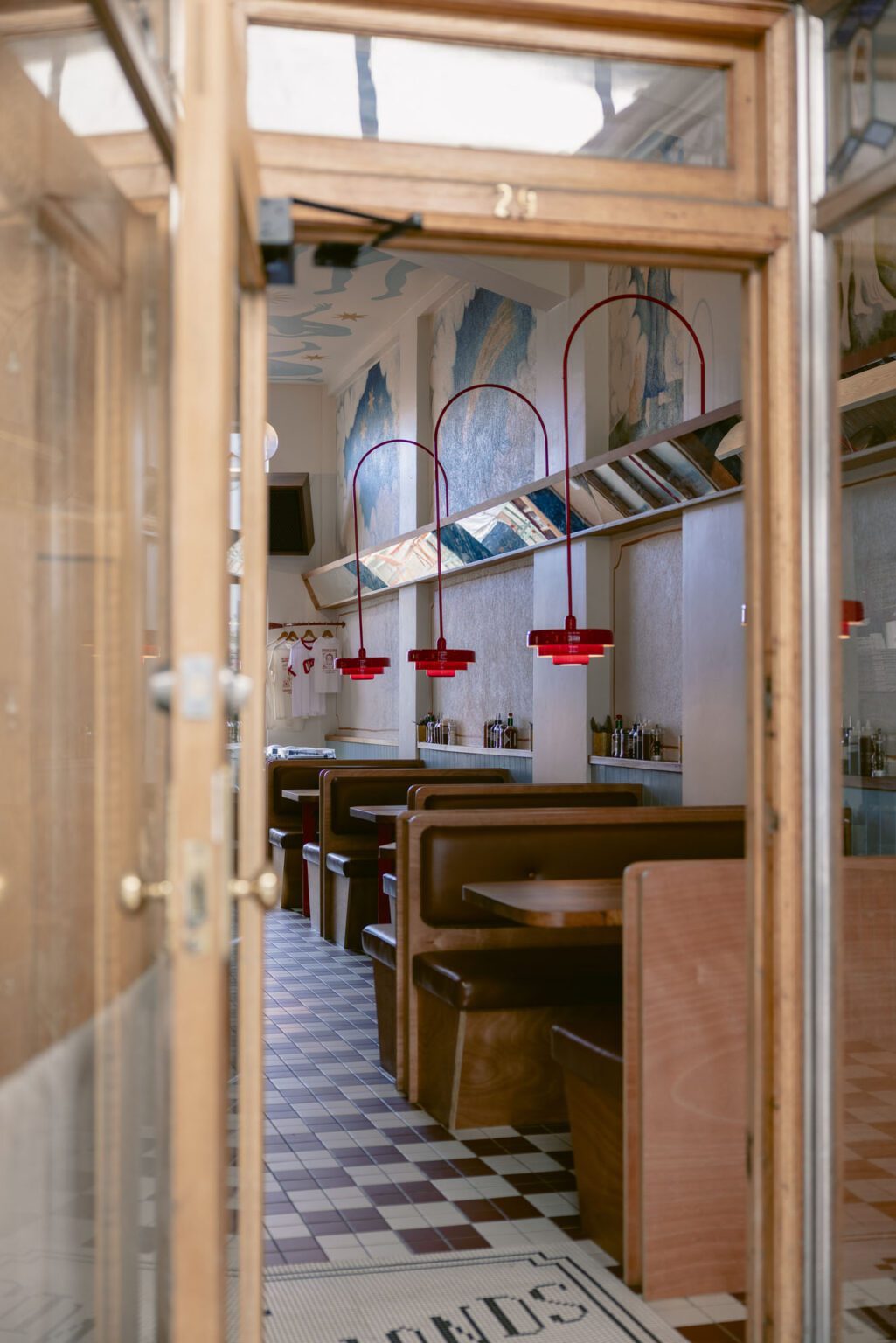
Those murals matter here. Painted by co-owner Nina Michaelsen, they are the emotional centre of Vinci’s, and the wider palette was derived from them rather than imposed upon them. Their skies and figures find a formal echo in Resene Altitude, a clear, buoyant blue that lifts the upper reaches of the room and keeps the interior from tipping into the brown-and-red heaviness that afflicts so many trattoria homages. Altitude does the work that blue always does in Mediterranean-inflected rooms, suggesting daylight, coastline and air, but in Napier, a city that faces the Pacific rather than the Tyrrhenian, the allusion lands locally.
This is the project’s quiet trick throughout: it borrows the grammar of the traditional pizzeria, the checked floor, the red signage, the painted walls, and conjugates it in a Hawke’s Bay accent.
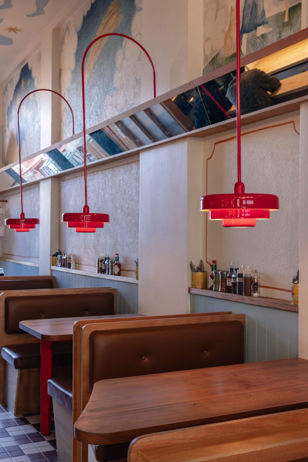
Red is the palette’s protagonist, taken from the original terrazzo in the entranceway and carried through the scallop-edged kitchen canopy, the custom booth lamps and the branding’s play on the Italian checked tablecloth. It is, tellingly, the one colour in the scheme that resists tidy specification, a hue that has evolved with the restaurant itself.
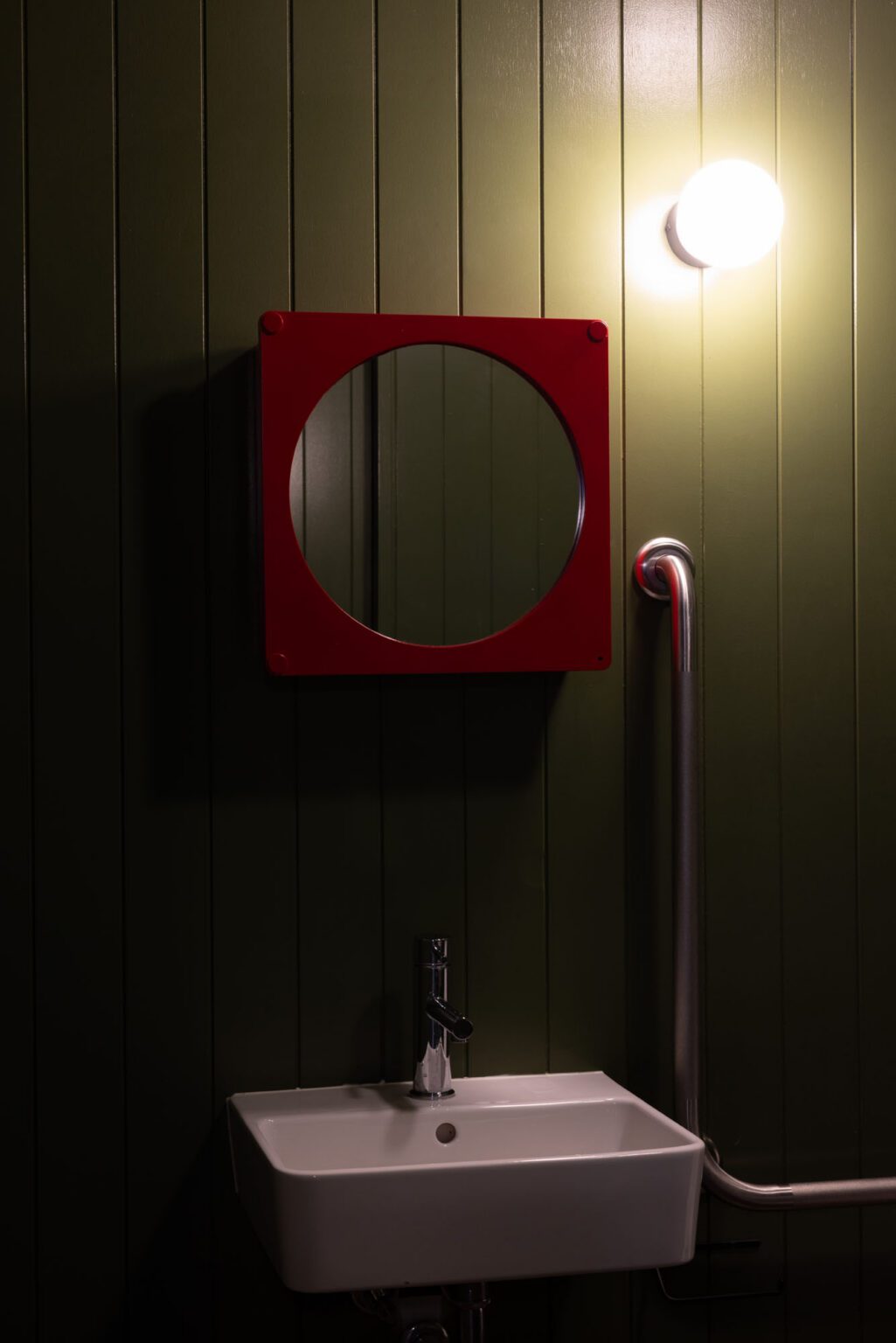
The Resene colours around it are calibrated as its supporting cast. Albescent White gives it a warm field to blaze against; Altitude offers the complementary coolness that stops it from overheating; and the deep, pastoral green of Resene Clover, deployed in the toilets, supplies the third leg of the flag, a knowing nod to the Tricolore delivered where guests least expect wit. Clover is no novelty green, though. Dark, olive-edged and calm, it turns the smallest rooms in the building into moments of compression and release, intensifying the return to the bright, busy dining floor.
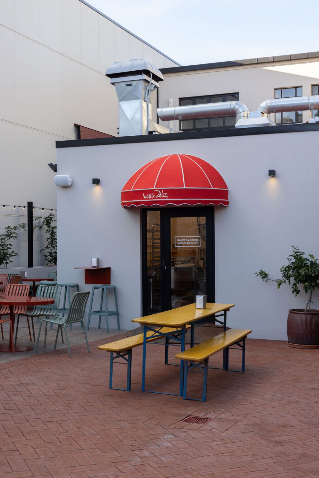
Contrast is managed with the same discipline. The relocated central kitchen, staged beneath its red canopy and lit brightly from within, becomes the room’s theatre; the surrounding dining areas sit in a lower, moodier register. Colour supports this hierarchy rather than competing with it, the pale walls catching and diffusing the kitchen’s glow while the darker joinery and floor pull the perimeter into intimacy. Diners read the room’s drama instantly, without ever being told where to look.
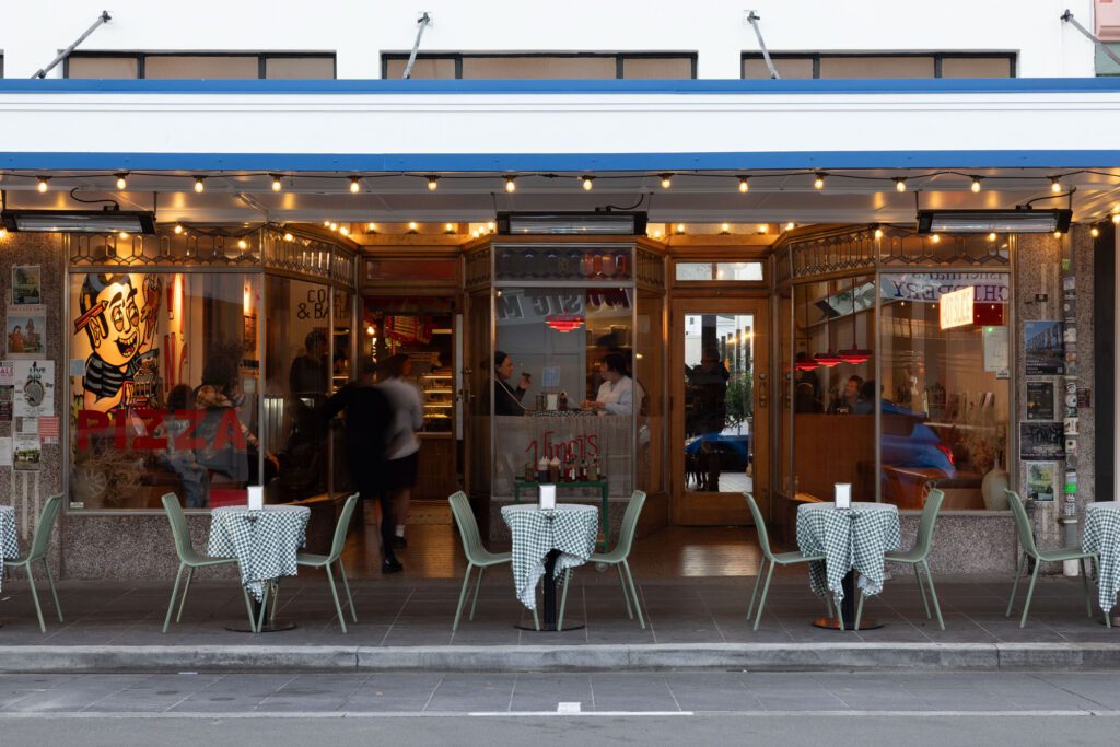
Pattern does much of the vibrancy’s heavy lifting, and the paintwork is what allows it to. The checkerboard tiling underfoot, the geometric lead-light motif above the shopfront glazing and the rhythm of the booths could easily have produced visual noise; held between Albescent White walls and the ordering warmth of oak and terracotta, they instead produce energy. It is the difference between a room that shouts and a room that hums.
The pragmatic colours are handled with equal intelligence. Resene All Black over the dish-washing area is a frank piece of back-of-house realism, absorbing the least photogenic zone of any restaurant into shadow. Outside, Resene Half Napa lends the exterior a gentle, stony neutrality, while Resene Alabaster, that popular New Zealand near-white with its slightly greyed edge, crisps the soffits without glare. Together they let the Ringlands’ Building’s Art Deco frontage, and Vinci’s recessed lead-light shopfront, remain the street’s protagonists.
What the Resene palette achieves at Vinci’s, finally, is tonal honesty. The judges’ citation praised the project for revealing and amplifying an identity rather than imposing one, and the colour strategy is where that principle is most legible. Nothing here is trend-driven; nothing is nostalgic pastiche either. The scheme takes the happy, saturated language of the neighbourhood pizzeria, red, green, white, sky blue, and grounds it in the specific light, heritage and murals of one Napier room. The result is a space that feels as though it was always going to look this way, which is, of course, the hardest colour outcome of all to engineer.
Colours used: Resene Albescent White (interior walls), Resene Altitude (murals), Resene Clover (toilets),
Resene All Black (dish-washing ceiling), Resene Alabaster (exterior soffits), Resene Half Napa (exterior)