Vivid hues: The colours of Milan

The colour of Milan, in Dulux colour specialist Davina Harper’s opinion, is burgundy. “We saw burgundy being used widely as an accent colour, along with berry reds and mulberry tones.”

Of course, it wasn’t just one colour that piqued Davina’s interest, it was the wider themes that emanated; a marked move away from minimalism and an embrace of bold, very personalised combinations — a tailoring of spaces to add playfulness and character.

A pairing of green, soft blue, and lilac at Muuto's 'The Artful Home'.

“What really stood out was the unexpected colour pairings. Green and lilac, for example, is an unusual pairing — Muuto was a great example of this.” The brand presented a Scandinavian perspective on a Milanese apartment entitled ‘The Artful Home’; six rooms exploring spatial identities where art, architecture, design, and nature converge to create a distinctive universe of colour, light, material, and tactility — an invitation to experience the way colour affects body and mind individually.

Baxter's 'The Clay House' installation.

“We saw a lot of green, as well as greens and blues paired together. Burgundy with soft blue was another pairing that felt fresh and different.” Baxter presented ‘The Clay House,’ described by the brand as: “It’s an architecture of raw earth. With a Mediterranean flavor. A caravanserai, a place of hospitality and encounter in a desolate and distant imaginary.” Here, burgundy met blue, orange, and creamy neutral accents in an immersive spatial experience.

Moooi's 'A Life Extraordinary' installation.

In contrast, Moooi presented a warm palette of pared-back neutrals underpinned by beautiful pattern and texture. “Pale greys and neutrals were interesting, and quite different to the bold, dark palette they presented last year — an embrace of soft, protective colours. Neutrals in general this year were still quite warm with lots of buttery, soft tans, and warm browns. However, we also saw soft greys coming through, which is probably a reflection of the global economic uncertainty we’ve been experiencing.”

Vivid green and blue pairings featured in the 'Shape Rugs' collection from Moooi.

The annual Dulux Colour Forecast will be released in late August; an in-depth consideration of these global trends and the colours we’ll be seeing in the local design landscape in the year ahead.

dulux.co.nz

Latest video features

In the Coromandel, a home with a humble profile and a thoughtful design makes the most of a stunning location.

Built with awe-inspiring attention to detail, this Arrowtown home is a fresh interpretation of a familiar Otago rural vernacular.

This sculptural Northland bach is a perfect north arrow on a remote farm high above the sea.

With the sun on its bow and the community at its stern, this is a house in which the elements are always front of mind.

Trending articles

Design News

From Art to Object

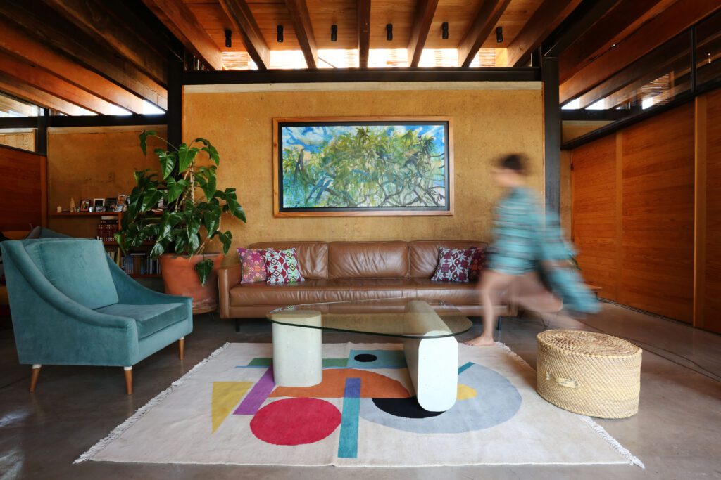
Two sisters — a creative director and an artist — have launched a new studio, bringing painterly abstraction into the tactile realm, with handwoven rugs

Architecture For Sale

The Crescent

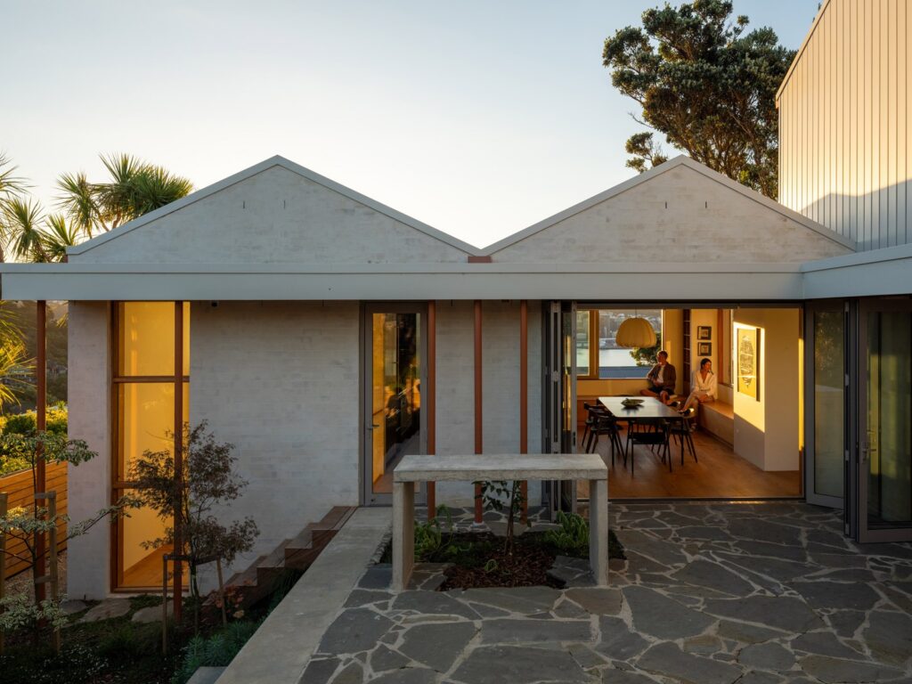
An award-winning Roseneath home, now for sale, unfolds across five levels — where crafted materiality and calibrated views shape a composed, enduring response to the

Homes

Modernist Bunker Residence

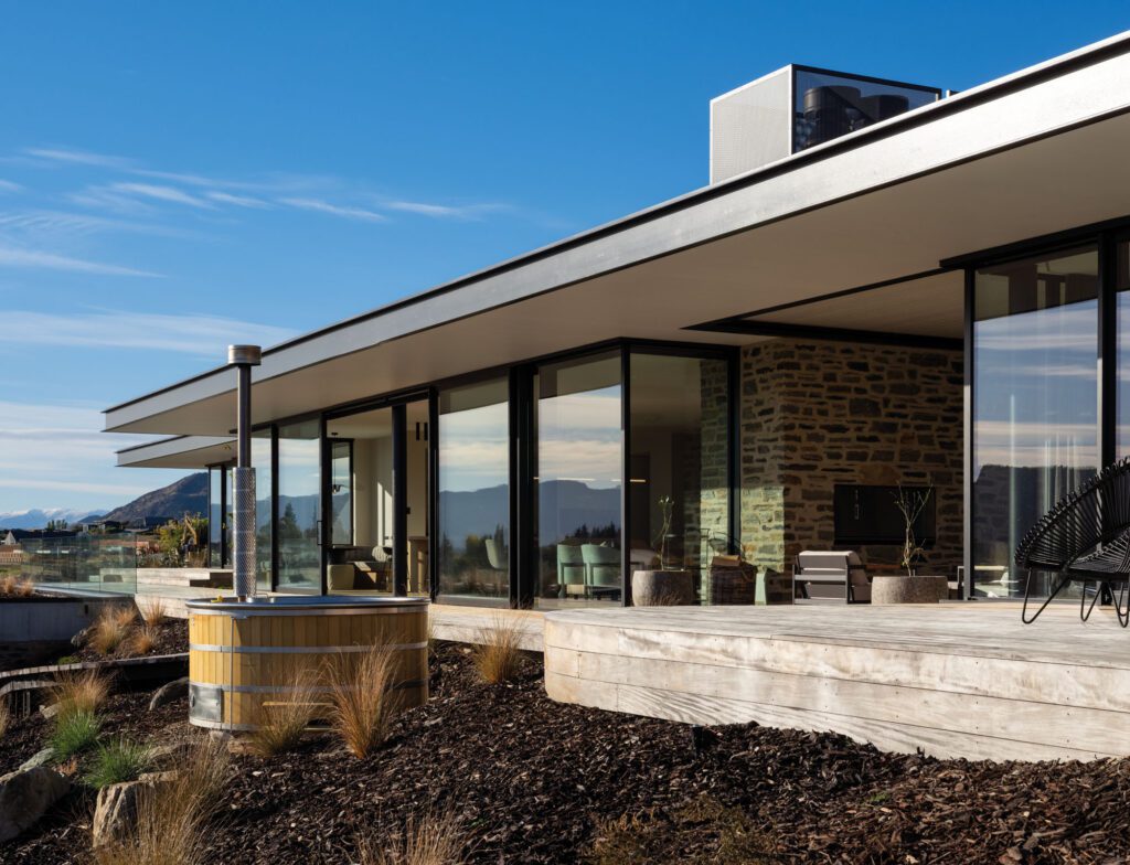
A low-slung, linear form recessed into the foothills of the Southern Alps. A semi-subterranean minor dwelling, and a family home that creates a strong and

Design News

Social Gallery: Home of the Year 2026

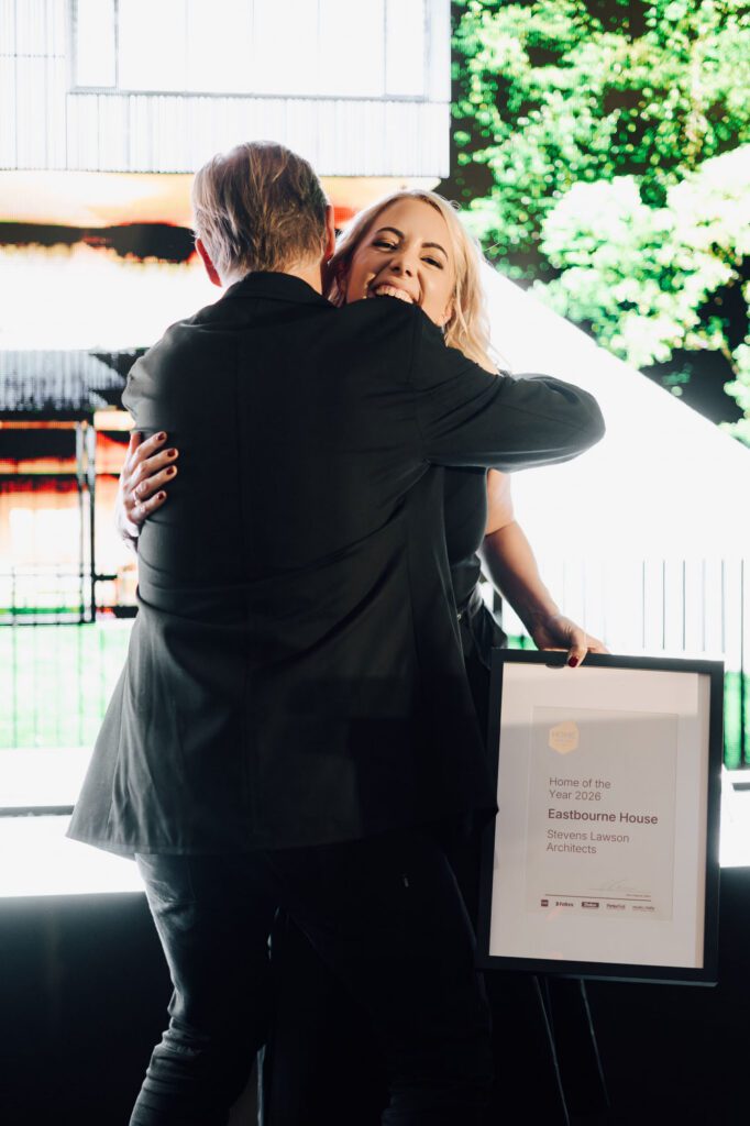
More than 200 architects, designers, suppliers and homeowners gathered in Auckland to celebrate this year’s Home of the Year — an evening that brought together