In a fittingly colourful gala event, the winners of the prestigious 40th Dulux Colour Awards celebrated the milestone occasion at the Sydney Opera House. Here are the standout New Zealand projects.
The symbolic moment honoured four decades of awarding exceptional colour use in the built environment, as well as the extraordinary winning projects chosen from a record number of entries across New Zealand and Australia this year.
“Our long-running Dulux Colour Awards are regarded as a benchmark in the design industry, unique in recognising colour as an integral design tool,” says Dulux Colour & Design Specialist Davina Harper. “For forty years, the awards have championed the transformative power of colour across New Zealand and Australia. Over the past fifteen years, New Zealand has also helped showcase how thoughtfully colour can elevate architecture and shape spatial experience.”
Critically, the Dulux Colour Awards have constantly evolved, introducing new categories and attracting increasing numbers of entries as the significance and prestige of the programme has grown since its inception in 1986.
“The calibre of the New Zealand projects continues to evolve, reflecting a growing confidence and sophistication in the way colour is being used,” says Harper.
“Across this year’s winners, we’re seeing colour applied with real intent – not as an overlay, but as a foundational design tool that shapes mood, identity and spatial experience. These projects demonstrate a deep understanding of context, drawing from landscape, materiality and personal narrative to create outcomes that are both expressive and highly resolved.”
This year’s Grand Prix winners are demonstrable exemplars of the evolution of the awards programme. Vastly different, their strategies embody opposing concepts – one minimal, one maximal – highlighting the versatility of colour as an architectural device.
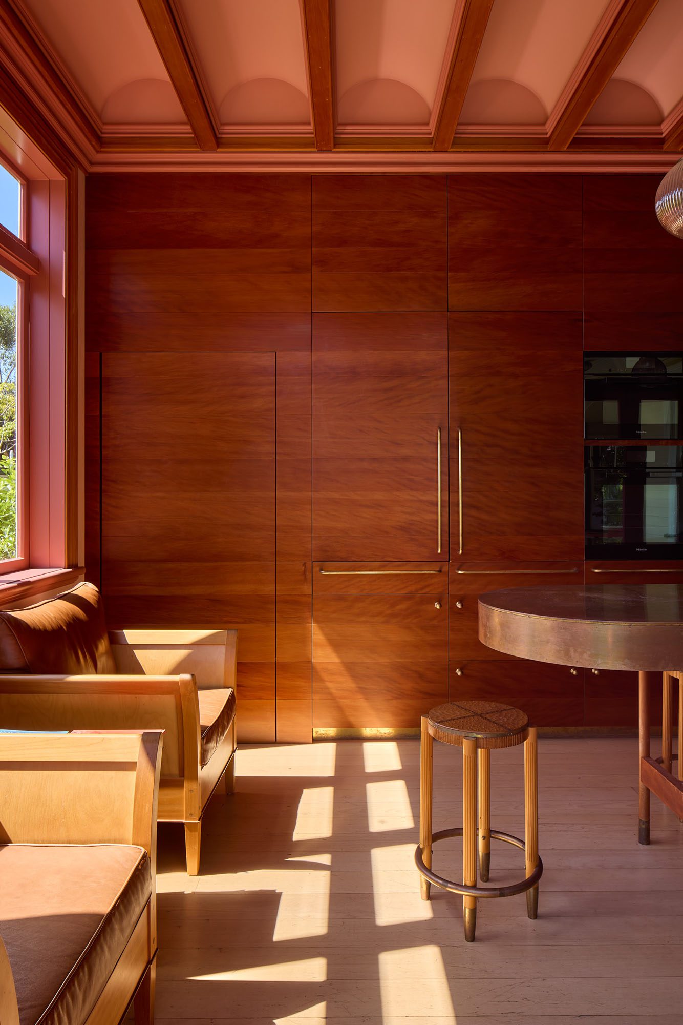
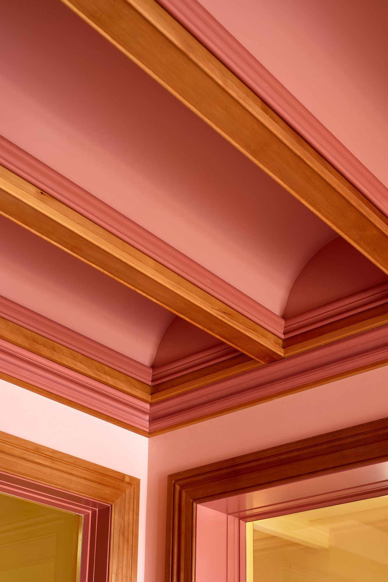
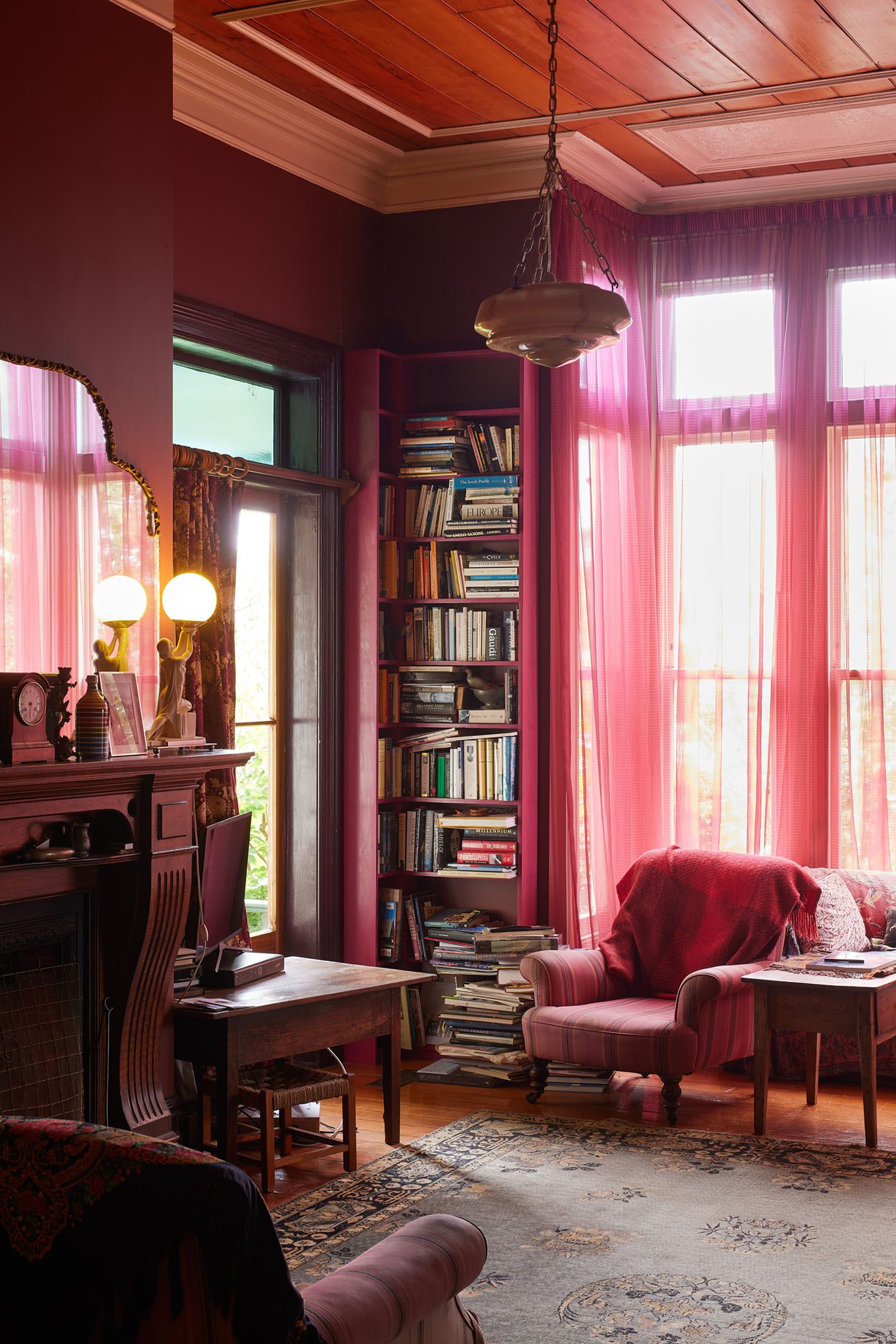
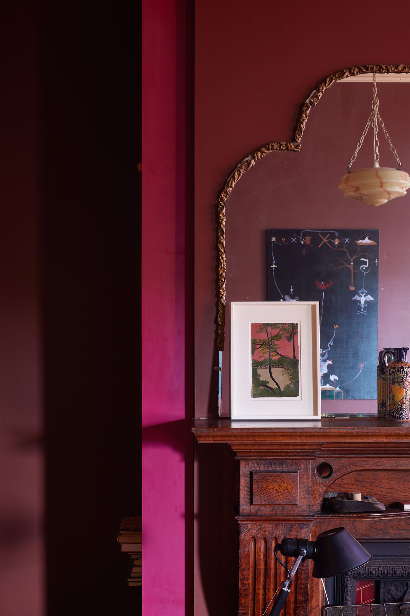
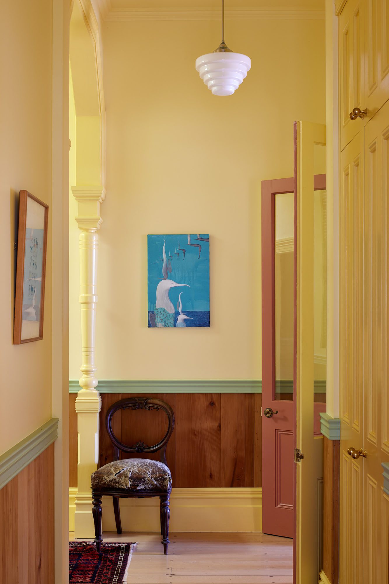
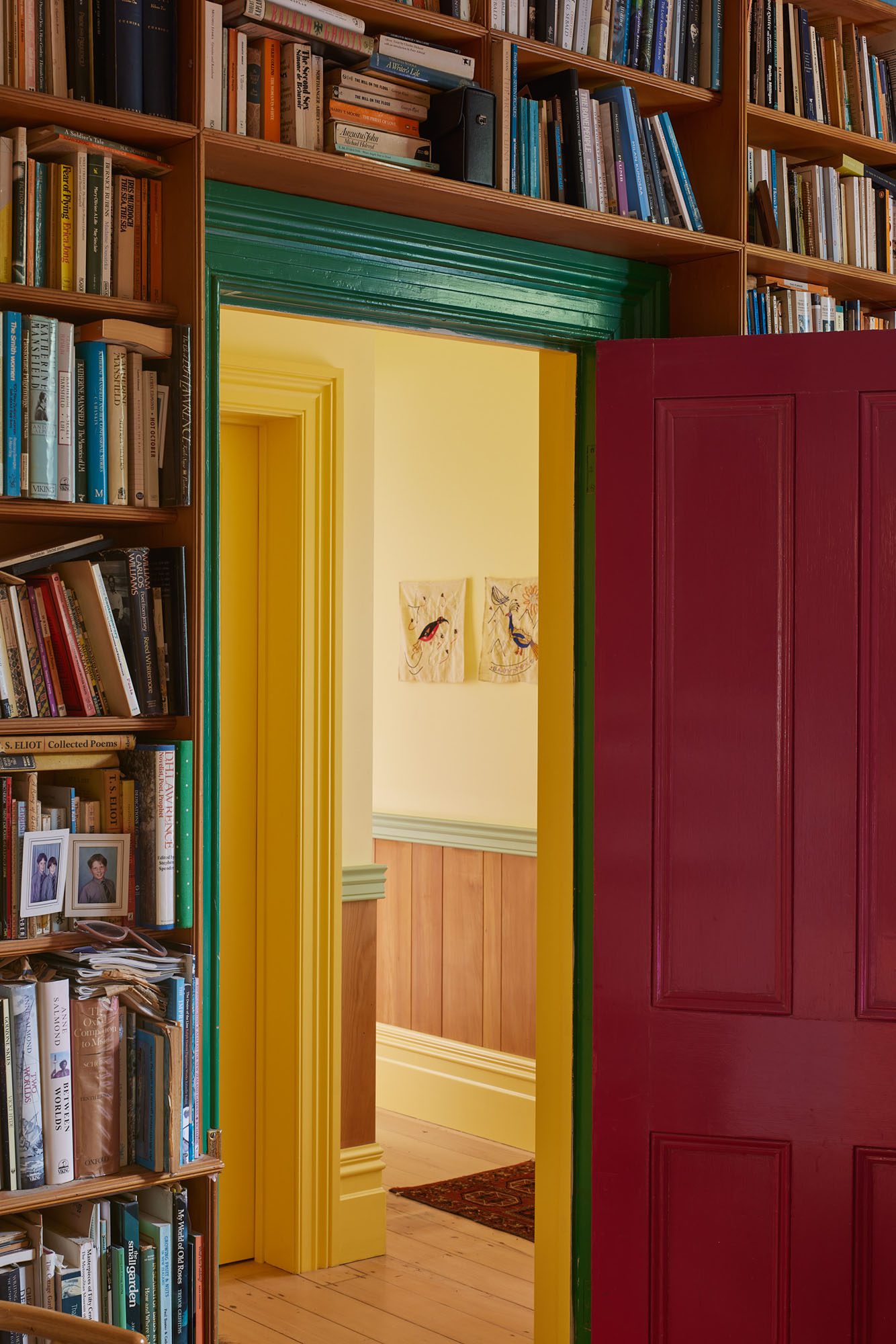
The New Zealand Grand Prix–winning Waka Huia by Pac Studio, reveals itself as a kaleidoscopic tapestry of colour which beautifully embodies the clients’ personal history within a harbourside home, resplendent with art, original architectural details and precious memories. It is the breathtaking result of the architects’ deep understanding of the theory, their conviction, and capacity to collaboratively create a scheme of saturated colour.
Grand Prix NZ: Waka Huia by Pac Studio
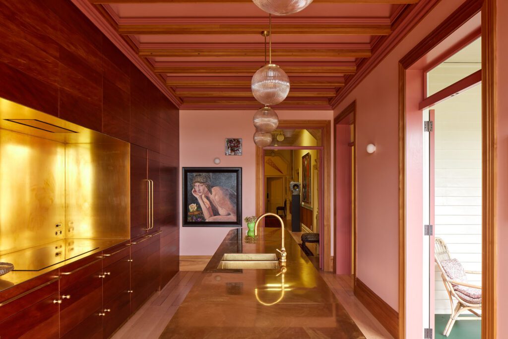
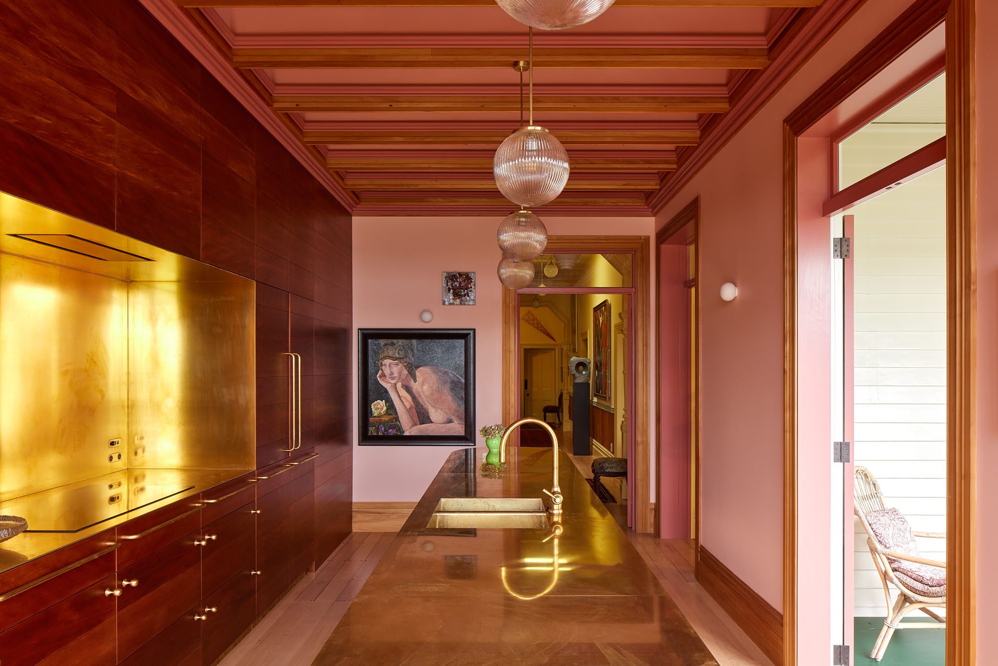
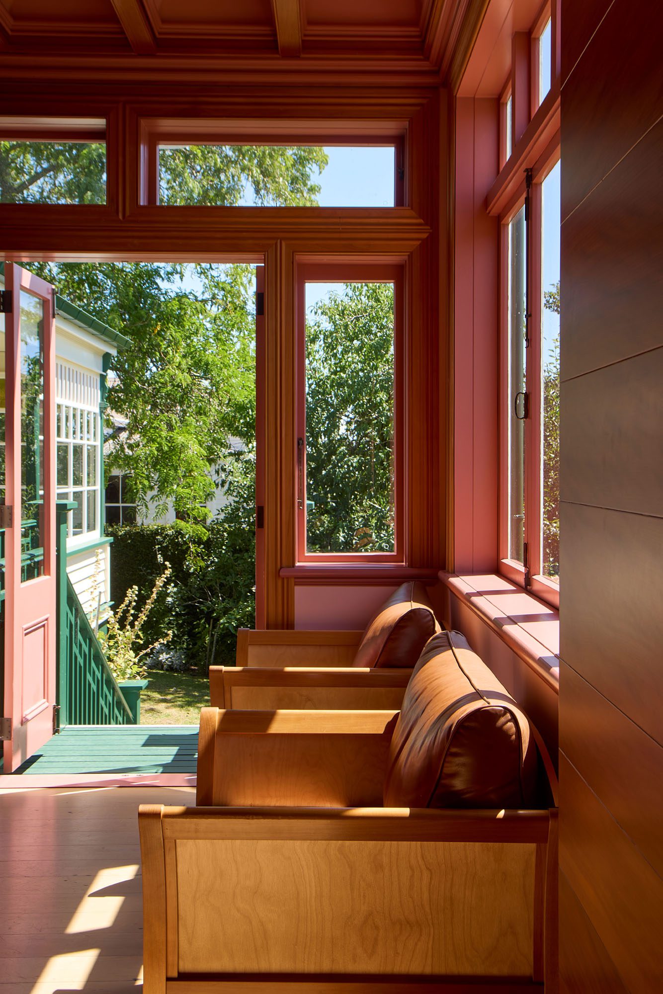
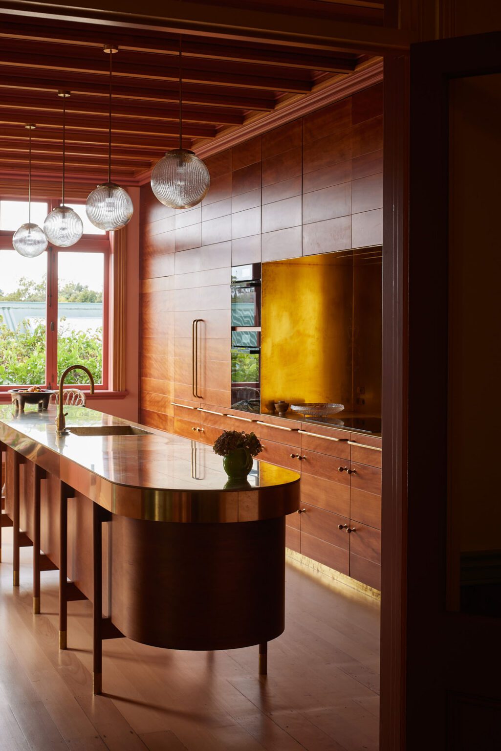
Layered with family history and enriched by a remarkable collection of artworks and artefacts, this villa renovation on Auckland’s harbourside made a compelling impression from its earliest stages. The completed home is an immediate standout creating a moment of genuine awe.
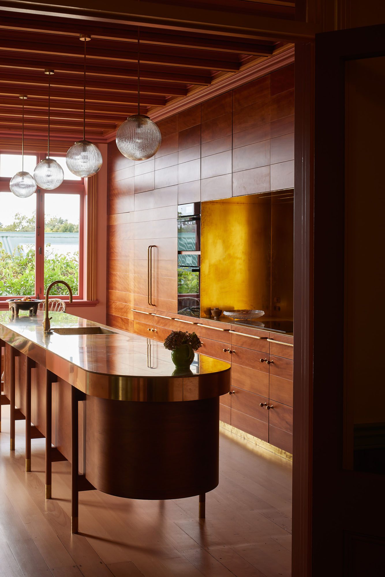
Colour is deployed with confidence and precision, working in careful support of exceptional craftsmanship to create a richly resolved outcome across detail, materiality and finish. The ambitious palette is expressed through intricate applications, considered colour blocking and unexpected tonal juxtapositions, that highlight both the close collaboration with the clients and the architects’ nuanced decision making, creative clarity and technical expertise.
In the kitchen, walls and vaulted ceiling are drenched in soft pinks (Dulux Bluff Hill and Tokatoka) that sit comfortably alongside warm brass surfaces, while the hallway, a connective spine through the home, becomes a luminous yellow (Dulux Solar) backdrop for even more art.
The project demonstrates how colour, when handled with restraint and intent, can bring together diverse elements with confidence and sensitivity. Within a New Zealand context, this work stands as a rare and highly advanced example of colour performing alongside architecture as an equal contributor to the quality of the living environment. Strikingly contemporary, yet deeply rooted in memory and meaning, the home is quietly joyful, expressive and enduring.
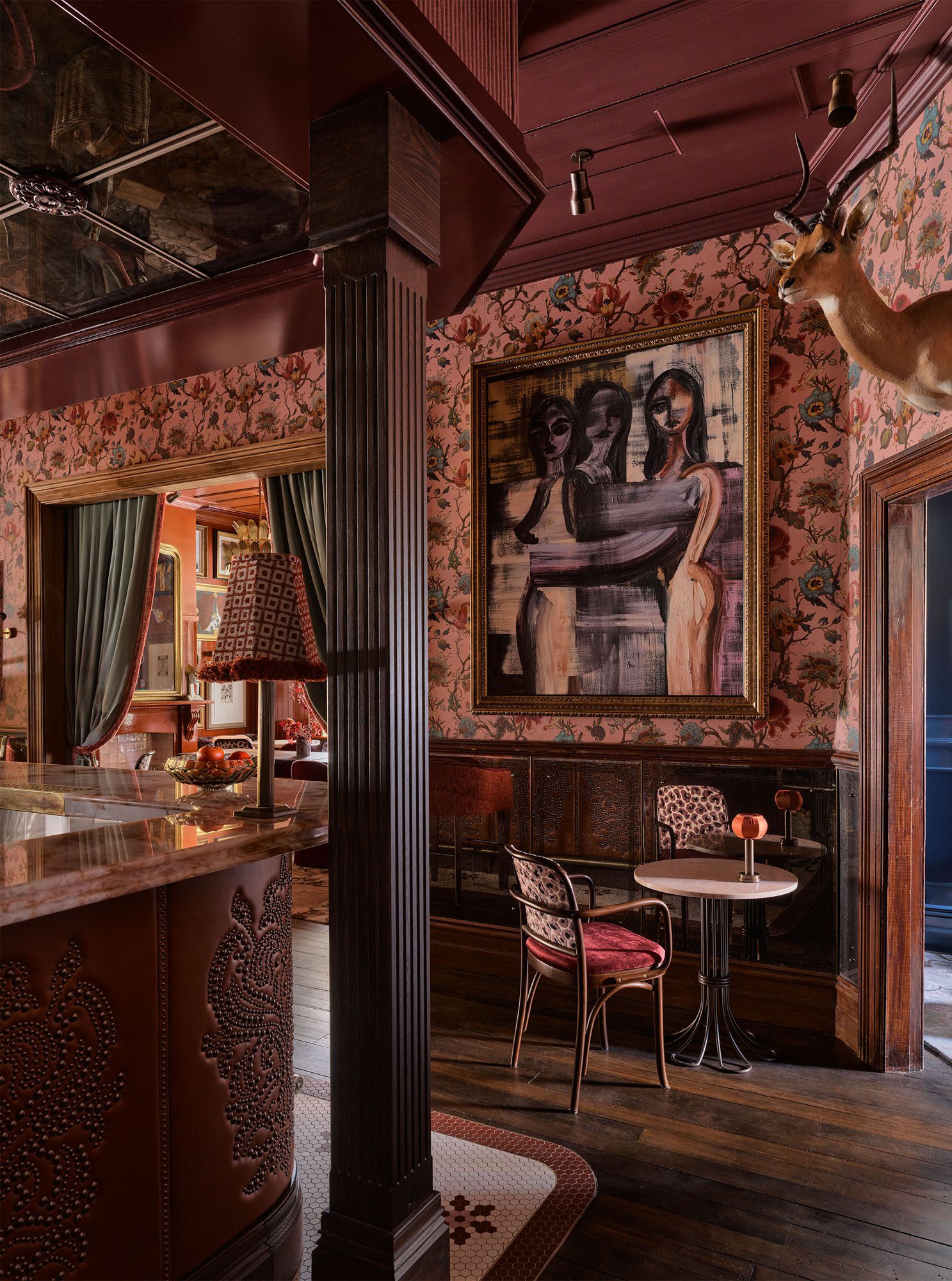
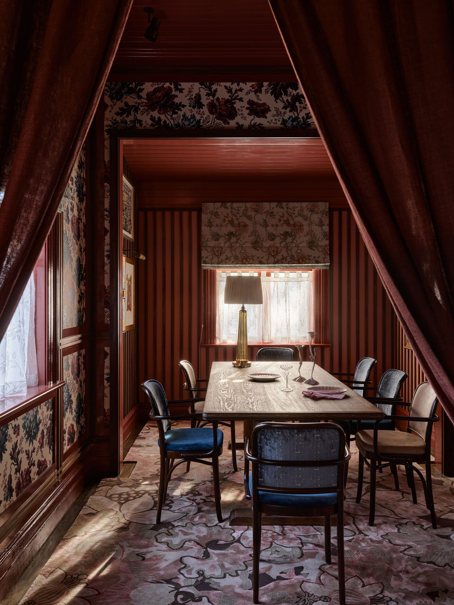
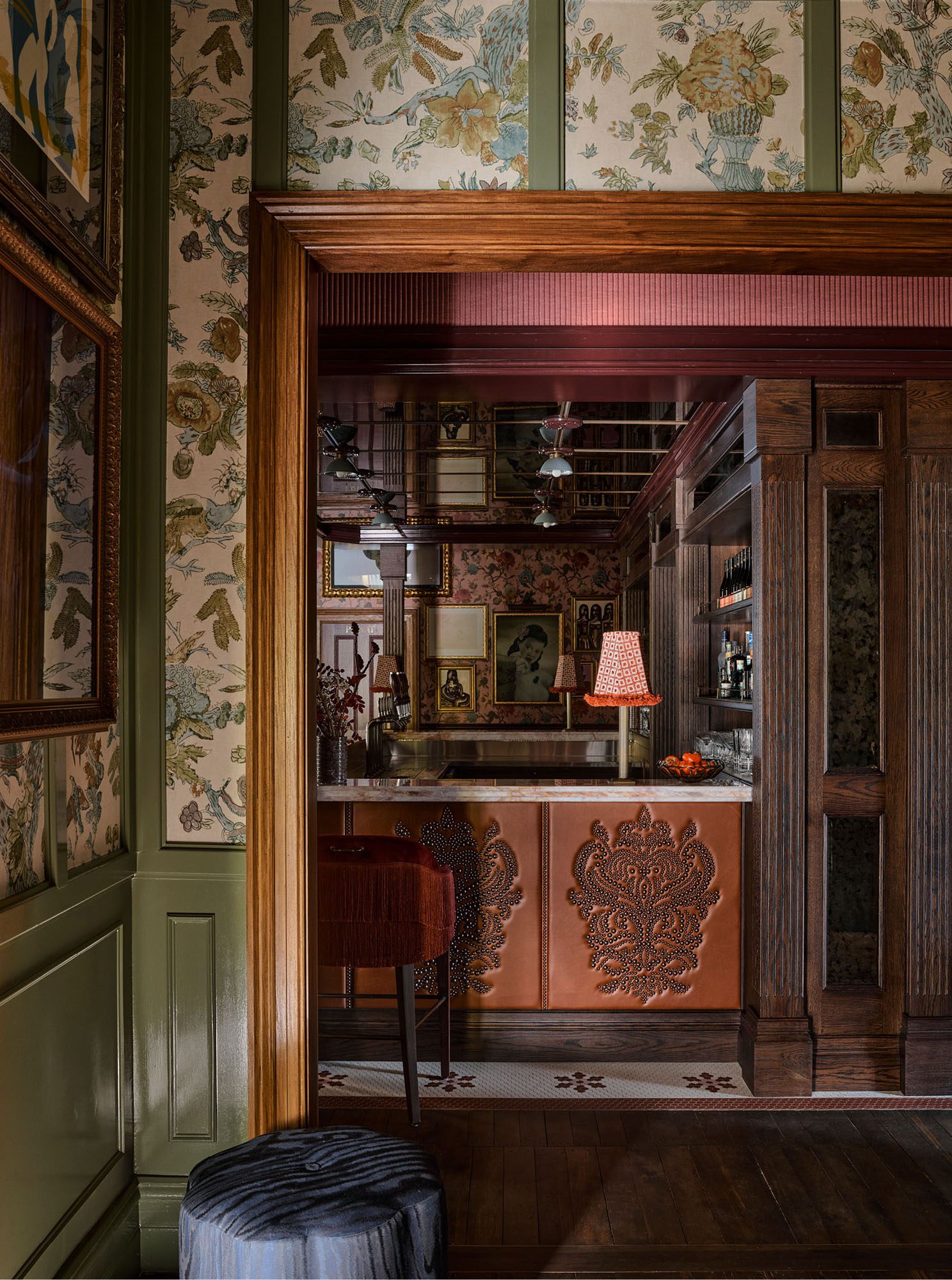
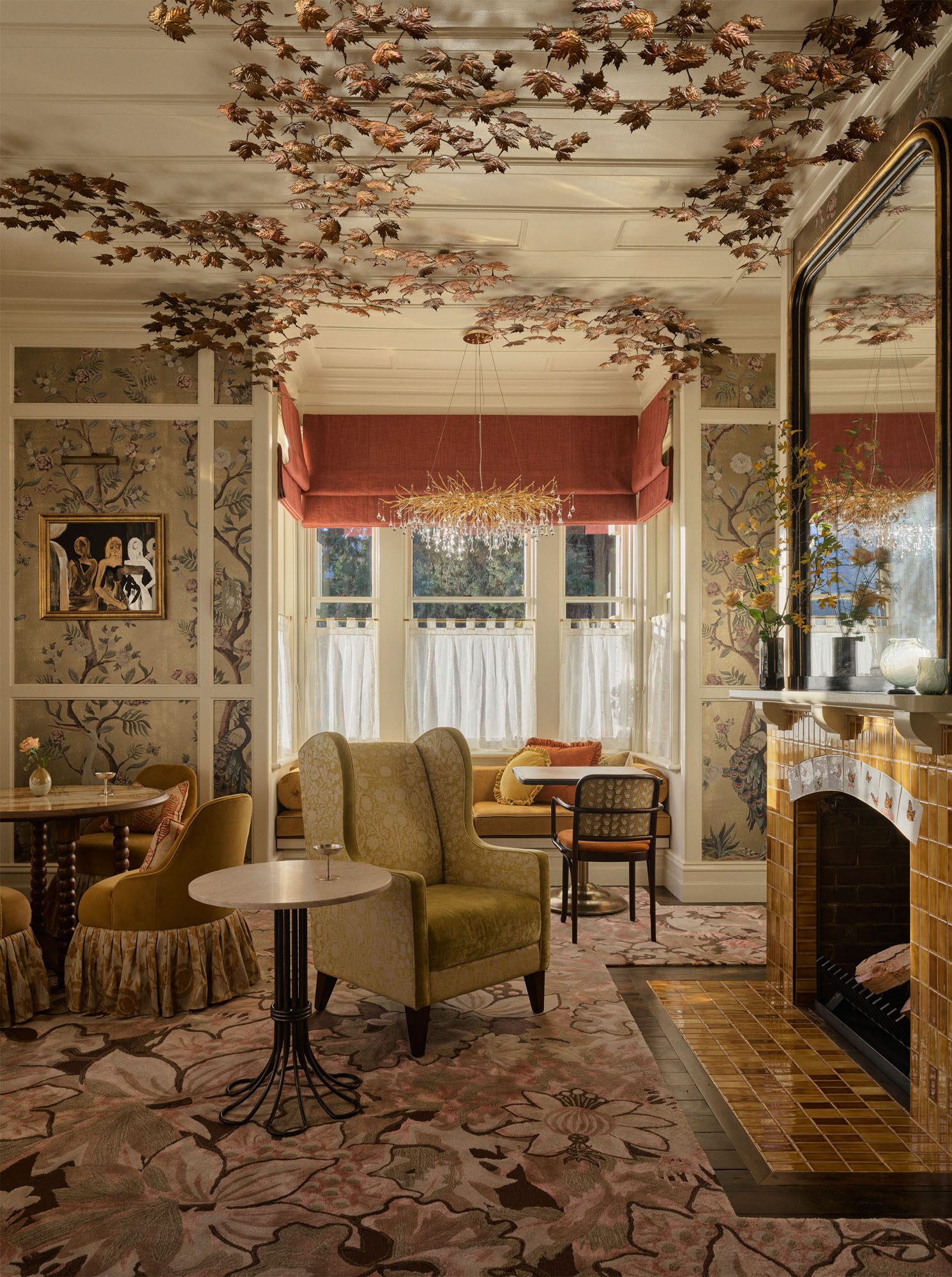
Commercial Interior – Public & Hospitality Winner: Billy’s Ayrburn by SA Studio and Alexander &CO
Judges’ comments by Simone Haag:
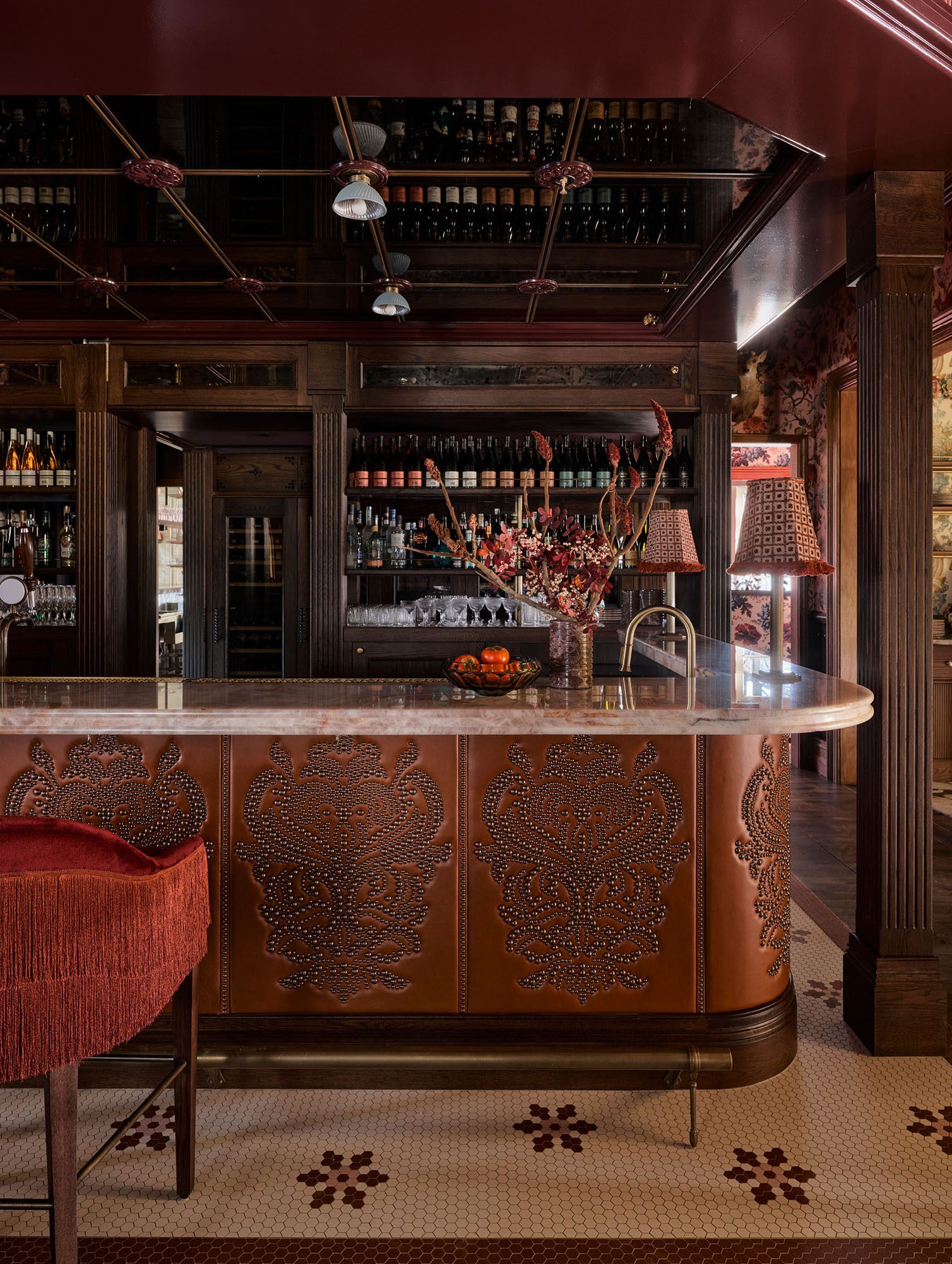
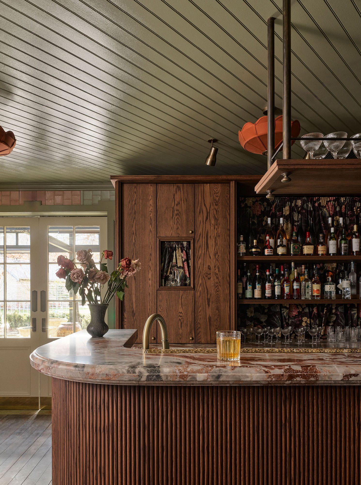
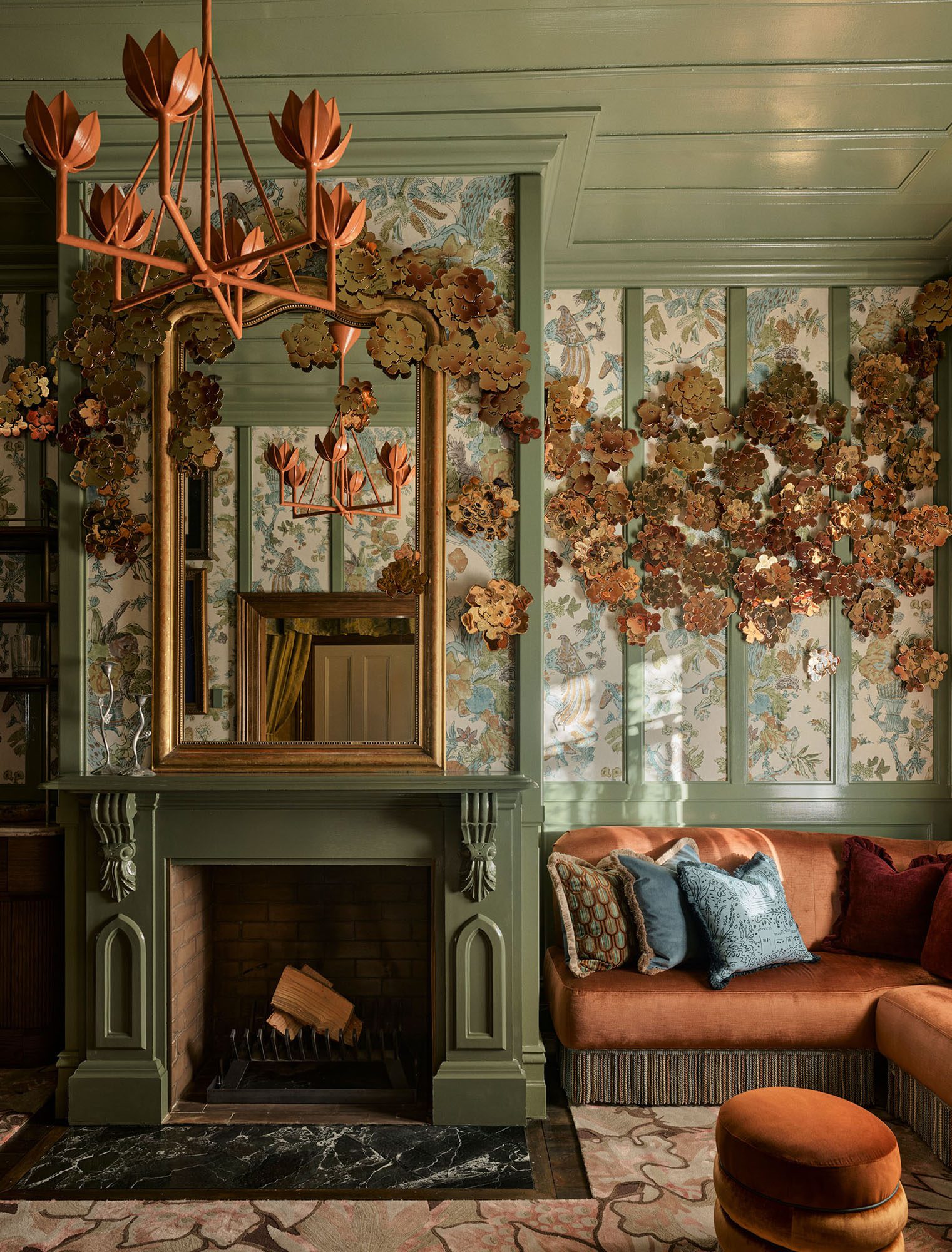
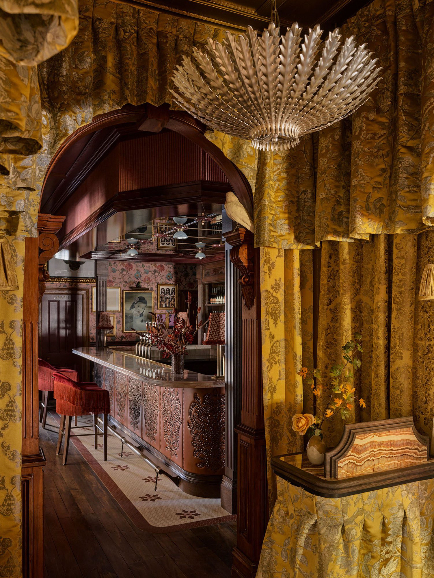
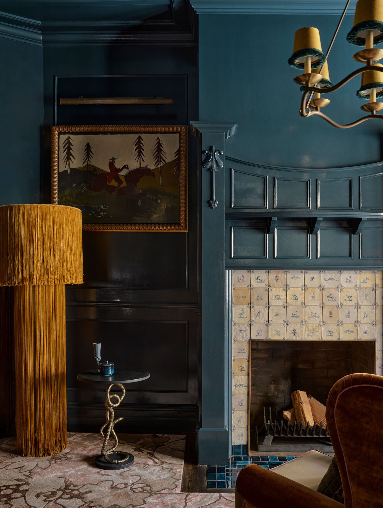
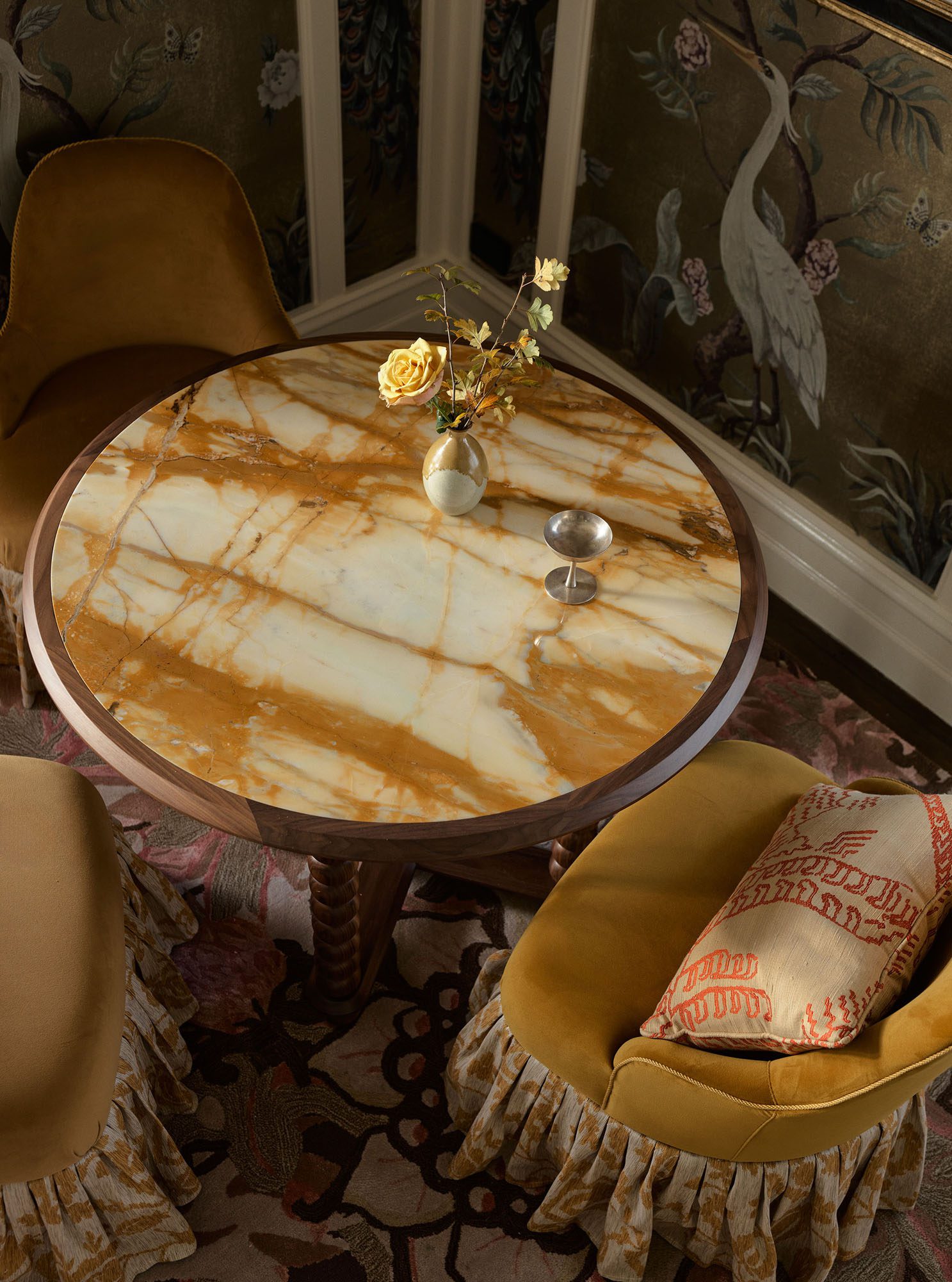
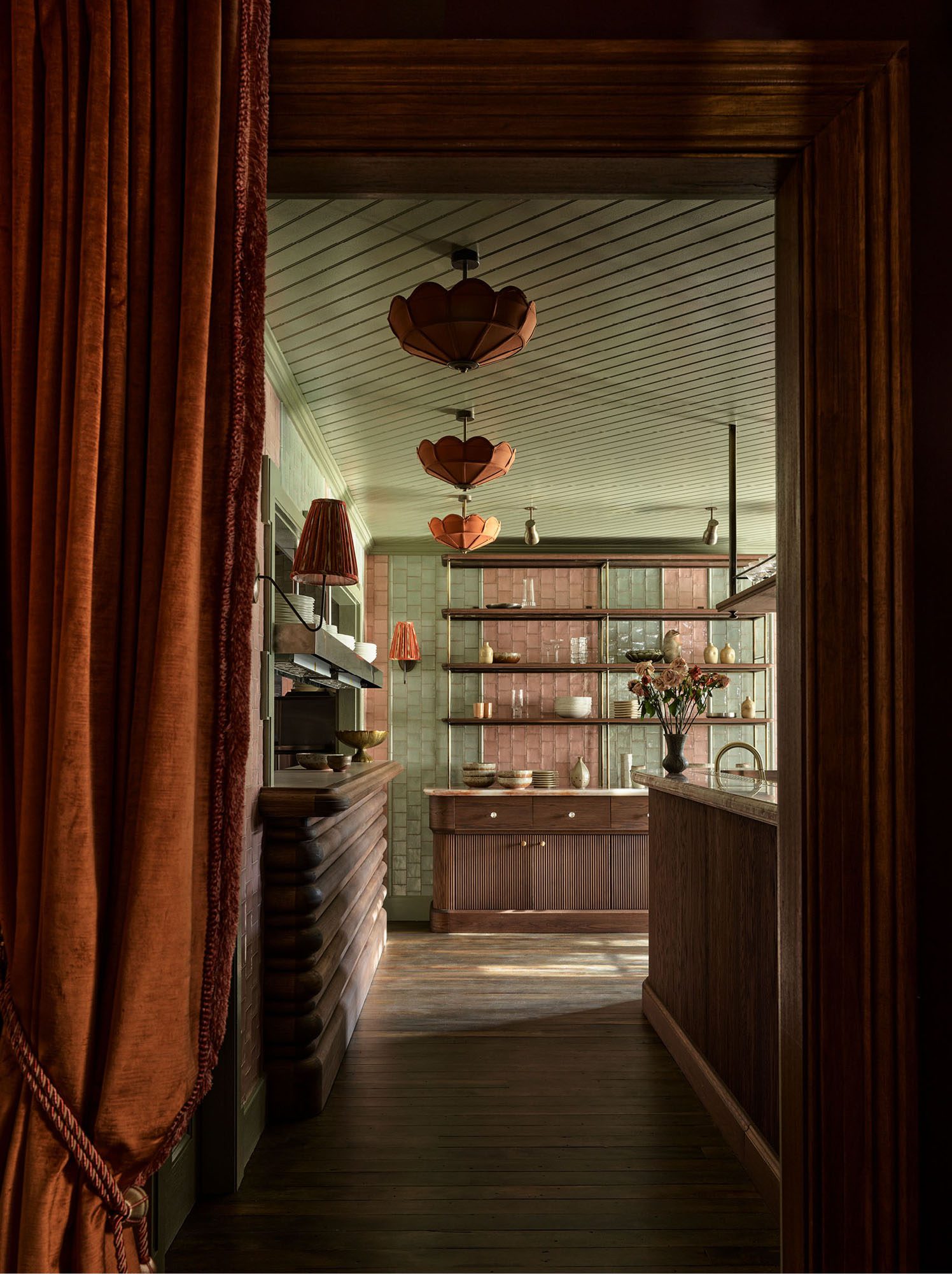
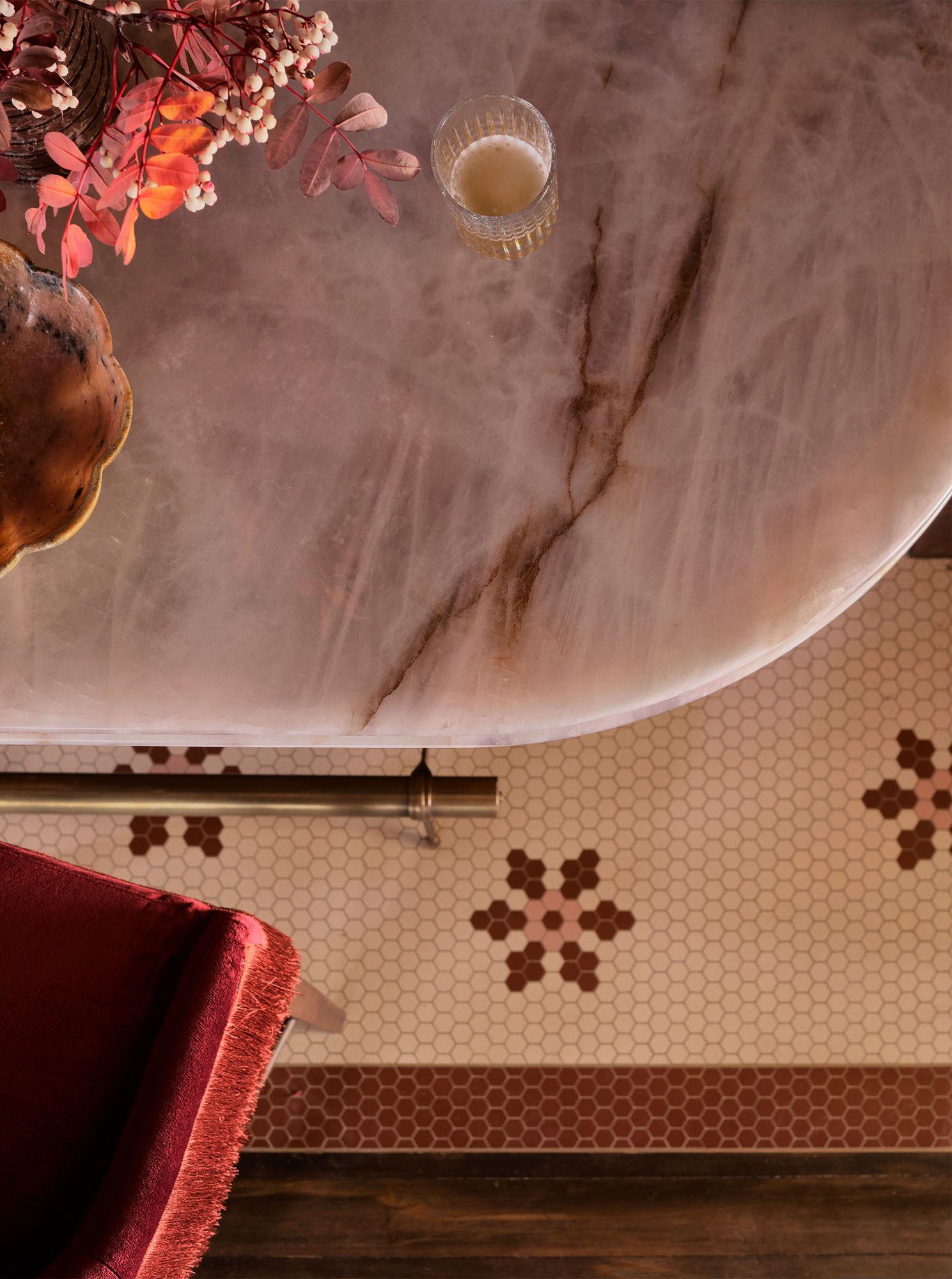
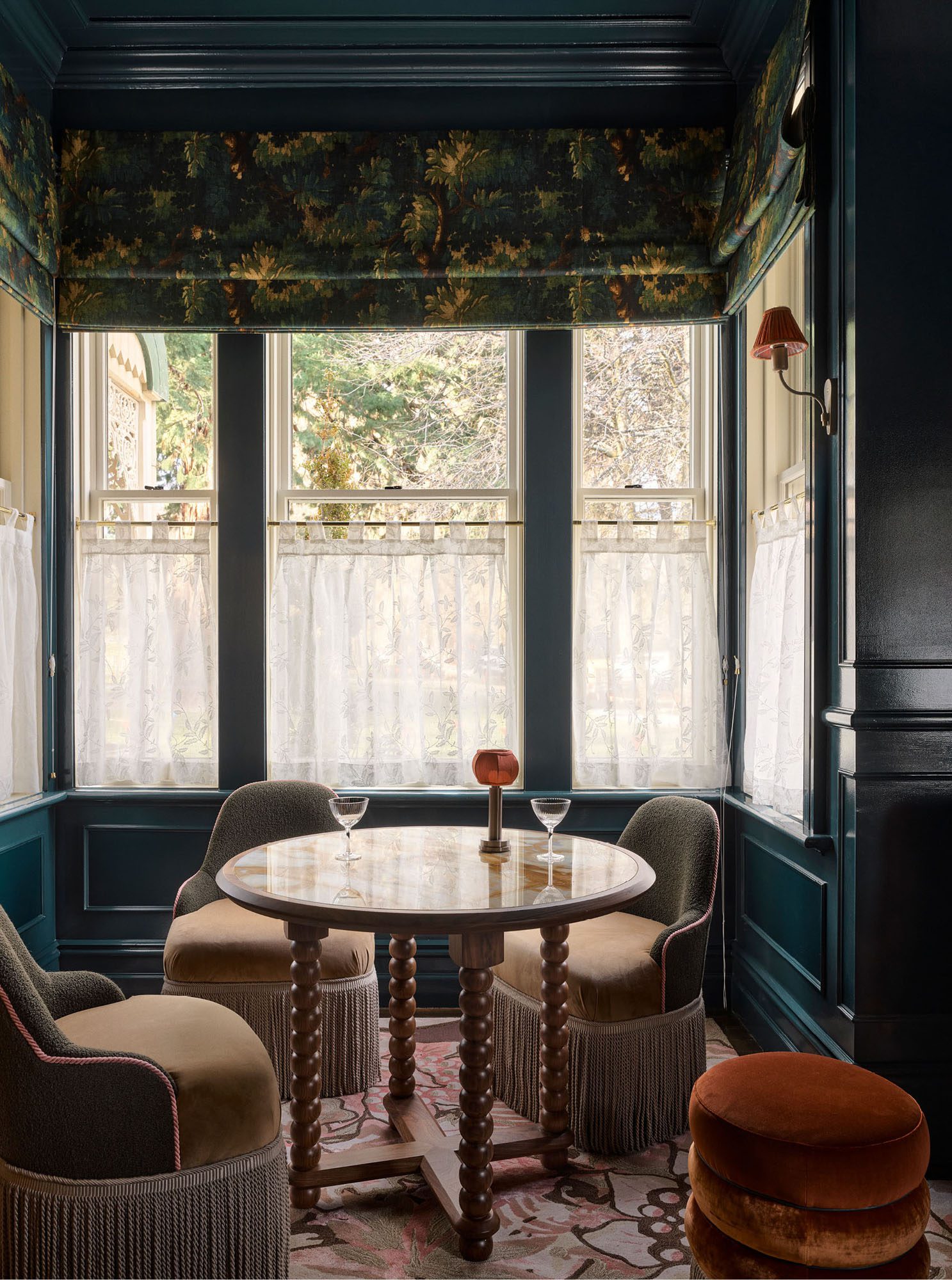
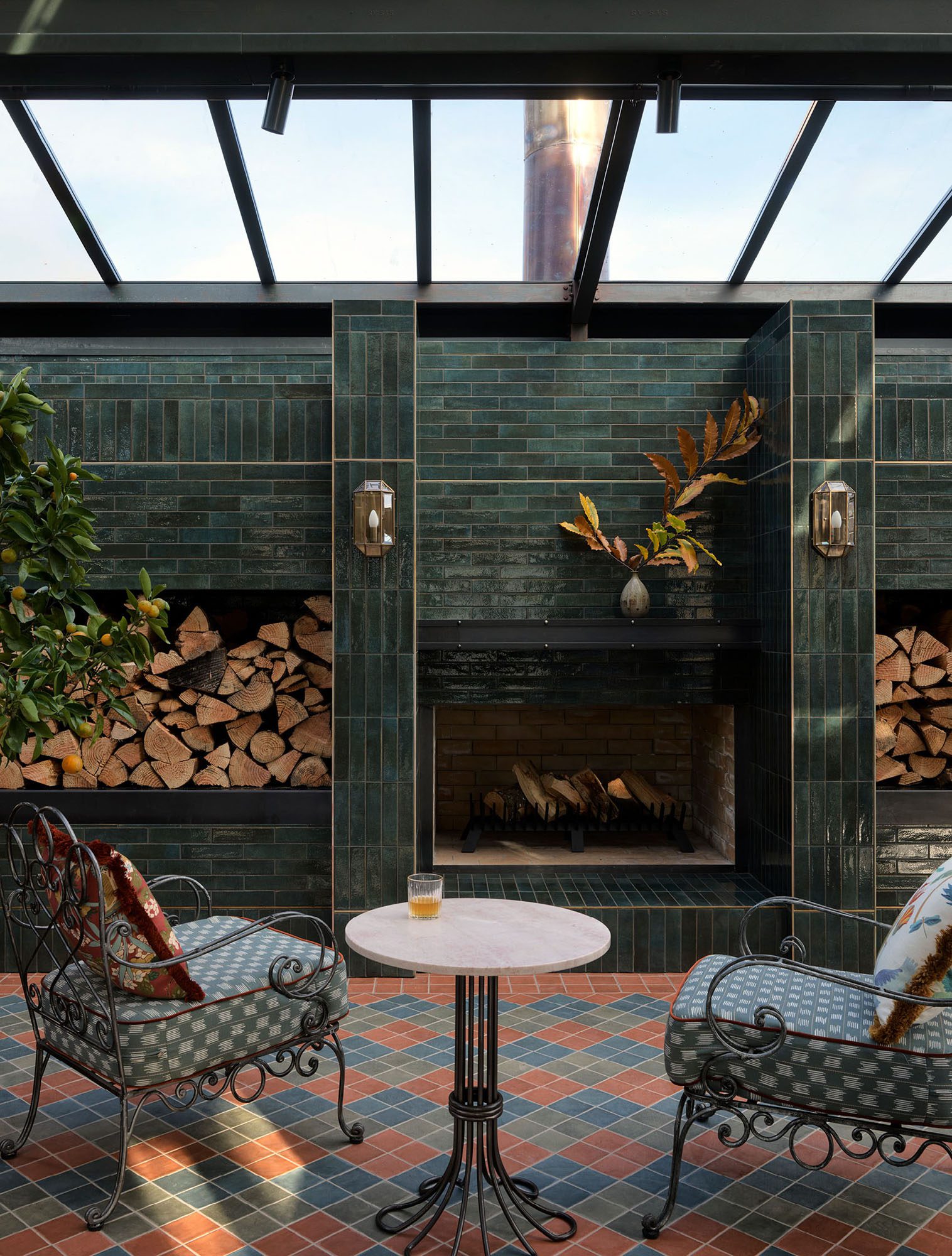
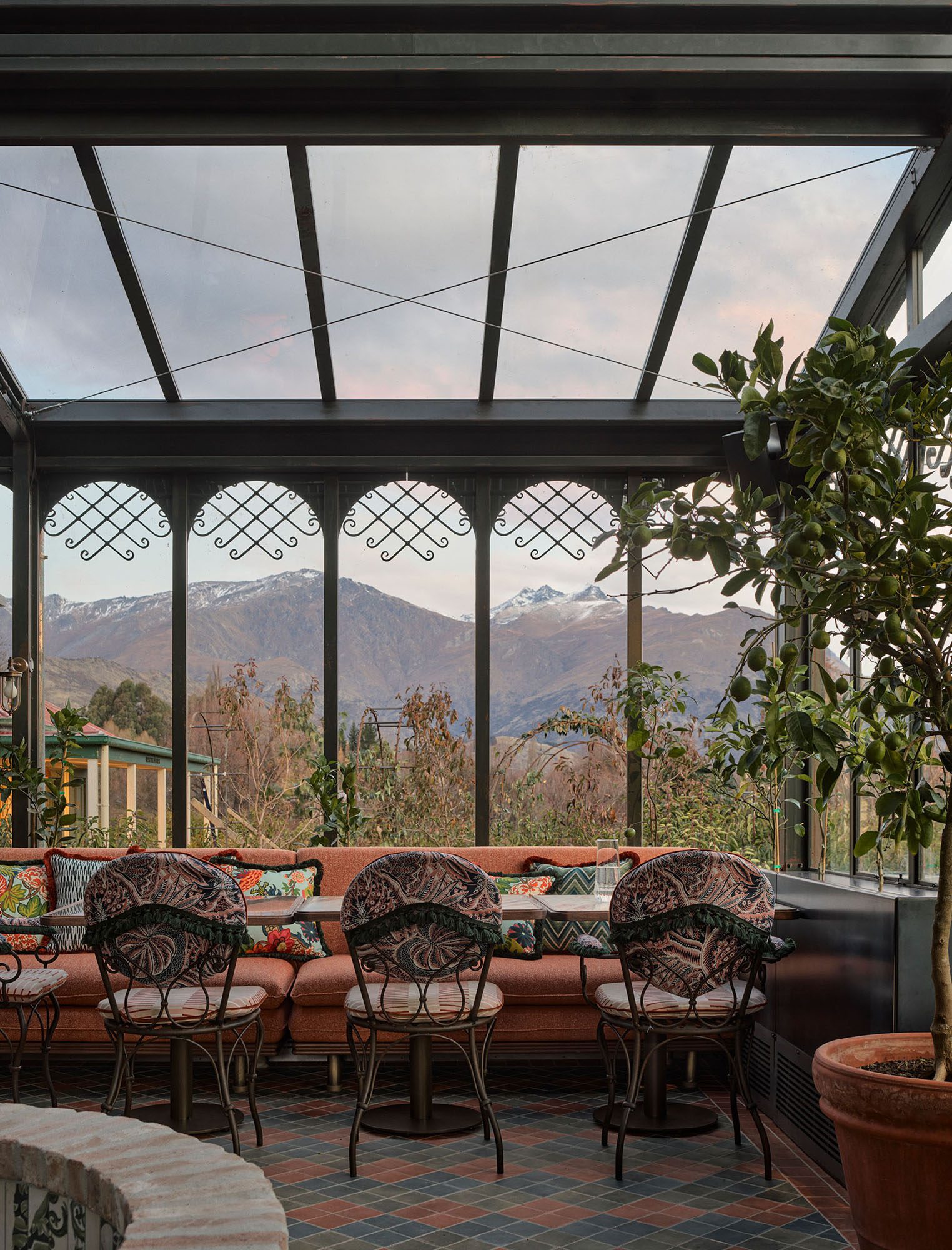
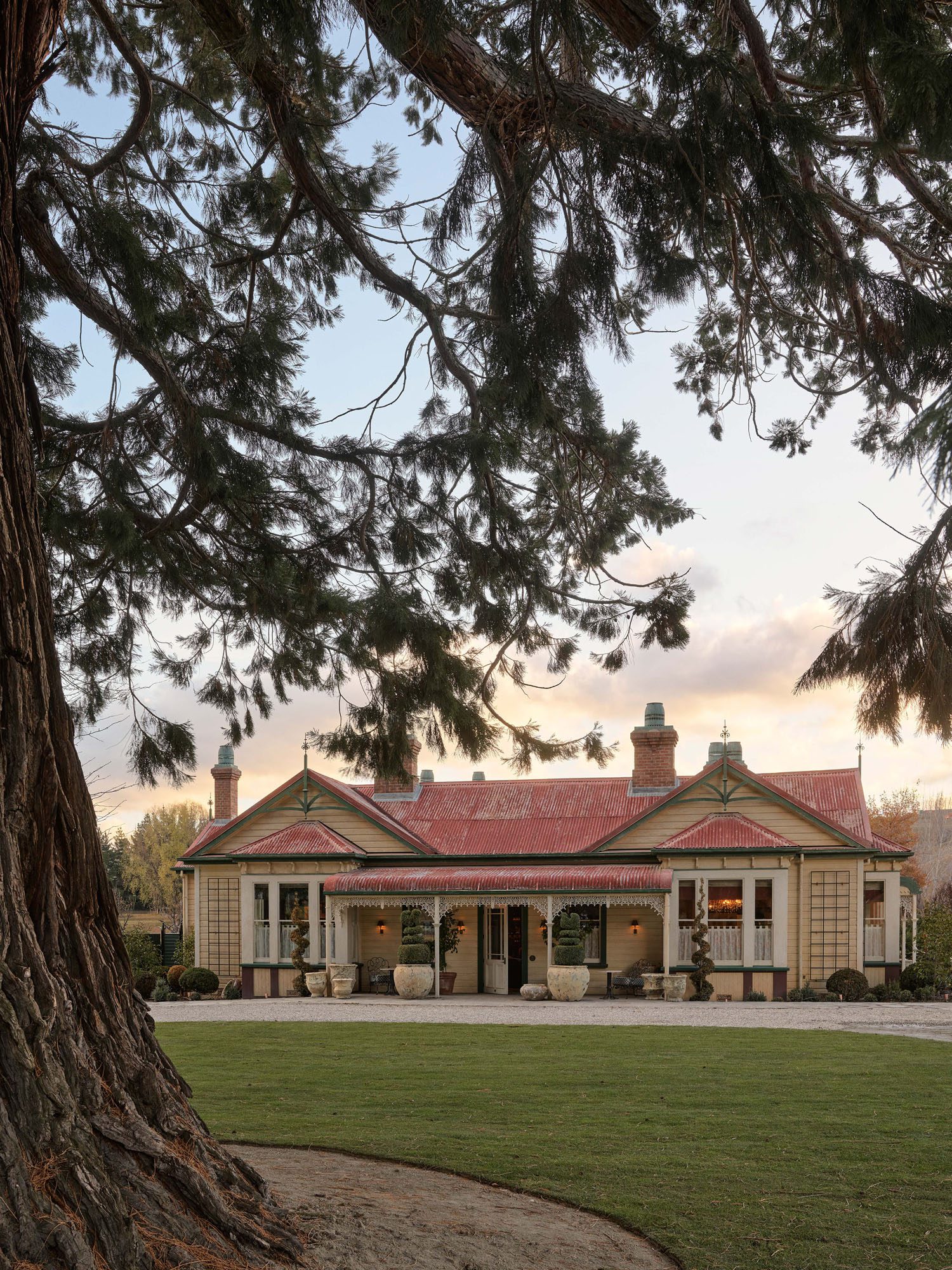
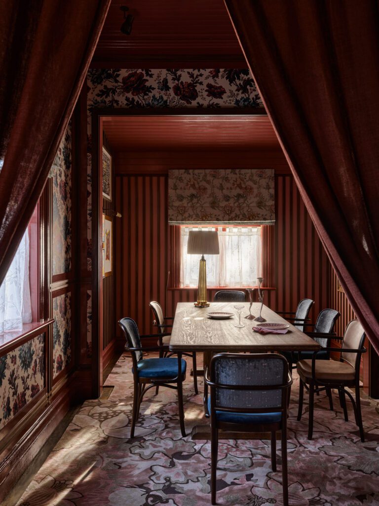
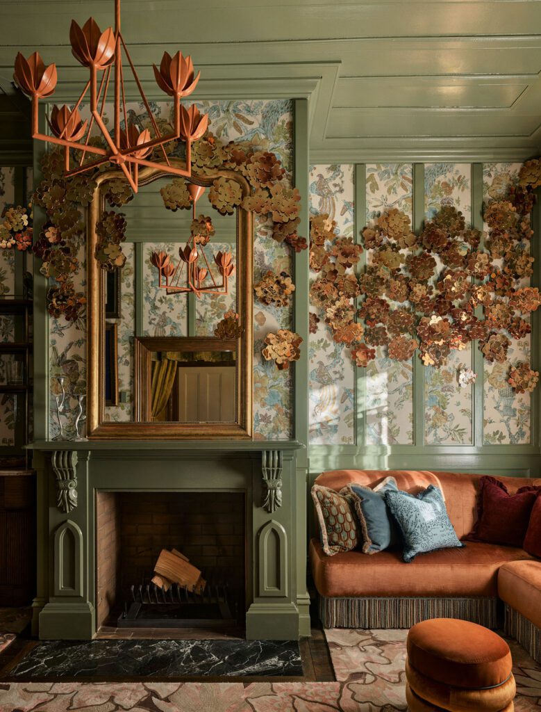
At Billy’s, the architects have fully embraced the brief to transform its setting within a restored 1890s homestead in Queenstown. The building’s Victorian character is overlaid with a confident contemporary vision, creating a richly immersive environment well suited to the luxury dining experience it offers. The outcome is deliberately transportive: a layered, high-impact interior defined by a maximalist approach to colour, texture and materiality, underpinned by a rigorous level of specification.
Drawing inspiration from the richly decorated interiors of European members’ clubs, colour operates as a central narrative device, clearly differentiating the five dining rooms, bars and external conservatory. Each space is imbued with its own identity, informed by the female figures associated with the original homestead. From a rust red room referencing the celebrated tale of a daughter’s red beret, to a sage-toned interior supporting floral wallpaper in homage to the matriarch’s love of gardening. High-gloss paint finishes introduce reflection and movement, amplified by marble, metal, and mirrored surfaces, while painted ceilings and structural elements heighten the sense of immersion.
Though distinct in character, the sequence of spaces is carefully calibrated to feel interconnected. Executed with confidence and restraint, this is maximalism at its most resolved, richly expressive yet composed, refined yet welcoming. The result is an extraordinary atmosphere shaped by assured and deeply considered use of colour.
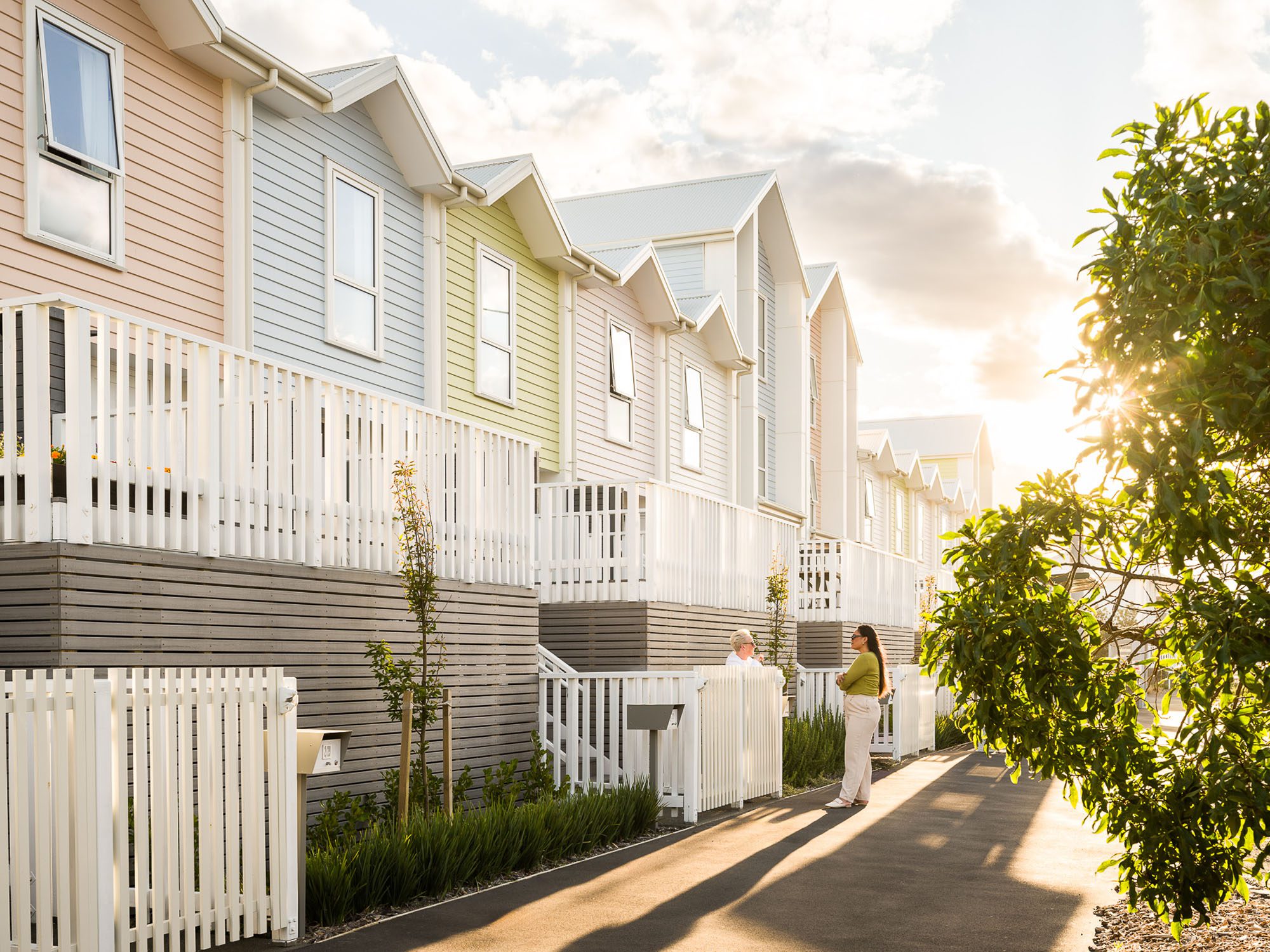
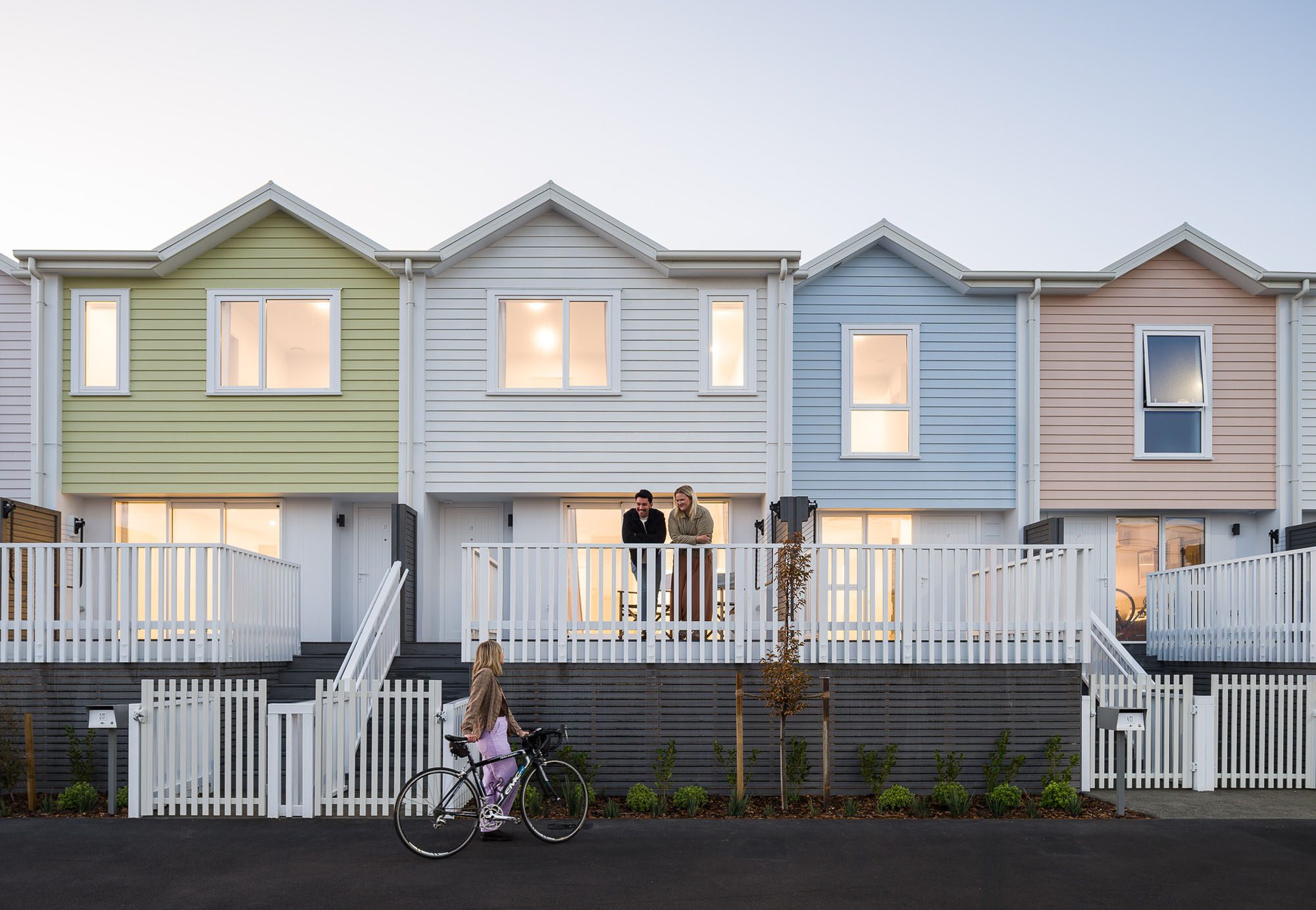
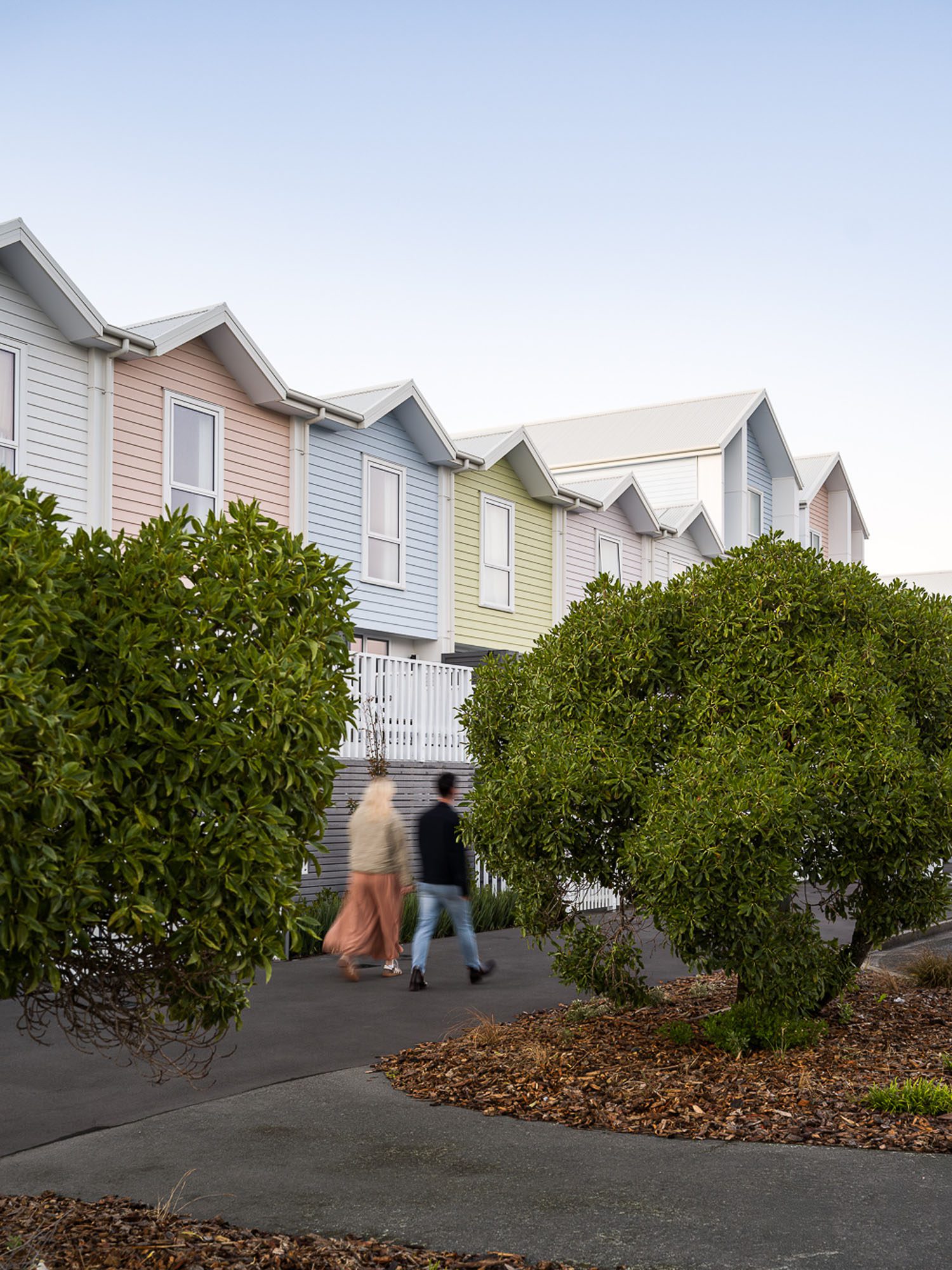
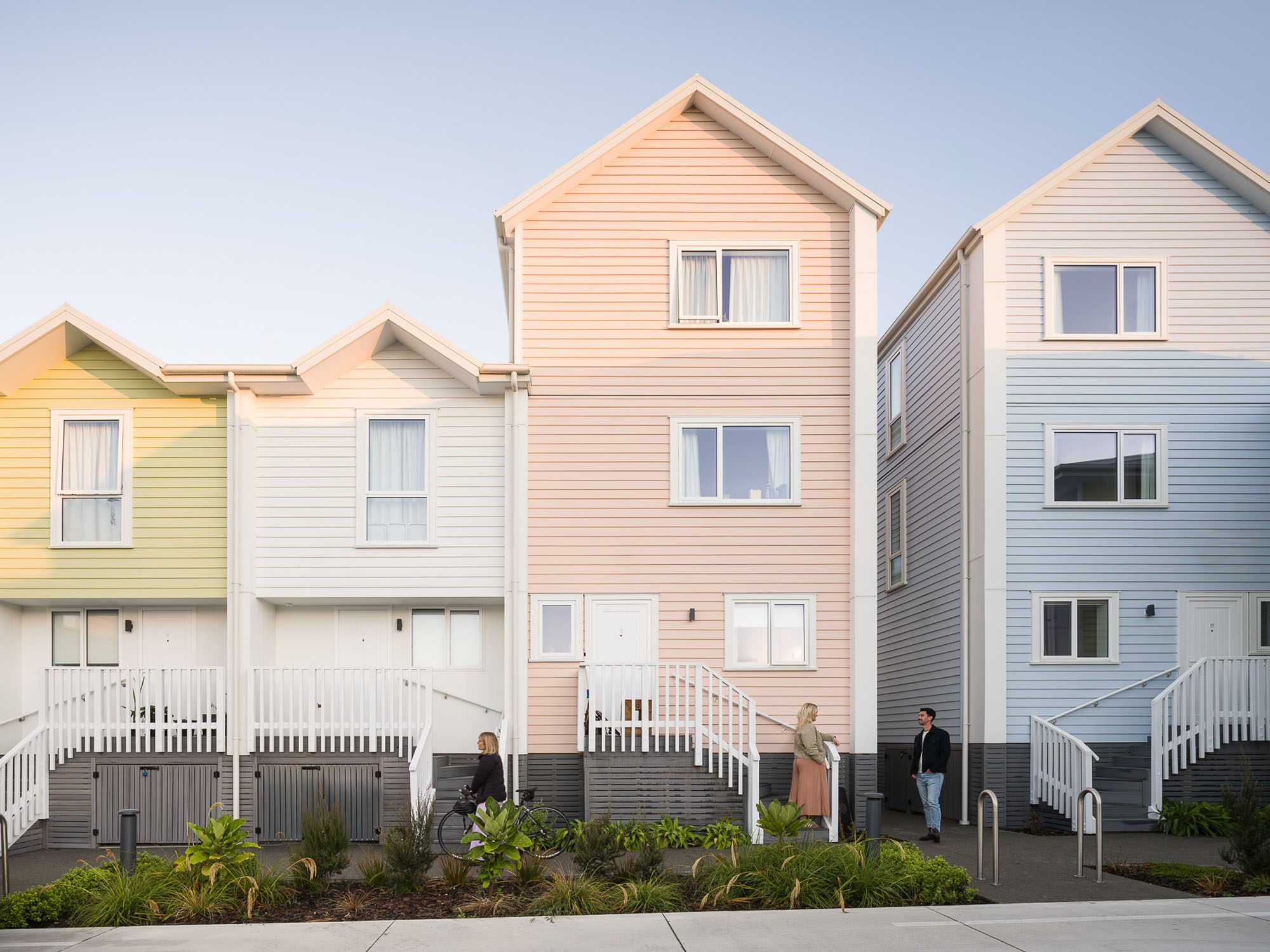
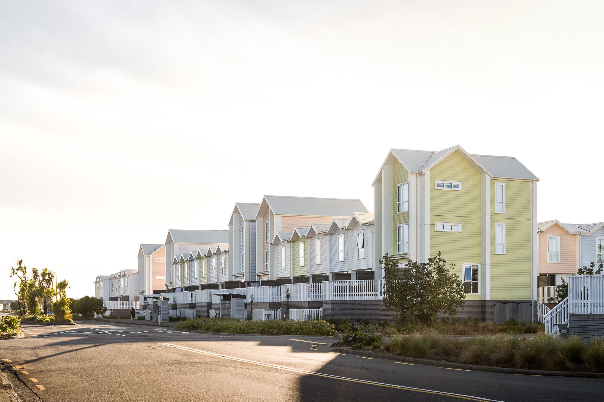
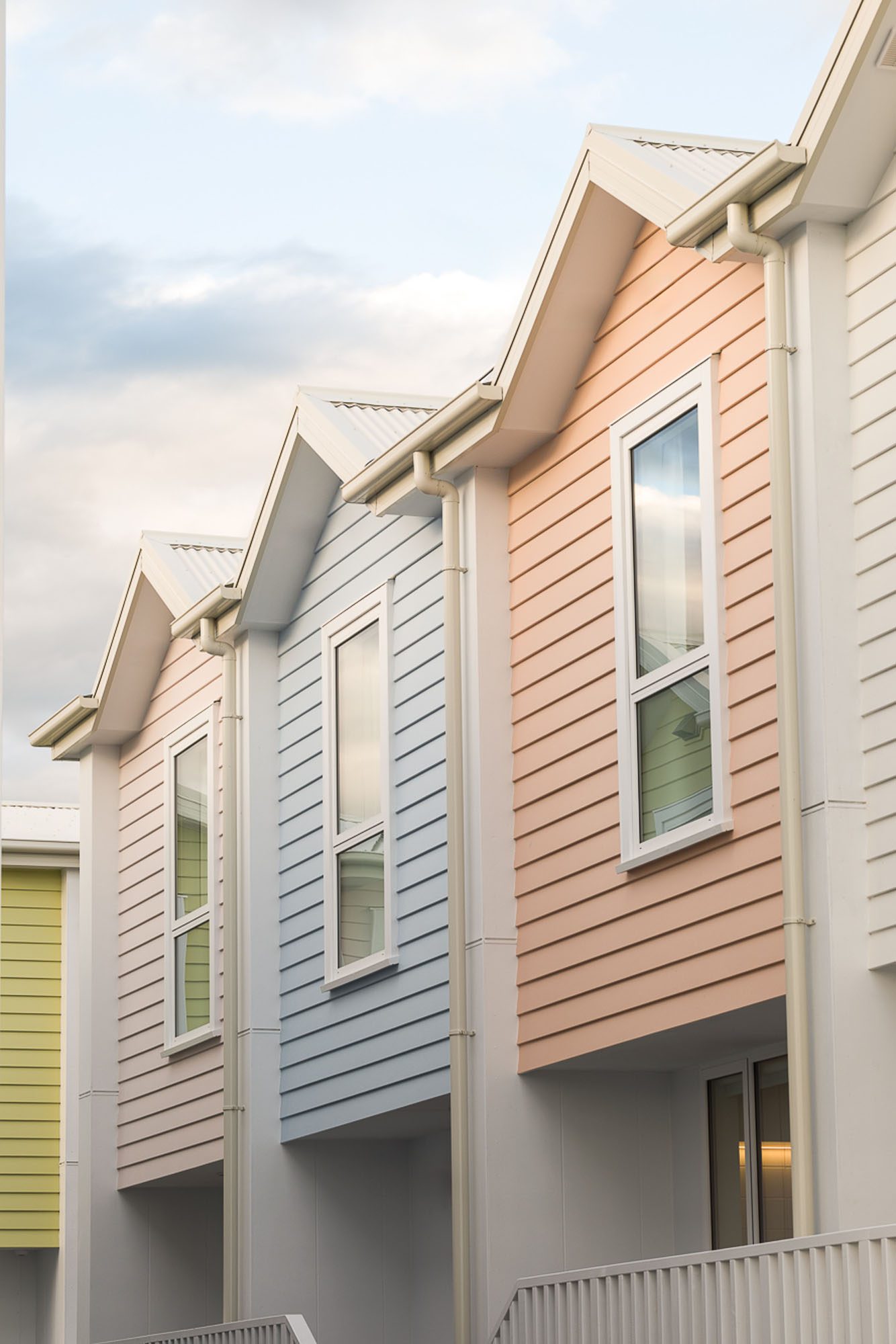
Commercial and Multi-Residential Exterior – Commendation: Te Pākau Maru by Kāinga Maha
Judges’ comments by Alix Smith:
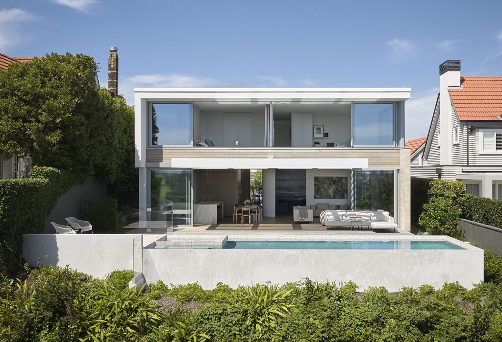
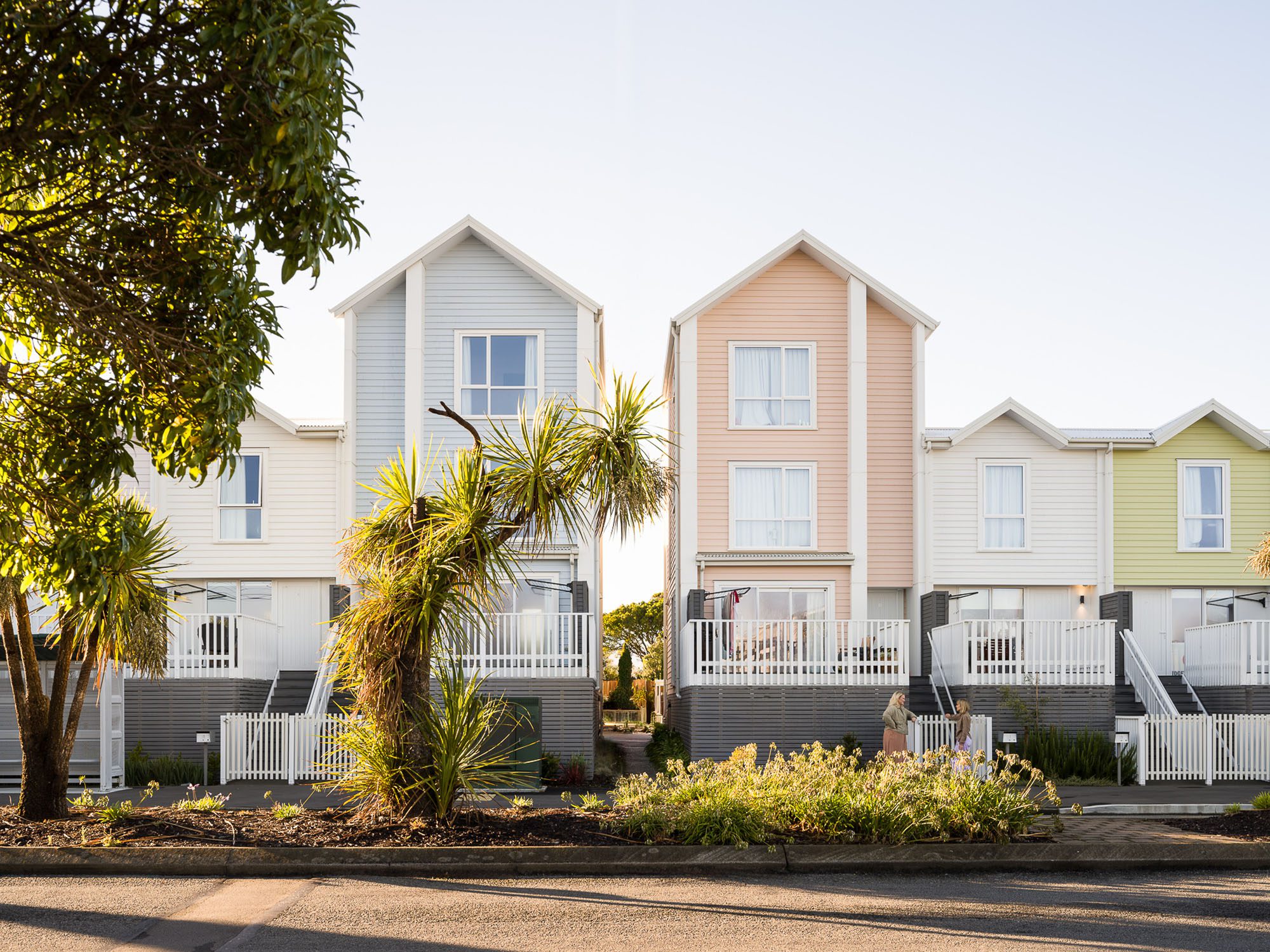
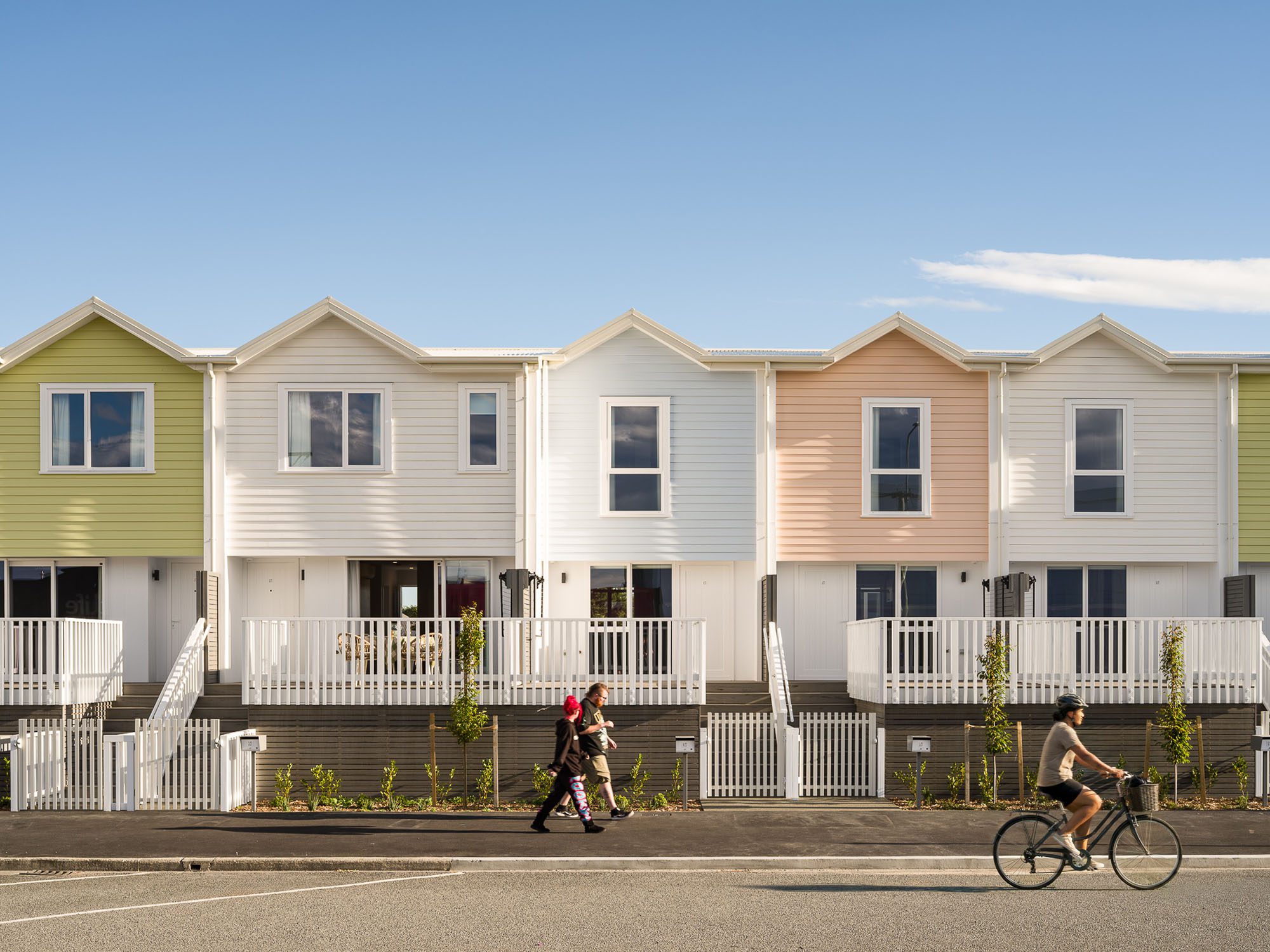
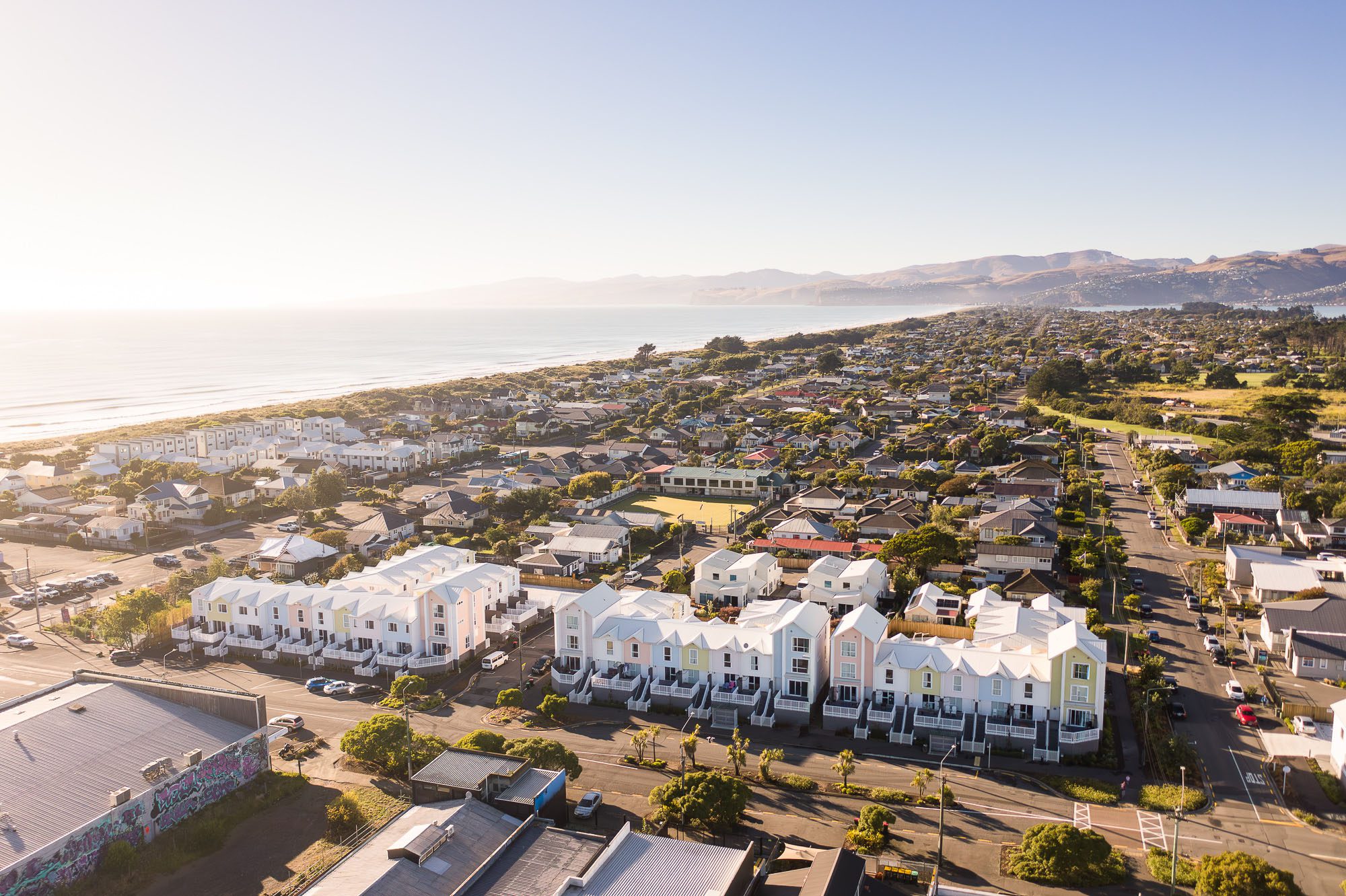
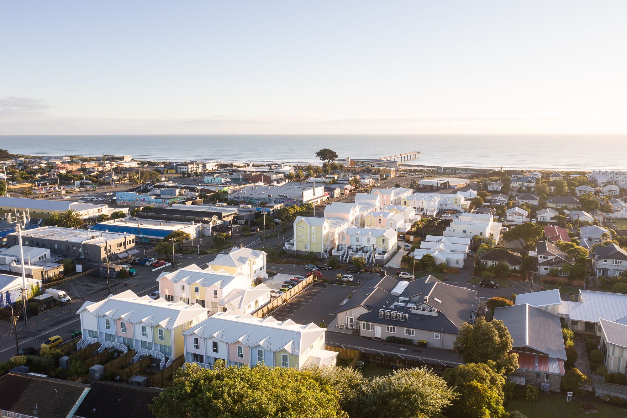
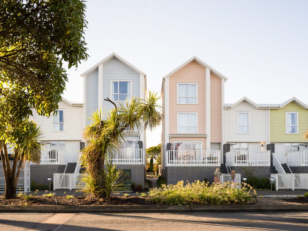
It’s beautiful to see that houses operating within a shared framework can be subtly differentiated through thoughtful colour application. Located in a socially diverse residential development in Christchurch, colour plays a fundamental role in expressing the identities of the varied housing types – affordable rentals, progressive ownership homes and market residences.
While the relaxed, coastal setting suggests ease, the community has experienced economic challenges and the impacts of natural disaster; the collective action across community, not for profit and public sector partners enabled the delivery of this much needed development. As a community driven project, the design ambition prioritised a context specific approach, with the exterior palette drawing
directly from the surrounding beachside environment, the area’s vibrant traditional huts, and a former theatre once
located on the site – a historic symbol of joy and hope. The architects also worked closely with individual homeowners to refine a shared palette of whites and softened candy tones, ensuring colour reinforces personal identity while strengthening a sense of cohesion, place and shared values.
Te Pākau Maru translates to ‘the sheltering wing’ or ‘place of joy’, and the care applied to each colour decision gives tangible expression to this meaning. The resulting environment evokes warmth, protection and optimism, demonstrating the capacity for colour to contribute not only to architectural clarity, but to social wellbeing. The project sets an important benchmark for this housing typology, with relevance and impact extending well beyond its immediate context.
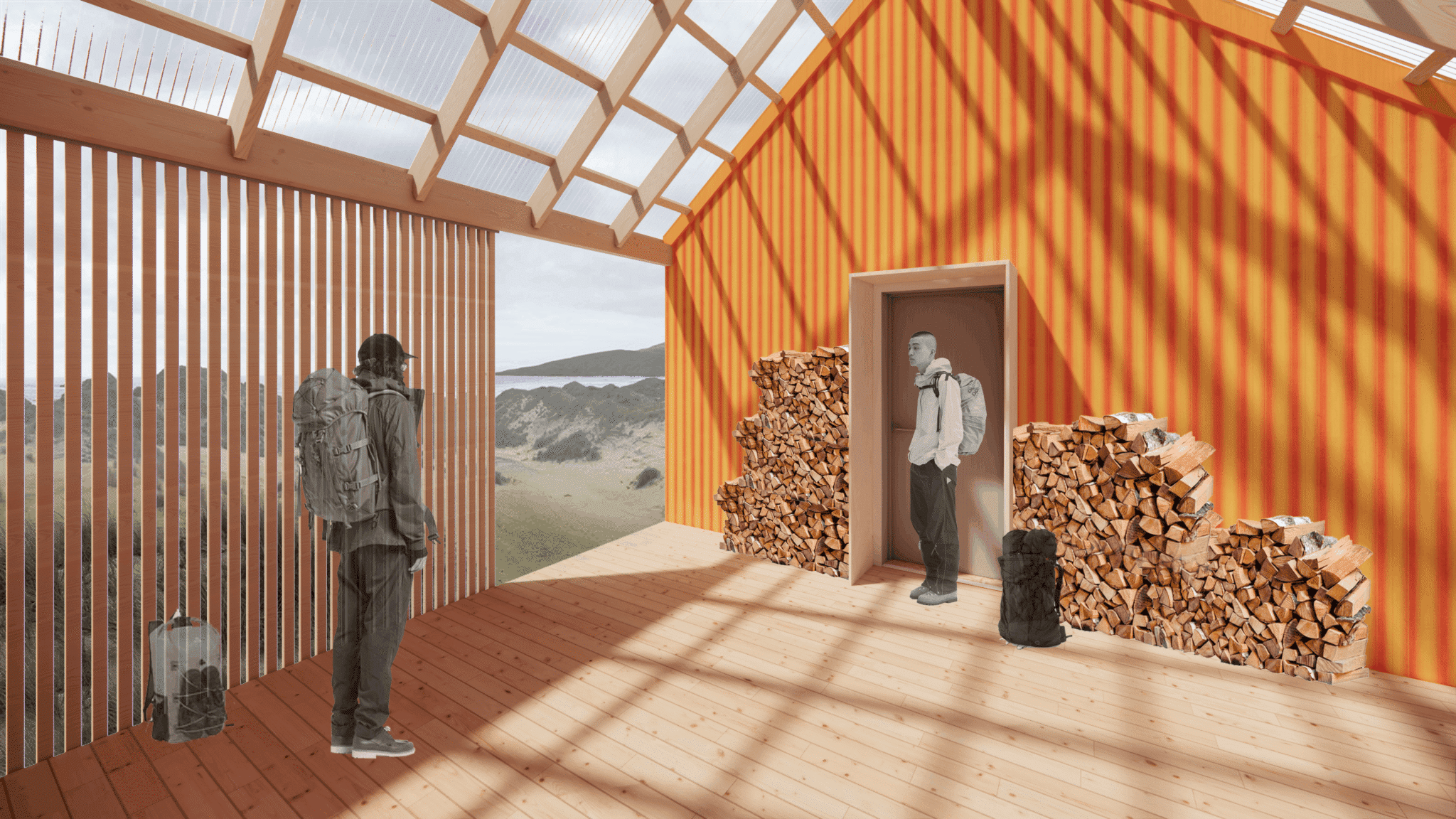
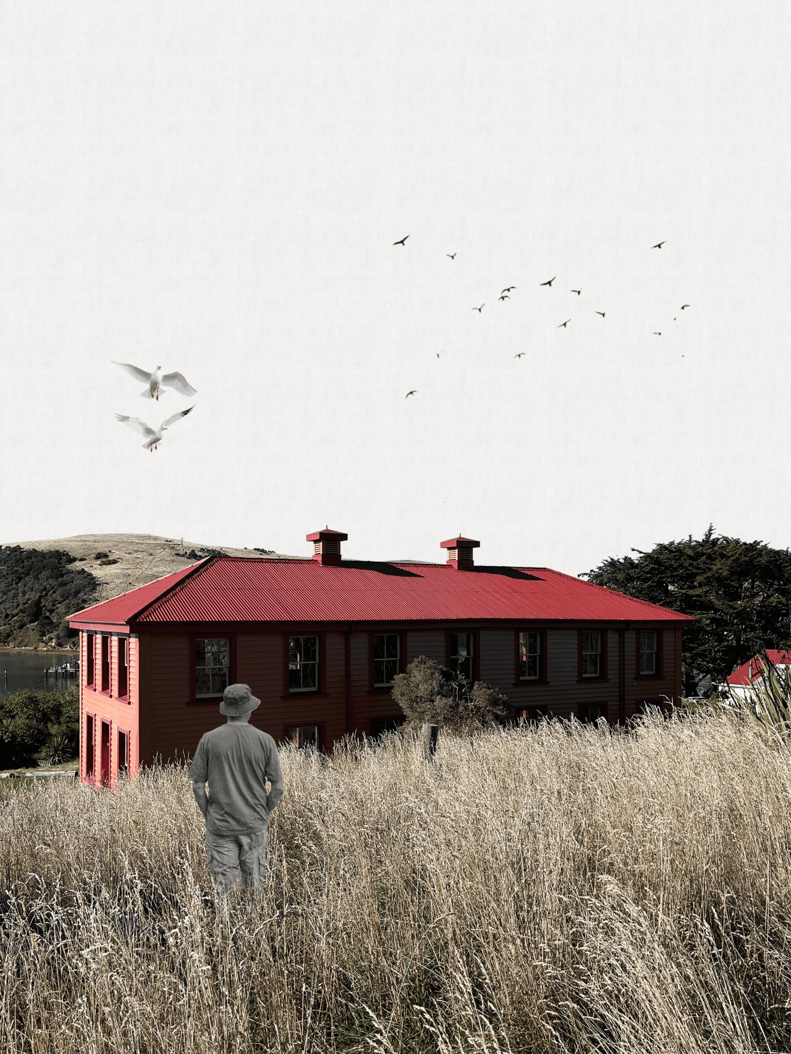
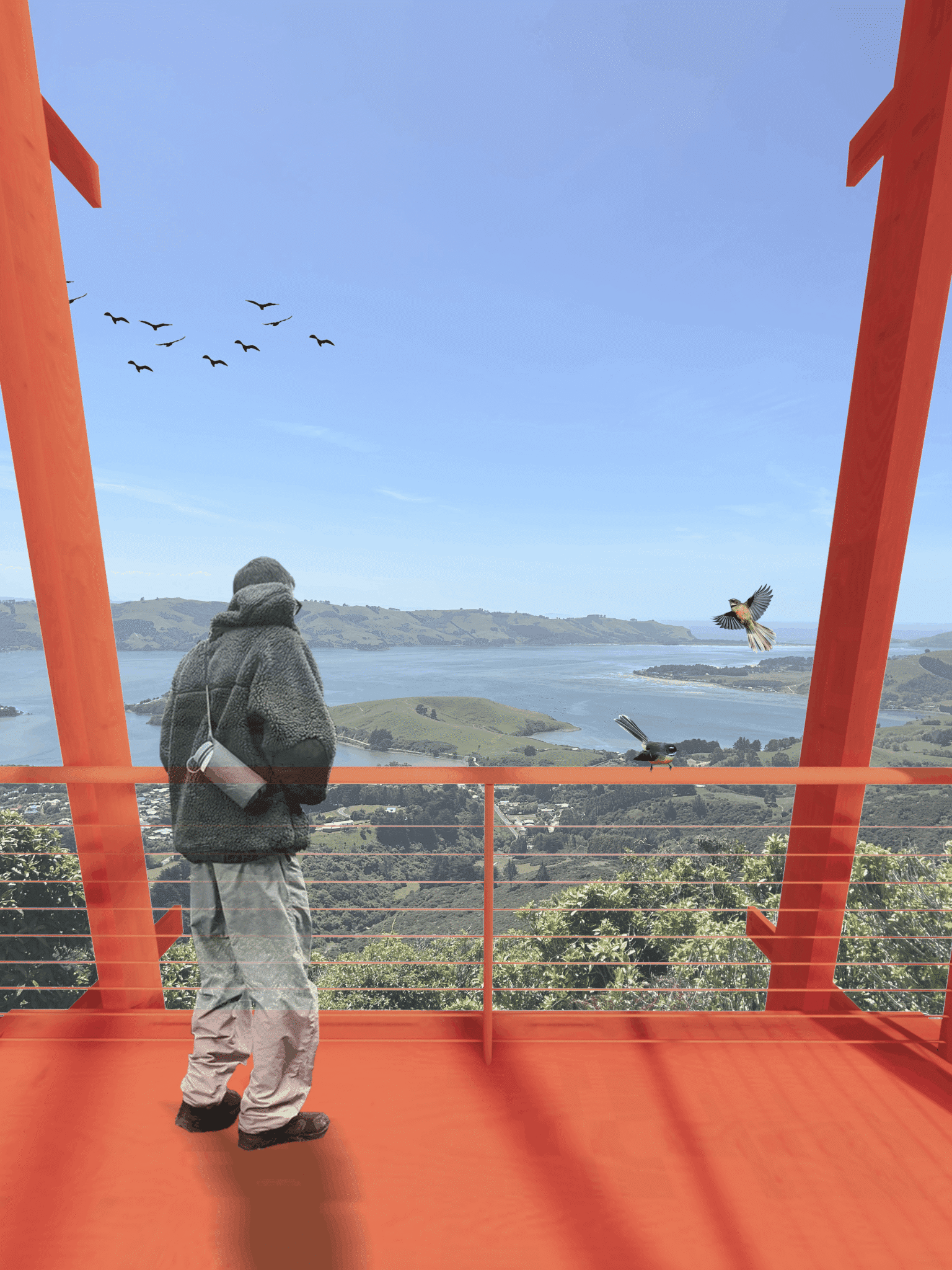
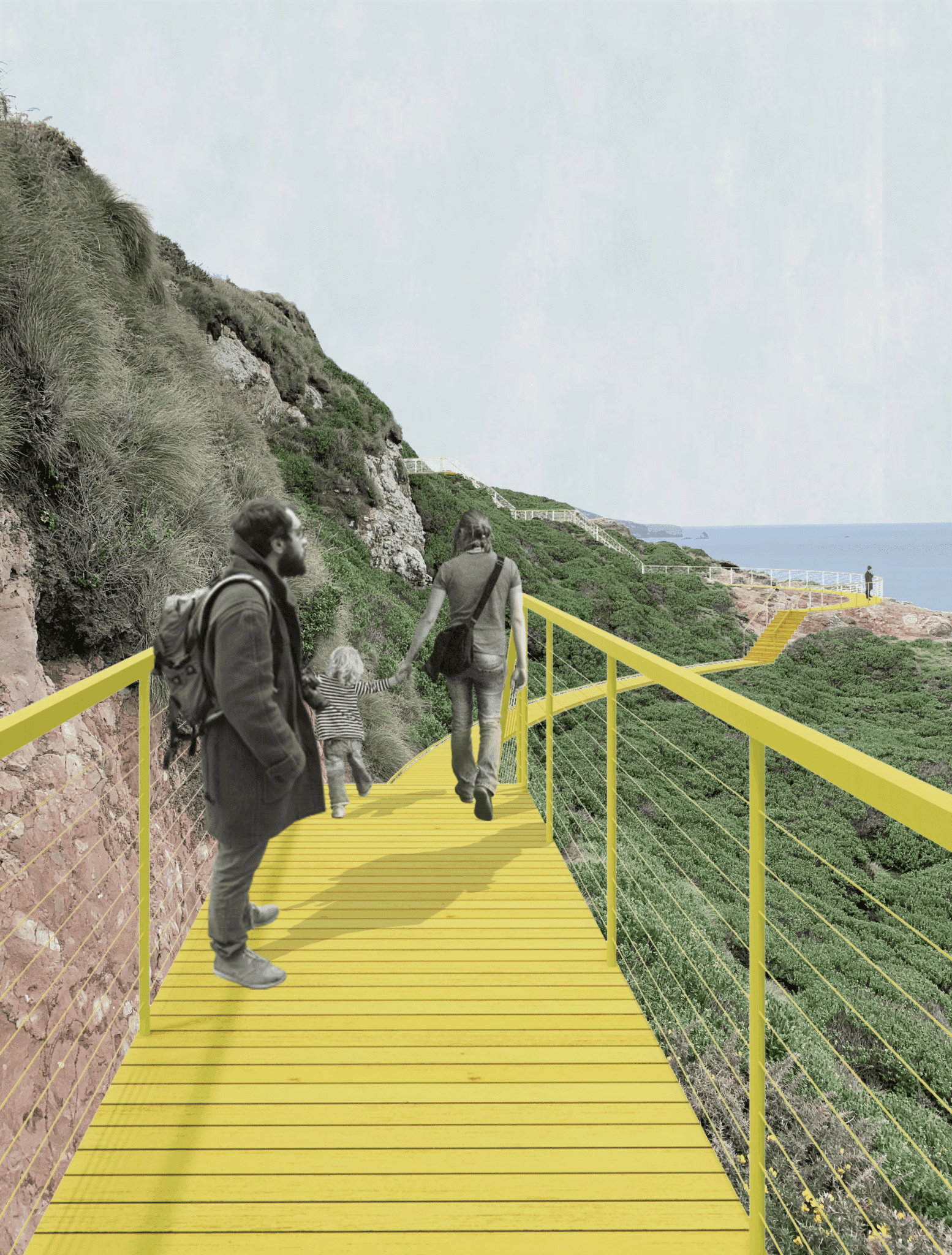
Student NZ Winner: Hot & Cold by Hudson Ross, Otago Polytechnic
Judges’ comments by Buster Caldwell:
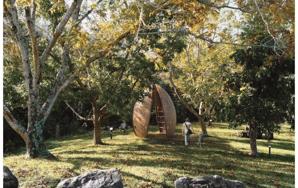
Programmatically ambitious, this regenerative walking trail in Dunedin is a sophisticated project of considerable scope, underpinned by a balanced and highly intentional approach to colour.
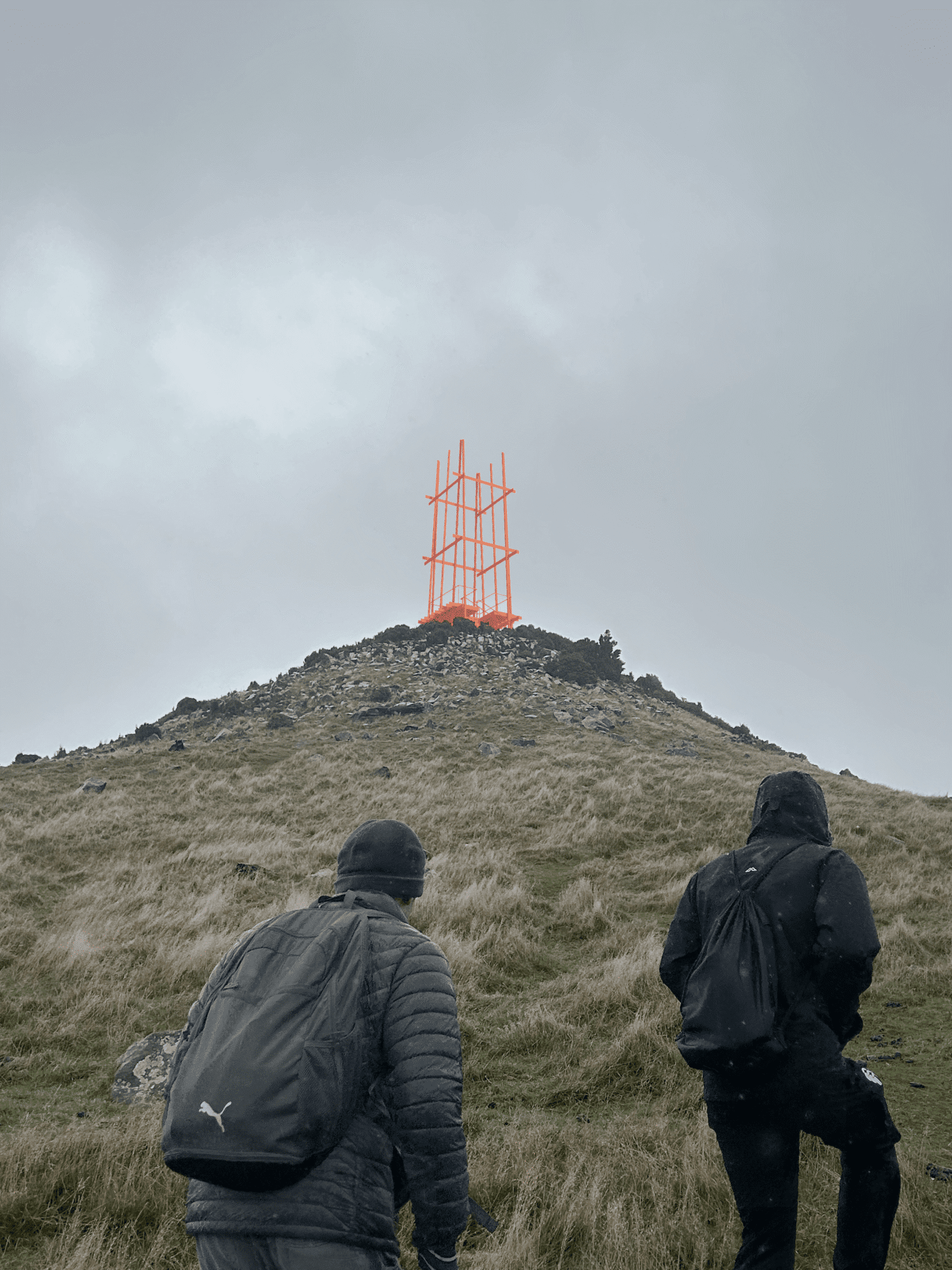
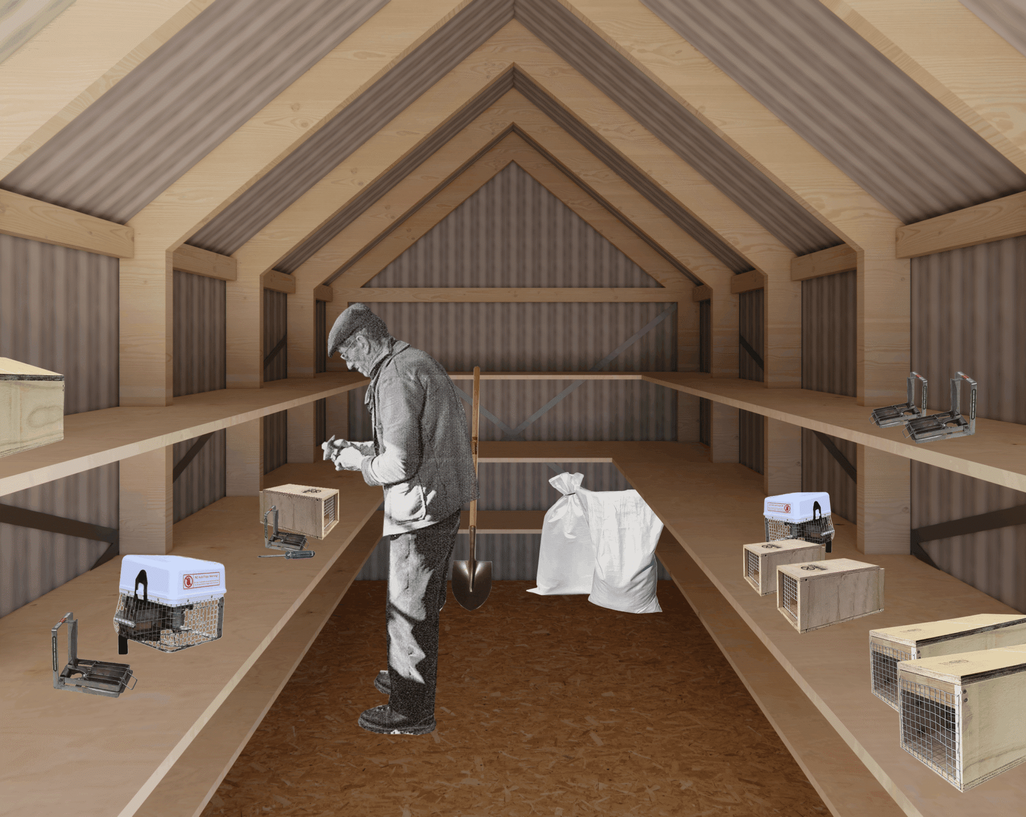
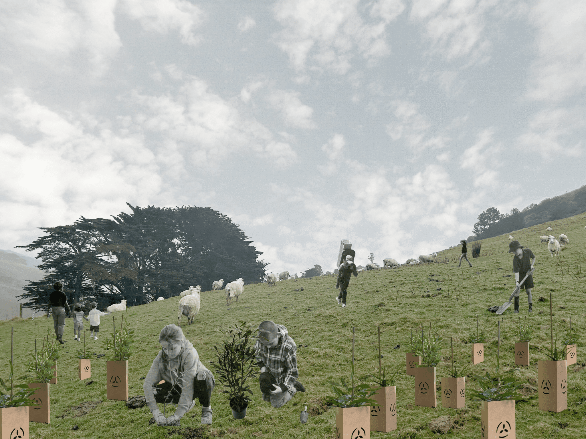
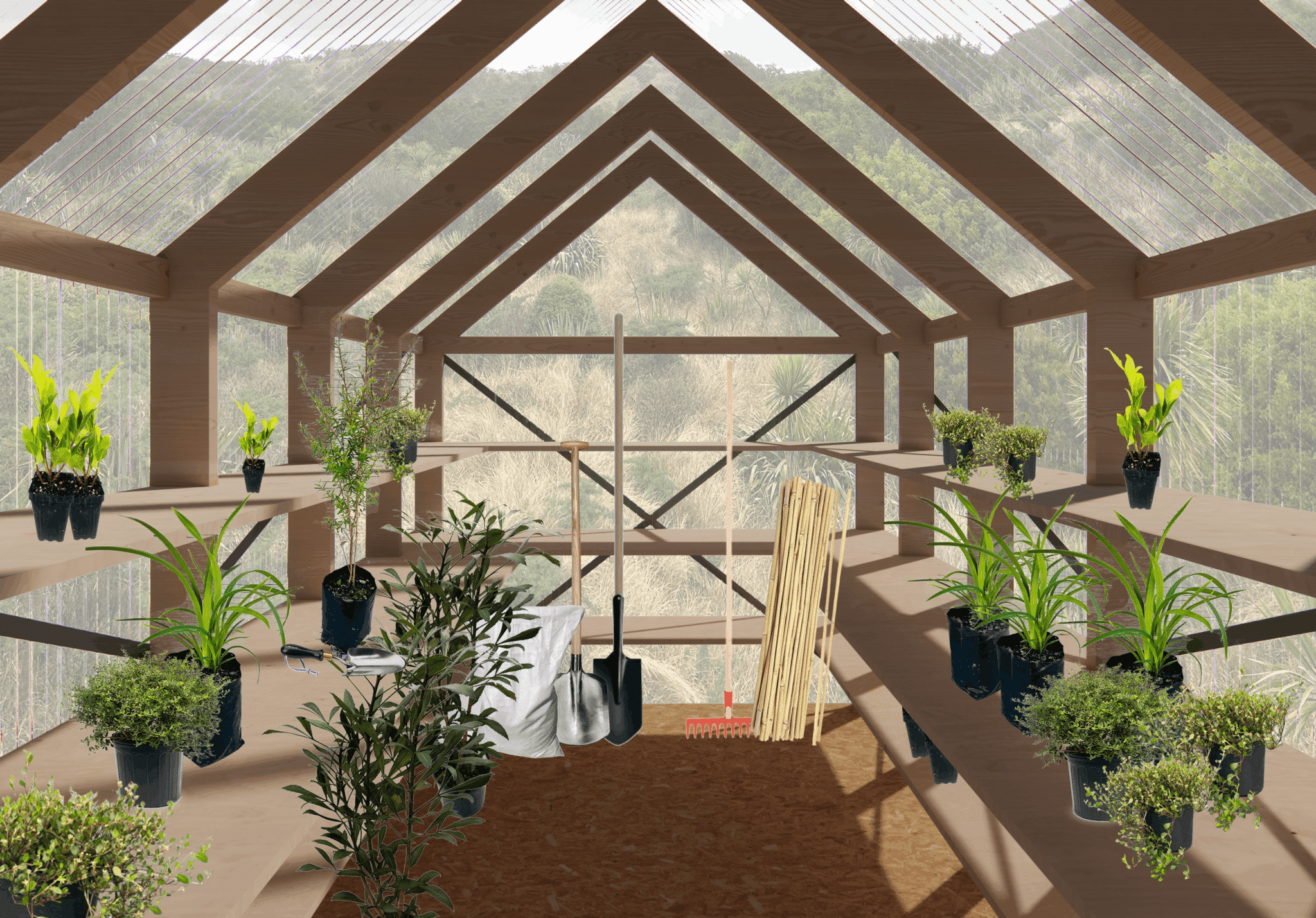
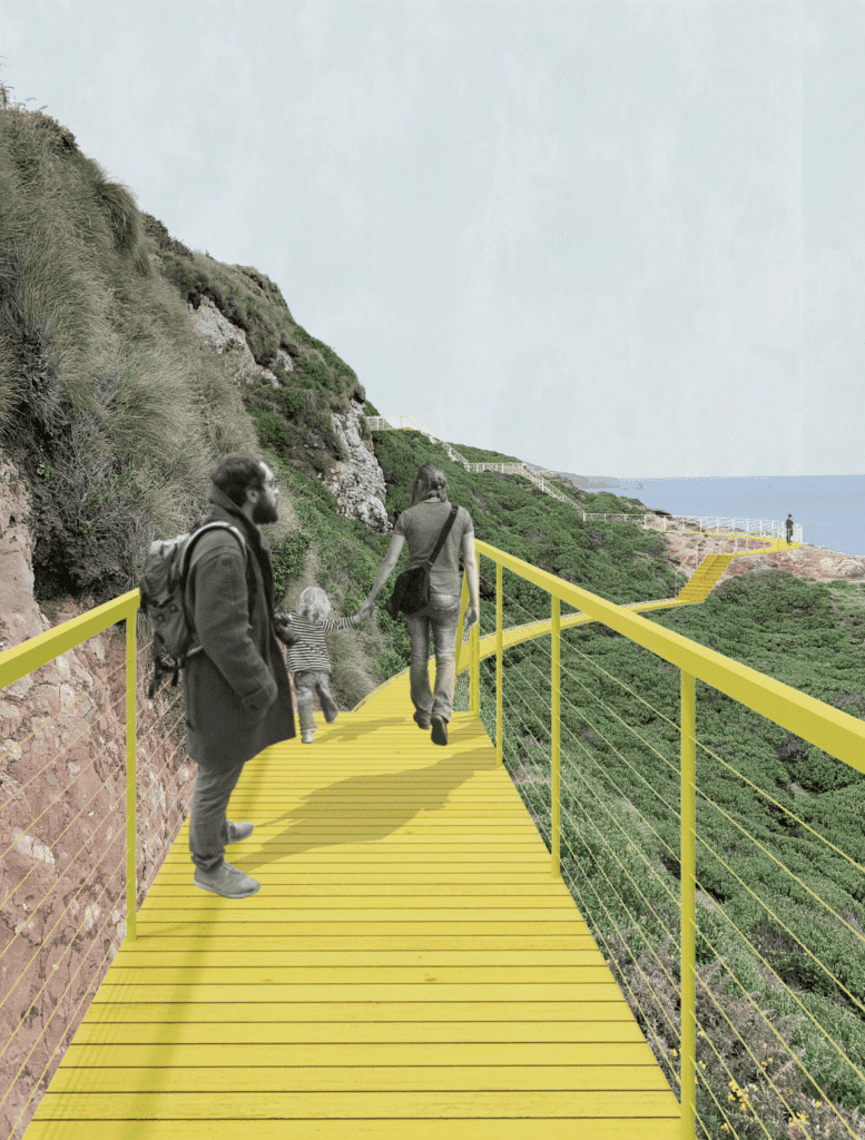
Its title draws on the children’s game of hide-and-seek, a reference grounded in its dramatic setting on the Otago Peninsula, a landform shaped by an extinct volcano – and expressed through a sequence of structures that deepen in tone as walkers move closer to the volcano’s core. Conceived as a four-day journey, the trail leads participants from beach to peninsula, across harbour and into hills, weaving environmental education into the experience. Along the way, walkers are invited to actively participate in the landscape’s regeneration through activities such as pest trapping, native planting and ecological restoration.
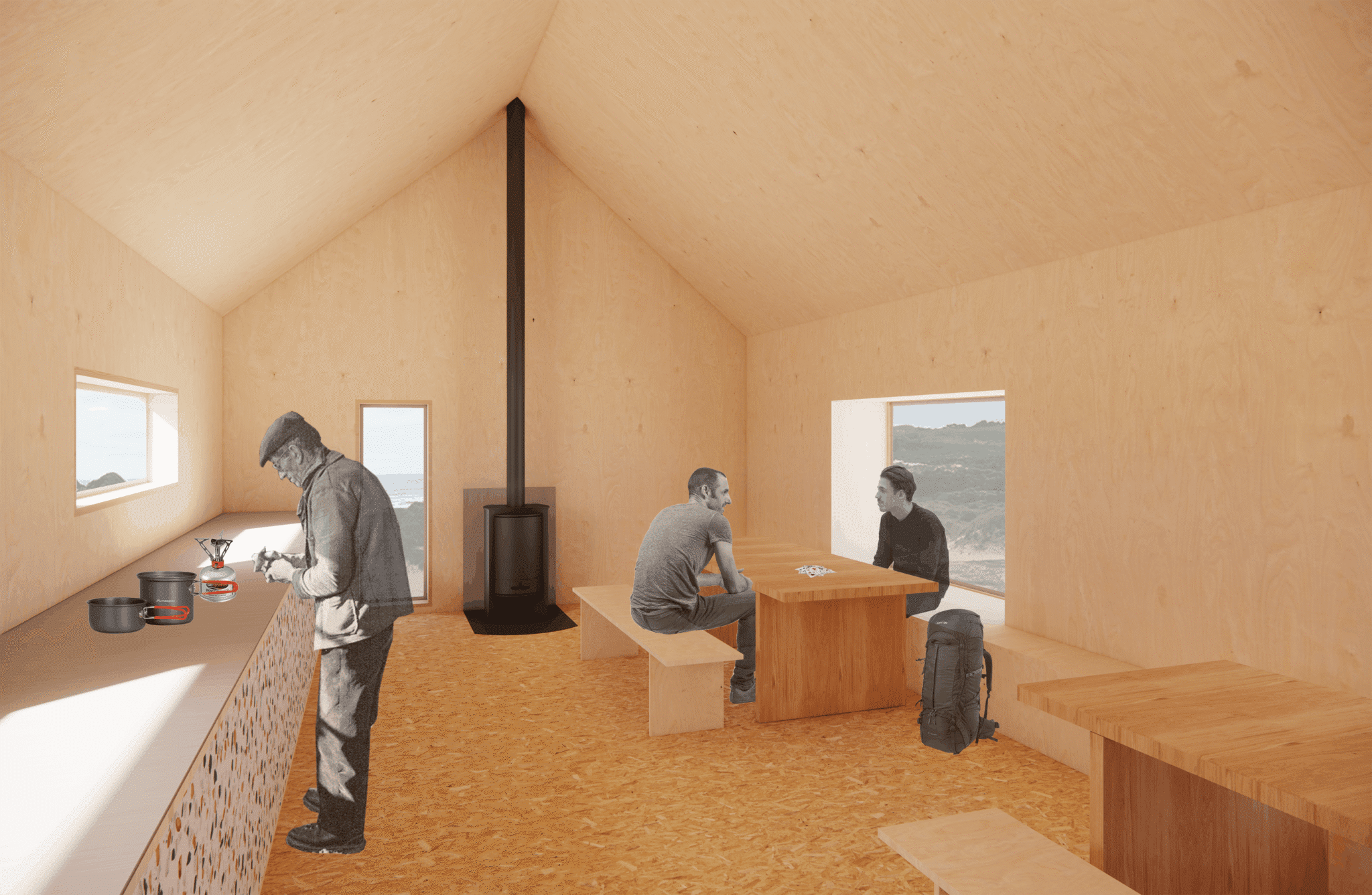
Colour is introduced in small built elements with the lightest of architectural footprints dispersed along the route – a vivid yellow boardwalk, burnt-orange stripes within a rest platform, rust-red on a viewing tower and warm beige interiors within accommodation huts. These moments form a considered, sequential language, with each hue carefully specified to respect both the sensitivity of the site and the intellectual rigour of the project. The result is a quietly powerful synthesis of landscape, colour and environmental stewardship.”