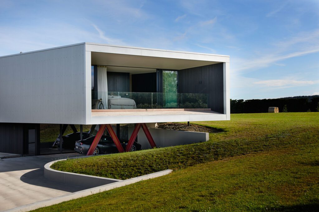


Eight architectural projects across Gisborne and Hawke’s Bay have been deemed the very best in Te Kāhui Whaihanga New Zealand Institute of Architects’ Regional Awards
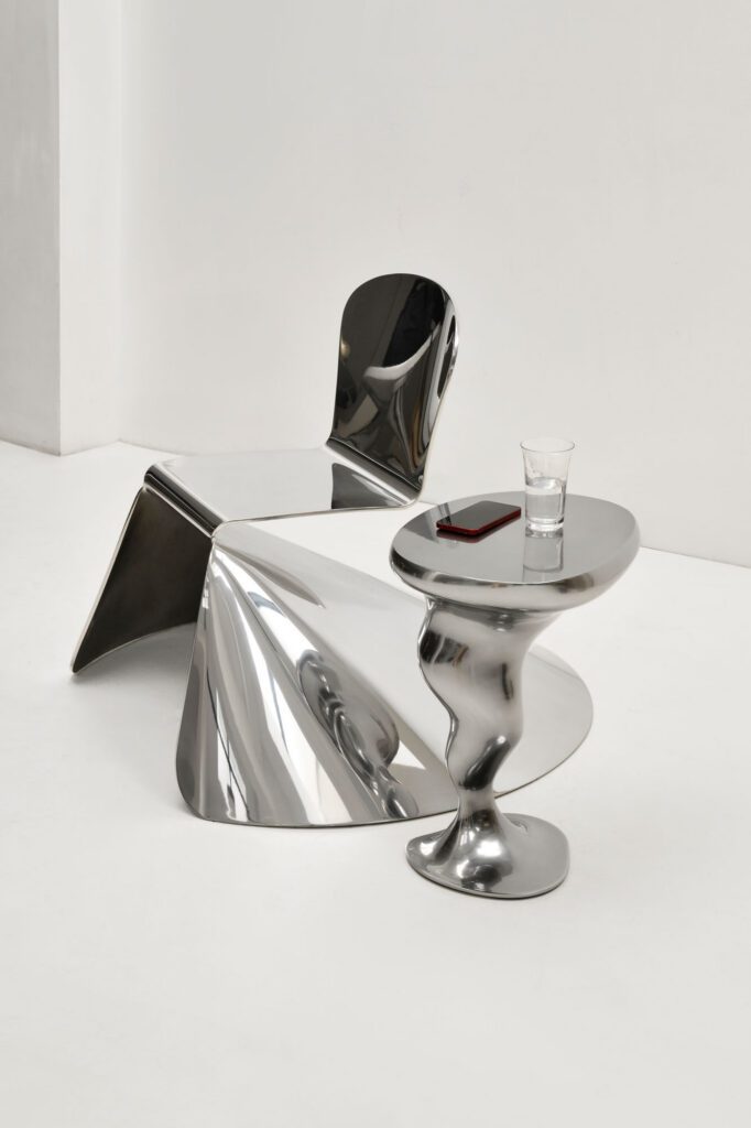
At the inaugural Salone Raritas, Xavier Lust presented forms that seemed to defy gravity, defined by unexpected influences.
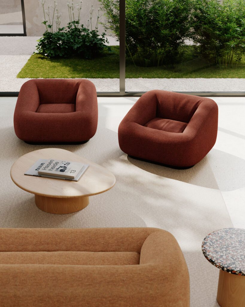
We speak with internationally renowned French architect and designer Jean-Marie Massaud about the shifting definition of luxury, and how flexibility, restraint, and the discipline of
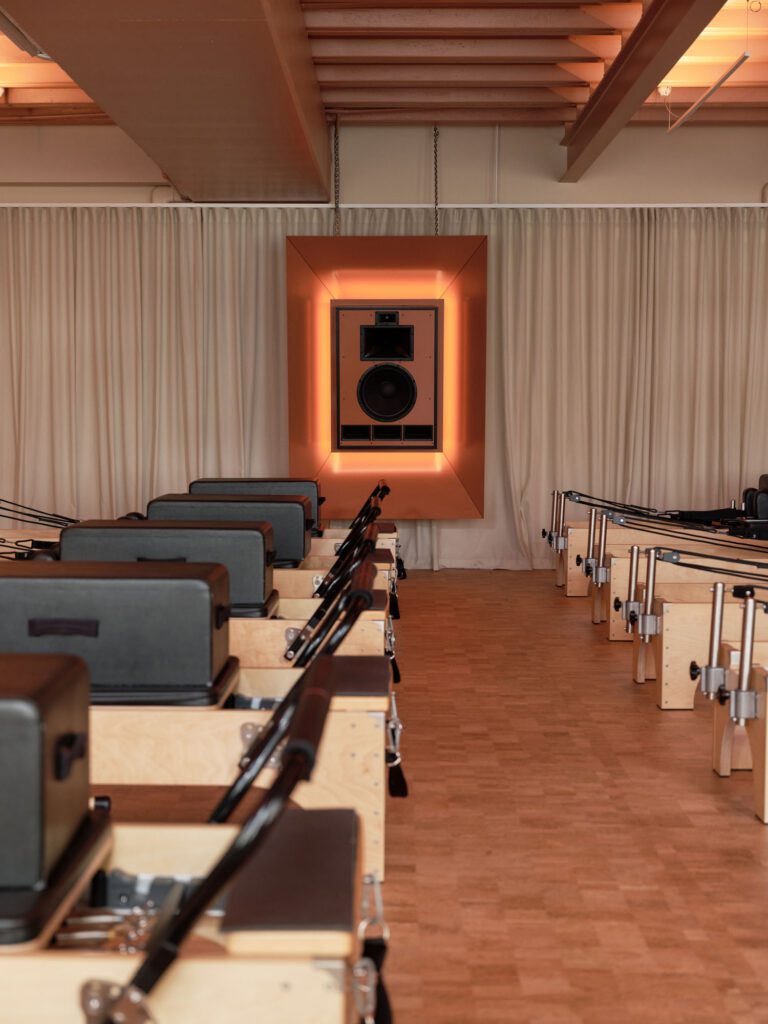
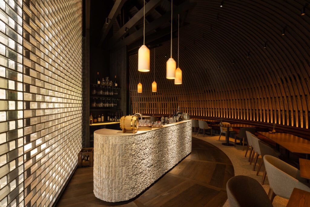
Auckland-based movement studio Sala has expanded its Brown Street site in Ponsonby with the opening of Sonar, a new 150sqm reformer Pilates studio designed to